Table of Contents >> Show >> Hide
- What “Foolproof” Actually Means (and Why Your Walls Don’t Care About Your Swatch)
- The Foolproof Palette Formula: 4 Colors That Do the Heavy Lifting
- The Best Interior Paint Colors for a Whole-Home, Can’t-Mess-It-Up Palette
- 1) Warm, Balanced Whites (Bright Without Feeling Harsh)
- 2) Off-Whites That Read “Cozy,” Not “Yellowed Receipt”
- 3) Greige & Taupe Neutrals (The “Goes With Everything” Middle Ground)
- 4) Soft Blue-Greens (Calm, Clean, and Surprisingly Neutral)
- 5) Navy & Ink Accents (The New Neutral for Grown-Ups)
- 6) Grounded Greens (Nature-Inspired Without Going “Jungle Theme Park”)
- 7) Deep, Warm Darks (Moody Without Feeling Like a Cave)
- Room-by-Room Pairings That Practically Choose Themselves
- Undertones, LRV, and Other Tiny Details That Save Your Weekend
- Paint Finish Cheat Sheet (Because Sheen Is Not Just a “Vibe”)
- Sample Like a Professional (Without Becoming One)
- Common Mistakes That Make Good Paint Colors Look Bad
- Conclusion
- Real-World Paint Experiences: What Happens After the Roller Leaves (Extra )
- Experience #1: The Open-Concept Color That Changes Personalities
- Experience #2: The “White” That Turns Creamy at Night
- Experience #3: The Bathroom That Finally Feels Like a Spa
- Experience #4: The Accent Wall That Was “Too Much”… Until It Was Perfect
- Experience #5: The Trim Color That Quietly Fixes Everything
- Experience #6: The Sampling Habit That Prevents Repainting
Choosing paint should be fun. Instead, it’s usually youstanding in aisle 12holding seven “warm whites” that somehow all look the same… until you get home and one turns your living room the color of steamed milk in a haunted fridge.
The good news: there is a way to build an interior paint palette that’s practically impossible to mess up. Not “trend-proof forever” (nothing isremember sponge painting?), but a cohesive, flexible set of colors that plays nice with most flooring, lighting, and furnitureand still looks intentional when the sun moves three inches.
What “Foolproof” Actually Means (and Why Your Walls Don’t Care About Your Swatch)
A foolproof paint palette does three things well:
- It stays consistent across rooms (so your hallway doesn’t feel like a different zip code).
- It survives real-world lighting (morning sun, afternoon glare, “cozy” lamps, and that one overhead light you hate but never replace).
- It harmonizes with fixed finishes like wood floors, stone counters, tile, and cabinetsbecause those are expensive and paint is not.
The secret sauce is undertone alignment. If your home’s fixed finishes lean warm (golden oak, creamy tile, beige stone), choose warm-leaning neutrals. If they lean cool (gray tile, crisp marble, blue-toned woods), go cooleror pick balanced “bridge” neutrals that can swing either way.
The Foolproof Palette Formula: 4 Colors That Do the Heavy Lifting
If you want a whole-home interior color scheme that feels pulled together (not accidentally assembled), start here:
- One main wall neutral (60%) a warm white, off-white, greige, or soft gray that looks good everywhere.
- One trim/ceiling white (25%) a clean, consistent white that frames rooms and makes everything feel crisp.
- One mid-tone (10%) a slightly deeper neutral for contrast (think taupe, deeper greige, muted clay).
- One accent (5%) a confident color (navy, blue-green, deep green) for a door, vanity, built-ins, or one moody wall.
You can absolutely add more colors later. But if you nail these four, your home already looks like it has a plan.
The Best Interior Paint Colors for a Whole-Home, Can’t-Mess-It-Up Palette
Below are “anchor” shadespopular, designer-approved categories that consistently perform well in real homes. The goal isn’t to memorize paint codes like a trivia champion. It’s to choose one from each category that suits your light and finishes, then build around it.
1) Warm, Balanced Whites (Bright Without Feeling Harsh)
Warm whites are the MVPs of foolproof palettes: they keep rooms airy, soften shadows, and don’t scream “hospital corridor.” Look for whites that are balancednot too creamy, not too icy.
- Sherwin-Williams Pure White (SW 7005) a bright, versatile white with a subtle warmth that keeps it from looking stark. Great for trim, ceilings, and even walls in modern spaces.
- Sherwin-Williams Alabaster (SW 7008) warm, calm, and cozy without going full vanilla pudding. Excellent for open-concept areas where you want softness.
- Benjamin Moore White Dove (OC-17) a classic “clean but not cold” white that works on walls, trim, and cabinetry.
- Benjamin Moore Simply White (OC-117) crisp with a hint of warmth; brightens spaces while still feeling lived-in.
- Behr Swiss Coffee (12) a warm white with a creamy base. Fantastic when you want cozy, but test it carefully in very warm light.
Where these shine: living rooms, kitchens, hallways, and anywhere you want the room to feel bigger and cleanerwithout looking sterile.
2) Off-Whites That Read “Cozy,” Not “Yellowed Receipt”
Off-whites are ideal when you want warmth, but you’re nervous about beige (understandablebeige has a complicated past). The trick is choosing off-whites with muted undertones so they look intentional, not aged.
- Benjamin Moore Chantilly Lace (OC-65) a crisp go-to when you want a fresh “cotton tee” white for trim or walls in bright spaces.
- Benjamin Moore White Dove (OC-17) again, because it’s that reliable friend who always brings snacks and never judges your life choices.
- Sherwin-Williams Alabaster (SW 7008) especially good if your flooring or cabinetry leans warm.
Pro move: Use a slightly warmer off-white on walls and a cleaner white on trim. That contrast makes ceilings feel taller and details feel sharper.
3) Greige & Taupe Neutrals (The “Goes With Everything” Middle Ground)
If white feels too bright and gray feels too cold, greige is your diplomatic solution. These shades are famous for being whole-house paint colors because they connect rooms without stealing the spotlight.
- Sherwin-Williams Agreeable Gray (SW 7029) famously flexible with a beige undertone that adds warmth. Works across many styles: modern, transitional, farmhouse, you name it.
- Benjamin Moore Revere Pewter (HC-172) a classic bridge neutral that can lean warm or cool depending on light (which is code for “test it, don’t guess”).
- Sherwin-Williams Accessible Beige (SW 7036) a beige with gray undertones that feels warm and grounded without looking dated.
- Benjamin Moore Balboa Mist (OC-27) a pale gray with a slightly warm cast; great for cohesive, calm interiors.
Where these shine: open-concept homes, hallways, living areas, and spaces where you want your furniture and art to do the talking.
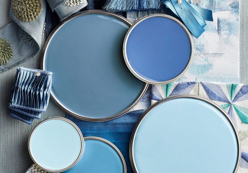
4) Soft Blue-Greens (Calm, Clean, and Surprisingly Neutral)
Blue-greens are the “I want color but I don’t want to commit” solution. They read fresh, spa-like, and pair beautifully with white trim and natural textures.
- Sherwin-Williams Sea Salt (SW 6204) a popular light blue-green that tends to feel airy and relaxed, especially in bathrooms and bedrooms.
Where these shine: bedrooms, bathrooms, laundry rooms, and home officesplaces where “calm” is the whole point.
5) Navy & Ink Accents (The New Neutral for Grown-Ups)
Navy works like a neutral, but with better posture. It adds depth, makes whites look crisper, and plays well with brass, black hardware, and wood.
- Benjamin Moore Hale Navy (HC-154) a classic maritime navy that works on built-ins, islands, doors, and dramatic accent walls.
- Sherwin-Williams Naval (SW 6244) a deep, confident navy that feels calm and groundingexcellent for an office or dining room.
6) Grounded Greens (Nature-Inspired Without Going “Jungle Theme Park”)
Greens are trending because they feel restorative and timelesswhen you pick nuanced shades. The most foolproof greens are muted, earthy, or slightly gray-toned.
- Deep greens for libraries, dining rooms, or a cozy bedroom accent.
- Muted sage/olive for kitchens and living spaces where you want warmth with a natural vibe.
If you’ve ever painted a wall green and then wondered why it looks like an energy drink label, you already understand the rule: avoid neon, avoid overly icy aqua, and test in your lighting.
7) Deep, Warm Darks (Moody Without Feeling Like a Cave)
Dark paint is absolutely foolproof… if you use it strategically. The safest approach is putting dark shades on built-ins, lower cabinets, a powder room, or one well-lit feature wall. Pair with warm whites and reflective finishes.
Think: charcoal, warm black, deep brown-leaning neutrals, and inky greens. They add instant “designer energy” with minimal effortlike wearing a blazer over sweatpants.
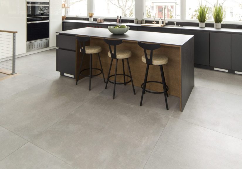
Room-by-Room Pairings That Practically Choose Themselves
Living Room
- Safe classic: warm white walls + crisp white trim + navy accents.
- Cozy modern: greige walls + warm white trim + deep green textiles.
Kitchen
- Timeless: warm white walls + slightly deeper greige on island + clean white trim.
- Fresh but grounded: off-white walls + muted blue-green on lower cabinets or pantry door.
Bedroom
- Soft and calm: blue-green walls + warm white trim.
- Hotel vibe: off-white walls + a navy headboard wall (or navy bedding if you’re not ready).
Bathroom
- Spa energy: light blue-green + bright white trim + warm metal finishes.
- Powder room drama: deep navy or deep green + crisp white ceiling.
Home Office
- Focus mode: navy or deep green on the main wall + warm white everywhere else.
- Bright productivity: soft greige walls + clean white trim.
Undertones, LRV, and Other Tiny Details That Save Your Weekend
Two paint colors can share the same “name vibe” (warm white, greige, soft gray) and still look wildly different at home. Why? Undertones, light direction, and LRV (Light Reflectance Value)a measure of how much light a color reflects.
Practical takeaways:
- North-facing rooms often feel cooler and need warmer paint to avoid looking gloomy.
- South-facing rooms get warm light and can make warm paints look extra creamysometimes too creamy.
- East/west rooms change personality all day. Morning light is different from late afternoon “everything is orange now” light.
If your home has open sightlines, pick one main neutral and repeat it. Variety is fun; visual whiplash is not.
Paint Finish Cheat Sheet (Because Sheen Is Not Just a “Vibe”)
Color gets the glory, but finish decides how it behaves. As a rule of thumb:
- Ceilings: flat (hides imperfections, minimal glare)
- Walls: matte or eggshell (soft look, easier upkeep than flat)
- Trim & doors: satin or semi-gloss (durable and wipeable)
- Kitchens & baths: satin/semi-gloss where moisture and cleaning are real life
One warning: the shinier the finish, the more it highlights wall texture. Satin can make a bumpy wall look like it’s starring in a high-definition documentary.
Sample Like a Professional (Without Becoming One)
The most expensive paint mistake is the one you repaint. Sampling prevents that.
- Test large: a tiny swatch lies. Use a big sample area or paint a poster board.
- Move it around: compare the color in shade, sun, and under lamps at night.
- Check it against your fixed finishes: floors, counters, tile, cabinets, and the giant sofa you’re keeping because it’s still “fine.”
- Compare to your trim white: this is how you catch sneaky undertones early.
Common Mistakes That Make Good Paint Colors Look Bad
- Choosing paint in a store (retail lighting is basically a practical joke).
- Mixing multiple whites without a plan (suddenly one looks dirty and nobody knows why).
- Ignoring flooring undertones (your paint doesn’t exist in a vacuum; it lives next to oak).
- Overusing “cool gray” everywhere (it can read flat or chilly in many homes; warm neutrals are often more forgiving).
- Skipping sheen strategy (a perfect color in the wrong finish can look cheap or patchy).
Conclusion
The best interior paint colors for a foolproof palette aren’t about chasing the loudest trend. They’re about choosing reliable neutrals with compatible undertones, adding one or two confident accents, and letting lighting guide the final call.
Start with a warm, balanced white or a flexible greige. Pick one consistent trim white. Add a mid-tone for depth. Then choose an accent like navy or a muted blue-green. That’s it. That’s the whole “secret.” (Interior designers everywhere just sighed with relief.)
Real-World Paint Experiences: What Happens After the Roller Leaves (Extra )
Let’s talk about the part of painting nobody puts on the mood board: the emotional journey between “This is going to be gorgeous” and “Why does it look like oatmeal… but angry?” These are common, very human experiences that show why a foolproof palette works so well in real homes.
Experience #1: The Open-Concept Color That Changes Personalities
In open layouts, one wall color can face multiple light sourceswindows in the living room, a darker hallway, and kitchen lighting that’s suspiciously bright. A true gray might look modern in one corner and blue-ish in another. That’s why balanced greige shades are such a safe bet: they’re basically the Switzerland of paint. They don’t pick fights with your floors, they don’t turn purple at sunset, and they tend to keep the peace when rooms flow together.
Experience #2: The “White” That Turns Creamy at Night
Many homeowners pick a clean white, paint the room, and love it at noon. Then night falls, the lamps go on, and suddenly it feels warmersometimes much warmer. This isn’t the paint betraying you; it’s lighting doing what lighting does. Warm bulbs amplify warm undertones. If your goal is “bright and crisp,” a clean trim white paired with a gently warm wall white often looks best. You get comfort without losing clarity. It’s the difference between “inviting” and “did we accidentally buy antique parchment?”
Experience #3: The Bathroom That Finally Feels Like a Spa
Bathrooms can be tricky because tile and fixtures are bossy. Cool marble plus a yellow-leaning paint can look off. That’s where soft blue-greens shine. They tend to flatter white tile, work with chrome or brushed nickel, and feel calm without reading “nursery.” The moment a blue-green goes up with crisp white trim, the room often feels cleanerlike it started drinking water and doing yoga.
Experience #4: The Accent Wall That Was “Too Much”… Until It Was Perfect
A deep navy or inky green can feel dramatic in the paint store. Then you put it on one wallespecially in a room with decent lightand it suddenly looks rich and grounded. The key experience here is learning that dark colors need contrast. Pair them with warm whites, lighter rugs, or art with a bit of brightness. Used this way, dark accents stop feeling heavy and start feeling intentional, like the room is wearing a tailored jacket.
Experience #5: The Trim Color That Quietly Fixes Everything
People obsess over wall color and forget trim… until they repaint the trim and the entire house looks more “finished” overnight. A consistent trim white creates a repeating frame from room to room, which makes your palette feel cohesive even if the wall colors shift slightly. It also helps correct small differences in light: when rooms connect, the eye compares. A stable trim color keeps comparisons from getting weird.
Experience #6: The Sampling Habit That Prevents Repainting
The most satisfying “experience upgrade” is switching from tiny swatches to real testing. Paint a large sample (or a movable board), live with it for a few days, and check it in morning light, afternoon light, and under lamps. The color that holds up across those conditions is the one you can trust. This is especially true for whites and greigessubtle colors can swing the most. Sampling feels slow, but repainting is slower (and also smells like regret).
The overall lesson from real homes is simple: a foolproof palette wins because it respects lighting, undertones, and the way rooms connect. It’s less about finding “the one perfect paint color” and more about choosing a small team of colors that support each other. Like a good friend group: balanced, dependable, and not prone to drama.