Table of Contents >> Show >> Hide
- Why purple is having a major home-design moment
- Purple paint 101: undertones, light, and finish
- The best purple paint colors for your home (by mood & room)
- How to choose the best purple paint for your home (step by step)
- Design ideas for using purple around your home
- Common mistakes with purple paint (and how to avoid them)
- Experience-based lessons: living with purple in real homes
If you’ve ever stood in front of a wall of paint chips and thought, “Why are there
47 versions of purple and why do they all have different names?”, welcome to the club.
Choosing the best purple paint for your home can feel weirdly emotional: one shade looks
sophisticated and cozy, another looks like a melted crayon from a kids’ party.
The good news? Purple is one of the most versatile color families you can bring into your
space. From soft lavender that feels like a spa day to deep aubergine that screams
“moody designer library,” there’s a purple for every room, style, and personality. Major
paint brands like Benjamin Moore, Sherwin-Williams, Farrow & Ball, Behr, and Valspar
all highlight purple as a powerful choice for everything from bedrooms to front doors.
Let’s break down how to choose the best purple paint for your home, with real designer tips,
color psychology insights, and specific shade ideas you can actually ask for at the paint
counterwithout accidentally painting your living room like a cartoon castle.
Why purple is having a major home-design moment
Purple has long been associated with royalty, luxury, spirituality, and creativity. Modern color
psychology research and interior design guides note that lighter purples like lavender and lilac
can promote relaxation and calm, while deeper shades like plum and royal purple create drama,
opulence, and a sense of depth.
Designers are leaning into purple because it behaves like a chameleon:
- Soft lavenders can feel like an elevated neutral, similar to gray but warmer and more interesting.
- Dusty mauves and purple-greiges work beautifully in sophisticated living rooms and open-plan spaces.
- Deep plums and aubergines bring instant character to dining rooms, powder rooms, and home offices.
Trend reports and “best of” purple lists from designers show that homeowners are increasingly
using purple in more creative places: pantries, mudrooms, libraries, and even as a statement
front door color.
Purple paint 101: undertones, light, and finish
Understand undertones before you fall in love with a swatch
Every purple has an undertone. Some lean more red (plum, wine, magenta),
some lean more blue (periwinkle, indigo-violet), and some read
gray or taupe with just a whisper of purple.
Color experts suggest thinking in terms of temperature: warm colors have red, orange,
or yellow undertones; cool colors lean blue, green, or purple.
With purple, that means:
- Warm purples (red-violet, wine, eggplant) feel cozy, enveloping, and dramatic.
Great for dining rooms, bedrooms, and evening spaces. - Cool purples (lavender, lilac, periwinkle) feel fresh, airy, and relaxing.
Ideal for bedrooms, bathrooms, and light-filled living spaces. - Neutral-leaning purples (mauve, purple-gray, purple-greige) can act almost
like a stylish neutral, pairing easily with wood tones, creams, and metals.
One simple designer trick for reading undertones is to look at the darkest color on a paint
stripthe undertone is most obvious there.
Light changes everything
Purple is sensitive. The same paint color can look airy and lilac in a bright south-facing room
and then muddy or gray in a dark hallway. Paint companies and designers emphasize that you must
consider your room’s natural light and orientation when choosing any color.
- North-facing rooms tend to read cooler. Lavender can look icy here,
so slightly warmer mauves or purple-greiges often work better. - South-facing rooms get warm light that intensifies color.
Deep aubergine can look rich and luxe, while bright lilac can turn a bit sugary if you’re not careful. - East-facing rooms are cooler in the afternoon; west-facing rooms warm up
dramatically in the evening. Test purple tones at multiple times of day in these spaces.
Don’t forget the finish
For most interior walls, designers gravitate toward matte, eggshell, or low-sheen finishes, which
soften the look of saturated colors like purple. Higher-sheen finishes (satin, semi-gloss) are
great for trim, cabinets, and doors, where a deep purple can become a gorgeous focal point.
The best purple paint colors for your home (by mood & room)
You don’t have to memorize every quirky paint name, but it helps to know what types of purple
tend to work best in different spaces. Below are categories you can use as a guide, with examples
from major paint lines.
1. Soft lavender and lilac for relaxing bedrooms
Light purple paint colors are often recommended for bedrooms because they feel gentle and calming,
especially when paired with warm whites, natural wood, and soft textiles.
Popular examples among designers and color pros include:
- Soft lavender and lilac tones from Benjamin Moore and Sherwin-Williams,
such as pale, gray-lavender hues that function like upgraded neutrals. - Periwinkle-inspired lavenders, which mix blue and purple for a restful but modern feel,
echoing the popularity of past violet-leaning “colors of the year.” - Lighter lilac shades like those highlighted by Valspar for 2025, which customers love in
bathrooms and bedrooms for their soft, airy vibe.
Use these in:
- Primary and guest bedrooms
- Nurseries and kids’ rooms (especially paired with creamy whites)
- Calming home offices or yoga/meditation corners
2. Deep plum and aubergine for drama and luxury
If you want a room to feel like a boutique hotel, deep purple is your friend. Designers love
rich aubergine and plum shades for creating cocoon-like spaces with tons of character.
You’ll see colors in this family used for:
- Dining rooms paired with brass fixtures, white trim, and crisp table linens.
- Libraries and studies with leather chairs, wood shelves, and warm lighting.
- Powder rooms where “color drenching” (walls, ceiling, and trim in the same rich hue)
delivers serious drama in a small space.
Many designer-favorite lists call out deep purples from Farrow & Ball, Benjamin Moore, and
Sherwin-Williams as go-tos when you want sophistication with a bit of edge.
3. Purple-greige and mauve “almost neutrals”
Maybe you like the idea of purple but not the idea of living inside a grape. That’s where
subtle purple-greige and mauve tones shine. Many of the most popular “purple” colors on designer
lists are actually gray or taupe with a noticeable purple undertone.
These colors:
- Play nicely with red and medium wood tones.
- Look sophisticated in open-plan living/dining rooms.
- Offer just enough color to feel interesting, without overwhelming the space.
Designers often recommend this category if you’re nervous about committing to “real” purple but
want to move beyond standard gray or beige.
4. Playful purples for kids’ rooms, creative spaces, and accents
Not all purple has to be serious. Brighter, more saturated purples show up in kids’ bedrooms,
craft rooms, and accent walls where a bit of fun is the goal. Inspiration boards from brands like
Behr, Sherwin-Williams, and Pinterest are full of purple rooms layered with white furniture,
colorful art, and patterned textiles.
Try these ideas:
- A bold purple accent wall behind a bed or desk.
- Purple-painted bookcases or built-ins in a playroom or office.
- Painting the inside of a closet or pantry in a surprise pop of violet.
5. Underrated purple stars worth sampling
Paint brands occasionally spotlight unusual purples that people overlook. For example,
Sherwin-Williams highlighted a rich, inviting lilac shade as an “underrated” color, pairing it
with eclectic, boho-inspired interiors to show how flexible purple can be when used thoughtfully.
The takeaway: don’t be afraid to try the shades nobody else is buying. With the right styling
and placement, the “lonely” color on the rack might become the star of your home.
How to choose the best purple paint for your home (step by step)
Step 1: Start with your fixed finishes, not the paint chip
Before you fall head over heels for a purple swatch, look at what’s already in the room:
flooring, countertops, tile, cabinets, and large furniture. Color consultants stress that your
paint should complement these fixed finishes first, not fight them.
- If you have warm wood floors or creamy stone, consider warmer mauves and
plum-leaning purples. - If you have cool gray tile or crisp white cabinets, cooler lavender and
periwinkle shades may feel more at home.
Step 2: Narrow to 3–5 promising shades
Use online color tools and curated palettes from major brands to shortlist a few purples that
match your vibecalm, dramatic, playful, or sophisticated.
It’s easier to compare a handful of options than 50 random paint chips that all look the same
in your hand.
Step 3: Always test with real paint samples
Every pro agrees: you must test paint on your walls. Companies like Benjamin Moore and
independent painting pros recommend buying sample pots or peel-and-stick swatches and painting
large sections on multiple walls in the room.
- Paint samples at least 18–24 inches wide.
- Place them near the floor and near the ceiling.
- Look at them morning, midday, and evening.
- Compare them next to trim, flooring, and major furnishings.
A purple that looks dreamy on a tiny card can suddenly show its true undertonetoo pink,
too gray, too bluewhen you see it in a big swatch.
Step 4: Adjust by percentages if needed
Designers sometimes tweak paint colors by asking the store to mix a formula at 50% or 75%
strength to create a lighter version, or occasionally a darker variant. This trick helps fine-tune
the depth and undertone of a shade without reinventing the wheel.
If your purple feels “almost right but a bit too intense,” try requesting a lighter percentage
or sample a neighboring shade with similar undertones.
Step 5: Commit to a plan, not a single wall
Decide where purple will live in the room:
- All four walls
- One accent wall plus coordinating neutrals
- Walls in one finish, trim or doors in a deeper purple
- Cabinetry or built-ins as the only purple element
Having a strategy keeps the color from feeling random and makes the whole room look intentional
and designed.
Design ideas for using purple around your home
Living room
In a living room, try a soft mauve or purple-gray on the walls, layered with creamy white trim
and a mix of textureslinen, velvet, woven baskets. Add brass or black metal accents so the purple
feels grown-up rather than sugary.
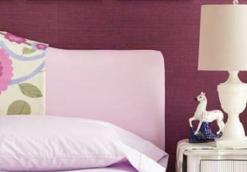
Bedroom
Choose a light lavender or lilac with a hint of gray for a relaxing retreat. Keep bedding mostly
neutral, then echo the wall color in throw pillows, a bench, or artwork. Designers often pair
soft purple with warm woods and ivory to avoid a “princess” vibe.
Bathroom
Bathrooms love purple because tile, stone, and chrome fixtures give it structure. Try a gentle
lilac on the walls with white subway tile, or go bold with a deep eggplant in a tiny powder room
for a jewel-box feel.
Kitchen and dining room
If you’re feeling adventurous, paint the dining room in a deep aubergine for a restaurant-level
vibe, or use a rich plum on lower kitchen cabinets with white uppers. A muted mauve backsplash or
pantry interior can be a stylish compromise if you’re not ready for full-on purple cabinets.
Entry and front door
A purple front door or interior entry accent wall sends a strong personality signalcreative,
confident, a little bit unexpected. Darker purples read sophisticated; lighter lilac doors feel
playful and welcoming.
Common mistakes with purple paint (and how to avoid them)
- Skipping samples: Purple can shift dramatically with light and surroundings.
Test generously, and don’t rely on digital mockups alone. - Ignoring undertones: A color that looks like “simple lavender” may lean pink,
blue, or gray once it’s on the wall. Compare several similar purples side by side so the differences
become obvious. - Overdoing the saturation: If you paint a large, bright room in a very saturated
purple, it can feel overwhelming. Consider dialing down to a more muted shade or using deep purple
on only one or two walls. - Forgetting your furnishings: Purple that clashes with your sofa, rug, or cabinets
will never feel “right,” no matter how stylish it looks online.
Experience-based lessons: living with purple in real homes
After watching how homeowners, designers, and DIYers use purple over time, a few patterns keep
showing up. Think of this as a set of “field notes” on what it’s really like to live with purple
paint day to day.
Purple behaves differently than you expectusually in a good way
Many people who choose a light lavender or mauve expecting a bold color discover that, on a large
wall, it reads softer and more neutral than they imagined. In open-plan spaces, a subtle purple-greige
can simply look like a warm, interesting gray that shifts with the lightmore violet at sunset,
more taupe at noon.
The reverse is also true: a deep aubergine on a tiny chip can look almost black until it’s up on a
whole wall with lighting, where suddenly the rich purple character comes through. People often report
that guests can’t quite name the color at first, only that the room feels cozy and expensive.
Lighting and lamps can make or break your purple
Homeowners frequently note that the same purple looks totally different under warm incandescent bulbs
versus cool LEDs. Warmer bulbs emphasize red and mauve undertones; cooler bulbs bring out the bluer,
periwinkle side. Designers advise choosing your lighting plan before locking in your paint color, or at
least testing samples under the bulbs you’ll actually use.
A practical trick people love: once your test swatches are up, carry a lamp around the room and see
how the color changes as you move it. That quick experiment reveals a lot about whether a purple will
feel cozy or cold at night.
Small purple spaces become fan favorites
One of the most common stories from homeowners is that their boldest purple space ends up being their
favorite room. A tiny powder room painted in a dark plum, a pantry in playful lilac, or a mudroom with
aubergine cabinets becomes the spot everyone comments on. Designers often highlight these “jewel box”
spaces as ideal for trying rich purple without overwhelming the rest of the house.
Because these rooms are small and often used in quick bursts, you can afford to be braver with color.
Even people who swear they “only like white walls” frequently end up loving a deep purple bathroom.
Textiles, art, and metal finishes complete the look
Another real-world lesson: purple walls alone don’t make a room feel finished. Success stories almost
always involve layering in complementary textures and finishes:
- Brass and aged gold against deep plum for a luxe, classic feel.
- Black metal and clean lines for modern, editorial-style purple rooms.
- Natural wood, rattan, and linen to keep lavender rooms from feeling cold.
People also find that repeating purple subtlyon throw pillows, a patterned rug, or artworkhelps the
paint color feel intentional, not random. Even a single framed print with touches of the same purple
makes the whole room look more cohesive.
Purple is surprisingly easy to live withif you pick the right one
The biggest surprise for many homeowners is how wearable purple really is. When you choose a shade that
respects your lighting and fixed finishes, purple behaves much like navy, forest green, or charcoal:
rich, flexible, and timeless.
Soft lavender can feel like a restful gray with personality. Muted mauve can act like a more interesting
beige. Deep aubergine can stand in for black or dark brown but with more depth and mood. That’s why so many
designersand more and more homeownersare calling purple one of the most underrated color families for
interiors.
So if you’re on the fence, treat purple like an experiment, not a life sentence. Start with a small room
or an accent wall, test a few great shades, and pay attention to how they behave throughout the day. Odds
are good that one of them will quietly steal your heartand earn a permanent place in your home.