Table of Contents >> Show >> Hide
Most people see a derelict ambulance station and think, “That looks expensive.” A rarer breed sees the same building and thinks, “That could be spectacular.” Thankfully for design lovers everywhere, interior architect Marta Nowicka belongs to the second camp. In Rye, East Sussex, a former St. John Ambulance station that had been neglected for decades was transformed into a warm, highly livable home that still wears its history proudly. The result is the kind of adaptive reuse project that makes renovation fans weak in the knees: part preservation, part reinvention, and part proof that a building with strange bones can become the one everyone wants to move into.
This is not a makeover in the “add two throw pillows and call it a lifestyle” sense. It is a serious reworking of a 1950s service building inside one of England’s most atmospheric old towns. Yet what makes the finished home so memorable is not just the scale of the transformation. It is the restraint. Instead of scrubbing away the station’s past, the redesign keeps the industrial spirit alive through brick, steel, timber, concrete, and clever planning. In other words, the place did not lose its personality in exchange for a pretty kitchen. It got both.
The Before: A Building With Good Bones and Plenty of Problems
The former ambulance station sat in Rye’s medieval citadel, tucked near Conduit Hill and sharing a courtyard with a Georgian building once used as the service headquarters. Originally built in the 1950s for the St. John Ambulance Association, the structure had a twin-pitched garage once large enough for two ambulances. By the time the property changed hands, however, romance was not exactly spilling out of the masonry. The building had not been meaningfully updated since the 1970s, and its layout had become cluttered with partitions, tired systems, and the sort of awkward add-ons that old buildings seem to collect like badges of survival.
Still, the fundamentals were there. The ground floor was generously proportioned because it had once served a practical, vehicle-oriented purpose. The roof spaces, meanwhile, had unusual attic-like rooms that made the building feel quirky instead of generic. That contrast mattered. Great conversions often begin with a useful tension: wide-open communal potential downstairs, intimate tucked-away corners upstairs. This building had exactly that. It also had what every ambitious renovation needs, even if no one likes to admit it out loud: drama.
And yes, plenty of headaches came free with purchase. The home sat in a conservation area, which meant strict planning rules. Neighbors objected to proposals. Local planners did not allow the footprint to grow beyond the original limits. The work stretched over years, not months. This was the opposite of a fast flip with a mood board and a prayer. It was a long, patient exercise in design problem-solving, the kind where every “simple change” probably required three drawings, five conversations, and one deeply sigh-filled cup of coffee.
The After: A Home That Feels New Without Acting Amnesiac
The completed project turns the old station into a four-bedroom home of roughly 215 square meters, but the smarter achievement is how naturally the new life of the building fits its old character. The redesign does not pretend the ambulance station was always meant to be a conventional family house. Instead, it embraces the fact that this was once a working structure and lets that former identity shape the final mood.
That approach shows up immediately in the exterior. A 1970s extension was rebuilt with a pitched roof that visually extends the original form instead of fighting it. Local clay tiles help the addition sit more comfortably among Rye’s historic surroundings, while carefully placed roof windows bring in natural light without making the building look overworked or overly polished. It is a respectful move, and a savvy one. Good adaptive reuse rarely wins by shouting. It wins by making the new work feel inevitable.
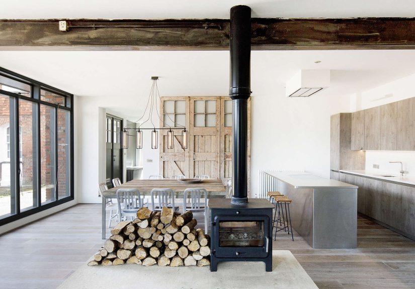
Inside, the transformation is dramatic. The plan was reorganized to create a huge open-concept living, dining, and kitchen space on the ground floor. A non-original central wall came out, allowing the main level to operate as one flowing social zone. In lesser hands, that might have resulted in a giant blank room with all the emotional warmth of an airport lounge. Here, it feels grounded, because the space is organized around a large concrete plinth topped by a double-sided wood-burning stove. That plinth is not just functional. It acts as an anchor, a divider, and a visual reminder that even modern spaces still crave a hearth.
Why the Design Works So Well
1. It Preserves Character Instead of Sanding It Into Oblivion
One of the smartest choices in the renovation was keeping and highlighting the building’s rougher, more honest materials. Exposed brick walls remain central to the look, and they are paired with steel, timber, and concrete rather than buried behind drywall in the name of “freshening things up.” That decision gives the house depth. Exposed masonry has a way of carrying memory into a room. It makes a space feel rooted, textured, and lived in, even when the furnishings are restrained.
The same is true of the exposed beam overhead and the industrial-style doors. The original sliding doors were replicated to preserve the building’s practical, workmanlike feel, and the garage-style openings still create a strong relationship between the interior and the courtyard outside. This matters because adaptive reuse is most convincing when the building’s old logic still whispers through the new one. You want a converted structure to feel evolved, not erased.
2. It Softens Industrial Elements With Warm, Livable Materials
Industrial design can go wrong in two very predictable ways. It can become cold and self-consciously edgy, or it can become so softened that it no longer feels industrial at all. This project neatly avoids both traps. Wide oak flooring runs through the main levels and even climbs into wall cladding in the stairwell and upper rooms, bringing warmth and continuity. Grey-toned timber cabinetry and Carrara marble add refinement without becoming fussy. The stainless steel island is a clever touch: it nods to the building’s medical past while still feeling perfectly at home in a modern kitchen.
That material mix is a big reason the house feels balanced. Brick and concrete provide grit; timber and marble provide softness and polish. The result is what so many renovated industrial homes are chasing: a space that feels architecturally serious but still comfortable enough for everyday life. You can picture a dinner party here, but you can also picture someone padding in for coffee on a rainy morning and not feeling like they live inside a concept sketch.
3. It Uses History as Inspiration, Not Costume
The redesign draws on local and historical references without turning theatrical. The central hearth idea echoes medieval dwelling patterns, which suits Rye’s age and setting. Roof timbers and clay tiles help the project speak the visual language of the town. At the same time, small medical references, including stainless steel accents and a repurposed nurse’s trolley used in a bathroom vanity, acknowledge the building’s former purpose with a wink rather than a costume change. That is a hard balance to strike. Too much thematic design and the place starts to feel like a boutique hotel called The First Aid Arms. Too little and the story disappears. Here, the references are just right.
4. It Understands That Light Is a Renovation Material
One of the quiet triumphs of the project is how it handles natural light. Roof windows bring daylight into the upper level from both directions, and a dramatic triangular glass insertion between the roof pitches opens views outward from the primary bedroom. Large glazed openings and the bi-folding ambulance doors help the ground floor feel connected to the courtyard. Light is doing more than brightening the house here. It is making an old service building feel breathable, generous, and unexpectedly calm.
That matters because open-plan living only works when a space feels pleasant to inhabit for long stretches of time. The best before-and-after renovations are not just about visual contrast. They are about emotional contrast. The “before” feels constrained, dim, and underused; the “after” feels open, intuitive, and alive.
What This Project Says About Adaptive Reuse
The East Sussex ambulance station is a compelling example of why adaptive reuse has such lasting appeal. Converting former workspaces into homes is not just aesthetically interesting. It is often more sustainable than starting from scratch, and it preserves architectural diversity that new construction cannot easily fake. Old buildings come with material richness, odd proportions, and localized character. They also come with limitations, of course, but those limitations often force better design decisions.
This home proves that point. Because the footprint could not simply sprawl outward, the design had to get smarter about reorganization. Because the building sat in a historically sensitive setting, the exterior had to respond to context. Because the structure had a specific past, the interiors had an opportunity to build narrative through materials and layout. Constraints did not weaken the project; they sharpened it.
It also shows why so many converted spaces feel more memorable than many brand-new homes. New builds can be lovely, but they often start from a blank slate. Blank slates are overrated. A former ambulance station already has texture, attitude, and a built-in story arc. The designer’s job is not to invent meaning from nothing. It is to edit, reveal, and translate what is already there.
Lessons Homeowners Can Borrow From the Renovation
Even if you do not happen to own a retired emergency-services building in a medieval English town, there is plenty here worth stealing, design-wise. First, keep original features when they genuinely add character. Brick walls, unusual rooflines, old doors, exposed structure, and timeworn materials often provide more personality than any trendy finish ever could. Second, use one or two strong architectural gestures to organize open space. In this case, the concrete plinth and wood stove keep the main room from feeling shapeless.
Third, blend raw and refined materials. Old brick loves good wood. Concrete gets friendlier when paired with warm textiles and generous light. Stainless steel becomes elegant when set beside marble. Fourth, let context guide the renovation. A home should respond to its neighborhood, not act like it was dropped from another planet by a very stylish spacecraft.
Finally, remember that a successful before-and-after is not about making the “after” look expensive. It is about making it feel right. This project does not impress because everything is shiny and new. It impresses because the new work feels deeply connected to the old shell. That kind of coherence is harder to create than luxury, and much more satisfying.
The Experience of the Finished Home
What makes the reimagined ambulance station especially fascinating is the experience of moving through it. From the outside, the building still carries a certain reserve. It does not announce itself like a flashy conversion begging for attention. It sits within Rye’s layered streetscape with enough humility to belong there. Then you step inside, and the mood shifts. The former station opens up into a broad, social living zone where brick, timber, and concrete create a quiet kind of drama. There is nothing fussy about it. The room breathes.
You can imagine the first sensation being one of scale. Because the ground floor was once shaped by function rather than domestic convention, the proportions feel generous in a way many houses do not. The old ambulance workshop logic lingers in the width of the room, the relationship between the doors and the courtyard, and the sense that this space was built for movement. But the redesign changes that movement from practical to human. Instead of vehicles and equipment, the room now organizes itself around conversation, cooking, reading, eating, and lingering by the stove a little longer than strictly necessary.
Then there is the texture. This house does not read as precious. The exposed brick walls carry visual weight, and the oak underfoot softens them. The concrete plinth in the center has a sculptural firmness, but the fire immediately makes it feel inhabited rather than severe. The materials ask to be noticed, yet none of them seem to be performing for Instagram like overly enthusiastic extras in a renovation reality show. They simply belong.
The kitchen likely delivers another part of the experience: contrast. Stainless steel, marble, and timber create that satisfying tension between utility and comfort. It still makes sense that the building once served a medical purpose, and yet now it also makes sense to gather there for dinner, pour a glass of wine, and argue gently over whether one more loaf of bread was really necessary. In a good home, the practical and the pleasurable stop fighting each other. This one seems to understand that.
Upstairs, the experience shifts again. The roof spaces feel more intimate, almost secretive, with their attic-like quality and carefully introduced light. That contrast between open communal ground floor and quieter upper rooms is one of the home’s best qualities. It gives the conversion emotional range. Downstairs says, “Come in, stay awhile.” Upstairs says, “You may now become a slightly more interesting version of yourself and read in peace.”
There is also something undeniably moving about knowing what the building used to be. It once existed to respond to emergencies, to hold equipment, to support service and motion. Now it holds family life, guests, long meals, and everyday routines. That is a powerful shift. Adaptive reuse at its best does more than recycle walls; it changes the emotional destiny of a building. It turns usefulness into belonging.
And perhaps that is why this before-and-after lingers in the mind. The project is visually striking, yes, but it is the atmosphere that seals it. The home still feels a little rugged, a little unusual, and entirely itself. It respects the old station without becoming trapped by nostalgia. It welcomes modern life without flattening its past. In the end, the real miracle is not that a derelict ambulance station became beautiful. It is that it became beautiful in such a convincing, livable, and deeply human way.
Conclusion
The transformation of this derelict ambulance station in East Sussex succeeds because it understands a simple truth: old buildings do not need to be rescued from their history. They need that history edited, respected, and intelligently reworked. Marta Nowicka’s redesign keeps the station’s industrial backbone, acknowledges its medical past, responds to Rye’s historic setting, and creates a home that feels both striking and comfortable. It is a lesson in adaptive reuse, but also in taste. The best renovations are not the ones that shout the loudest. They are the ones that make you believe the building always wanted to become exactly this.