Table of Contents >> Show >> Hide
- What You’ll Find Here
- How This “Dirtiest Cities” Ranking Was Built
- Mapped Patterns: Where the Dirt Clusters
- The 25 Dirtiest Cities in America (Ranked + Scored)
- Why These Cities Keep Showing Up (It’s Not Just Litter)
- What Actually Cleans a City Up (No, It’s Not Just “Try Harder”)
- FAQ: The Questions Everyone Asks (Usually While Pointing at a Puddle)
- Extra (): On-the-Ground Experiences from America’s “Dirtiest” Cities
- Conclusion
Because “gritty charm” is still charm… but your lungs didn’t sign up for the director’s cut.
“Dirty” is one of those words that can mean anything from smoggy air to overflowing trash cans to
“why does this sidewalk look like it lost a fight with a blender?” So let’s define it the grown-up way:
measurable pollution + real-world livability signals.
This article maps and explains the 25 dirtiest cities in America using a recent nationwide ranking as the backbone,
then adds context from public environmental tools (think: federal pollution indicators, air-quality reporting, and litter research).
The goal isn’t to dunk on anybody’s hometownit’s to understand why some places struggle and what actually helps.
How This “Dirtiest Cities” Ranking Was Built
The list below follows a 2025 ranking that compared 303 U.S. cities across 20 factors grouped into four
big buckets: pollution (like industrial and near-road exposure signals), living conditions,
infrastructure (like waste-related measures), and resident dissatisfaction with local environmental quality.
Think of it as a “how many different ways can a city be messy?” scorecard.
Important nuance: this is not a single “trash on the street” measurement. A city can rank poorly because it has
heavy industry, dense freight traffic, older housing stock, tougher heat/smog conditions, or simply more documented environmental burden.
That means the list is best used as a conversation starterand a nudge toward better policynot a reason to clutch pearls
in the airport arrivals line.
Two tools that show up behind the curtain
- RSEI (Risk-Screening Environmental Indicators): A screening model that helps compare potential impacts of toxic chemical
releases using TRI data and other inputs. It’s designed for prioritizationnot for diagnosing your neighborhood. - TRI (Toxics Release Inventory): A federal reporting program where certain facilities report how much of specific chemicals
they release or manage through treatment/recycling.
How to read this list like a pro
- Rank ≠ destiny. Cities change fast when leadership funds sanitation, reduces truck emissions, and modernizes infrastructure.
- Neighborhoods vary wildly. A metro can have pristine pockets and “why is the air spicy?” corridors.
- Data-rich areas can look worse. Better monitoring and reporting can reveal problems that other places simply don’t measure well.
Mapped Patterns: Where the Dirt Clusters
If you “map” this listeither on a real map or the mental one you keep next to your group chatyou’ll notice the dirt isn’t evenly distributed.
The biggest cluster is in the West, especially Southern California, where geography, freight corridors,
traffic density, and ozone-friendly heat can stack the deck.
Quick heat-check by region (out of 25)
- West (15): California dominates, plus Arizona and Nevada.
- South (4): Texas and Florida make appearancesoften tied to industry, port activity, and growth pressures.
- Northeast (4): Dense, older, port-and-traffic-heavy metros show up.
- Midwest (2): Legacy industrial footprint and public health indicators can weigh down scores.
Translation: it’s not just “people litter here.” It’s frequently a combination of traffic emissions, industrial activity,
heat-driven smog, and infrastructure strain. The map tells a story about how goods move, where people live,
and how cities fund (or don’t fund) clean air and clean streets.
The 25 Dirtiest Cities in America (Ranked + Scored)
Here are the cities ranked from “most dirty” downward, with overall scores from the referenced 2025 study. Use the table as your map legend:
it’s the “where,” not the entire “why.”
| Rank | City | State | Overall Score | Mapped Clue (What often drives “dirty” scores) |
|---|---|---|---|---|
| 1 | San Bernardino | CA | 55.34 | Freight/warehouse corridors + air-quality pressure |
| 2 | Los Angeles | CA | 49.79 | Near-road exposure, smog, density |
| 3 | Detroit | MI | 49.72 | Legacy industry footprint + public health signals |
| 4 | Reading | PA | 49.31 | Industrial indicators (toxics screening) + emissions |
| 5 | Ontario | CA | 48.20 | Freight logistics + traffic-linked pollution |
| 6 | Newark | NJ | 48.06 | Port/traffic density + older infrastructure stress |
| 7 | Phoenix | AZ | 47.47 | Heat, dust, sprawl, vehicle emissions |
| 8 | Jersey City | NJ | 46.53 | Dense corridors near major roads/ports |
| 9 | Las Vegas | NV | 45.96 | Heat + vehicles + dust + rapid growth |
| 10 | Corona | CA | 45.36 | Commuter traffic + inland air basin effects |
| 11 | Houston | TX | 44.07 | Ozone/industrial mix + transportation emissions |
| 12 | Flint | MI | 43.92 | Infrastructure burden + resident dissatisfaction signals |
| 13 | Santa Monica | CA | 43.81 | Traffic exposure + coastal urban pressure |
| 14 | Stockton | CA | 43.67 | Valley air patterns + transportation corridors |
| 15 | Glendale | CA | 43.60 | Near-road exposure + metro density |
| 16 | Miami | FL | 43.44 | High density + waste strain + coastal challenges |
| 17 | Baytown | TX | 43.39 | Industrial corridors + air-quality burden |
| 18 | Mesa | AZ | 42.95 | Sprawl + traffic emissions + heat-driven air issues |
| 19 (tie) | Fontana | CA | 42.93 | Freight/warehouse activity + truck traffic |
| 19 (tie) | Brownsville | TX | 42.93 | Growth pressures + infrastructure strain indicators |
| 21 | Bakersfield | CA | 42.80 | Valley geography + ozone/PM challenges |
| 22 | Long Beach | CA | 42.68 | Port activity + diesel/truck corridors |
| 23 | Riverside | CA | 42.51 | Inland basin smog + commuter corridors |
| 24 | Palmdale | CA | 42.11 | Dust/heat + regional air patterns |
| 25 | Yonkers | NY | 42.09 | Dense metro exposure + roadway proximity |
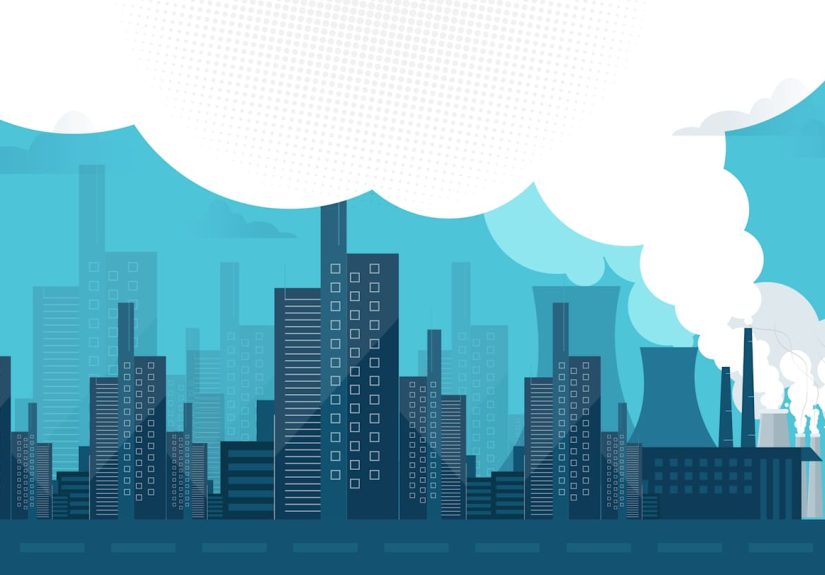
Notice how often air quality shows up as the “mapped clue.” That’s because air pollution is one of the most measurable,
consistently tracked “dirty city” signalsespecially through tools like the Air Quality Index (AQI), which translates pollutant
levels into easy-to-read categories (from “Good” to “Hazardous”).
Why These Cities Keep Showing Up (It’s Not Just Litter)
1) The “traffic + freight” combo is a cheat code for dirty air
Cities located along major highways, ports, or warehouse corridors can experience more pollution tied to
transportationespecially nitrogen oxides and particulate matter that contribute to smog and health risk.
If you’re near an area that moves a lot of goods, you’re also near a lot of engines that idle, accelerate, brake, and repeat.
2) Geography can trap pollution like a lid on a pot
Inland basins and valleys can hold onto pollution, especially during heat and stagnant conditions.
That’s one reason parts of California’s interior repeatedly show up when lists focus on ozone and fine particles.
The weather isn’t “causing” the emissionsbut it can make their impact more intense and longer-lasting.
3) Industrial footprints mattereven when facilities follow rules
Facilities that report into federal inventories don’t automatically mean a city is unsafe or “bad.”
But higher concentrations of industrial activity can raise a city’s profile in screening tools and rankings,
especially when combined with population density and exposure potential.
4) “Dirty” is also about infrastructure and day-to-day systems
Waste management, street sweeping, illegal dumping enforcement, public bathroom access, and older housing/infrastructure
can all affect how dirty a city feels. Even if air quality improves, a city can still score poorly if trash systems are strained
or residents report strong dissatisfaction with local environmental conditions.
5) Climate pressure can worsen the smog problem
Hotter conditions can raise the risk of unhealthy ozone days in many regions. That doesn’t absolve anyone of emissions control,
but it explains why “clean air” gets harder during heat waves: the chemistry is working against you.
What Actually Cleans a City Up (No, It’s Not Just “Try Harder”)
Clean air moves
- Freight + truck strategies: anti-idling enforcement, cleaner fleets, and routing that keeps heavy-duty traffic away from homes.
- Near-road buffers: better land-use planning and green buffers where feasible (not a magic wand, but helpful).
- Real-time transparency: easy AQI alerts and neighborhood monitoring so residents can reduce exposure on bad days.
Clean streets are built, not wished into existence
- More bins, emptied more often: boring, expensive, and wildly effective.
- Targeted illegal dumping enforcement: focusing on hotspots rather than blanket “don’t litter” signs.
- Street sweeping + drain maintenance: especially in areas with frequent storms or high foot traffic.
Clean water requires searchable accountability
If you’re curious about drinking water compliance where you live, federal tools can show a public water system’s
violations and enforcement history. That matters because “clean” isn’t only what you seeit’s what you can verify.
FAQ: The Questions Everyone Asks (Usually While Pointing at a Puddle)
Is this the official list of the dirtiest cities in America?
No single agency publishes a universal “dirtiest cities” list because “dirty” spans multiple domains.
This list reflects a specific 2025 study’s scoring approach (20 factors across 303 cities), plus supporting context
from public environmental reporting tools.
Why are so many cities in California on the list?
Multiple reasons: dense roadway networks, major ports and logistics corridors, geographic features that can trap pollution,
and heat patterns that can intensify ozone episodes. Also, air quality is heavily monitored, which means problems are more visible in the data.
Does “dirty city” mean it’s unsafe to visit?
Not automatically. Many of these cities have vibrant neighborhoods, great food scenes, and strong local initiatives.
“Dirty” here is more about environmental burdens and infrastructure strain than it is about whether you’ll enjoy your weekend.
What’s one simple thing residents can do?
Track the AQI on days that look hazy or smell “chemical-adjacent,” and plan outdoor activities for cleaner hours.
It’s not dramatic. It’s just smart.
Extra (): On-the-Ground Experiences from America’s “Dirtiest” Cities
A ranking can feel abstract until you’re actually out there, walking a few blocks and realizing “Oh… this is what they meant.”
Not every corner looks the samefar from it. But across many of the cities on this list, visitors and residents often describe a similar set of
experiences that match the “mapped” patterns: busy roads, constant movement of goods, and neighborhoods living close to the action.
In freight-heavy areasespecially in parts of Southern Californiayou’ll sometimes notice the air has a personality. Not always “bad,” but
present. It can show up as a faint exhaust scent near major arterials, or a light haze that makes distant mountains look like they’re
practicing social distancing. If you’re near logistics hubs, you may also notice how sound and motion never fully stop: trucks, ramps, idling,
and the rhythmic whoosh of highway traffic that becomes background noiseuntil you try to have a picnic next to it (bold choice!).
In older, dense metros like Newark or Jersey City, “dirty” can feel more like pressure than neglect. Sidewalks work hard:
lots of feet, lots of delivery vehicles, lots of construction cycles, and not always enough curb space for trash pickup to feel seamless.
When bins overflow, it’s rarely because people collectively decided to be villainsit’s because the system has tight margins and the city is
doing a daily logistics puzzle with real consequences.
Heat adds its own twist in places like Phoenix, Mesa, and Las Vegas. Dust is part of life, and extreme temperatures can make street grime
feel like it “bakes in.” On certain afternoons, it’s easy to understand why public messaging leans on the AQI: the difference between “go for a run”
and “maybe don’t” can hinge on air and weather conditions that aren’t obvious until you’re already sweating through your optimism.
The South shows a different flavor. Houston and Baytown can feel like a collision of rapid growth, highways, and industrial corridors.
On some days, the skyline looks crisp; on others, you get that “summer air” that seems thicker than it should be.
Miami’s challenges are more about density, tourism intensity, and the constant battle between waste systems and high-volume living.
In beach-adjacent areas, you’ll also see how quickly litter becomes a water issuebecause the next storm doesn’t ask permission before
carrying street trash toward canals and coastlines.
The most interesting experience across these cities is also the most hopeful: you’ll often see local pride fighting back.
Community cleanups, upgraded parks, new transit projects, better reporting, and residents who absolutely do not want their home reduced to a meme.
Rankings call attention to problems; people solve them. And if you ever want proof that cities can change, watch what happens when cleaner fleets,
better sanitation funding, and smarter planning all land at the same time. Suddenly the map starts to look… less dramatic.