Table of Contents >> Show >> Hide
- What Is the Studio Hinrichs 2015 Typography Calendar?
- Why This Calendar Feels Different From Ordinary Calendars
- Design Analysis: What Makes the 2015 Edition Special
- Why Designers and Typophiles Still Love It
- Is the 2015 Edition Still Relevant Today?
- Who Will Appreciate This Calendar Most?
- Final Thoughts on the Studio Hinrichs 2015 Typography Calendar
- Experience: Living With the Studio Hinrichs 2015 Typography Calendar
If most calendars are the visual equivalent of a microwave manual, the Studio Hinrichs 2015 Typography Calendar is the cool older cousin who knows letterpress terms, owns excellent pens, and somehow makes January feel stylish. More than a simple wall planner, this calendar belongs to Kit Hinrichs’ long-running 365 Typography Calendar series, a project that turned the humble act of checking dates into a yearlong celebration of type design.
That is exactly why the 2015 edition still deserves attention. Even though its dates are now old enough to have opinions, the object itself remains relevant to designers, typophiles, collectors, and anyone who believes paper can still out-charm a glowing screen. This is not just a typography calendar; it is a compact design lesson, a decorative print piece, and a reminder that fonts are not merely software menu items. They are artifacts of taste, history, and craft.
In a market flooded with throwaway planners, novelty wall calendars, and digital reminders that beep at you like impatient robots, the Studio Hinrichs 2015 Typography Calendar stands out because it treats typography as the main event. It invites you to look more closely at letterforms, notice differences in mood and structure, and appreciate the people behind the typefaces that shape what we read every day.
What Is the Studio Hinrichs 2015 Typography Calendar?
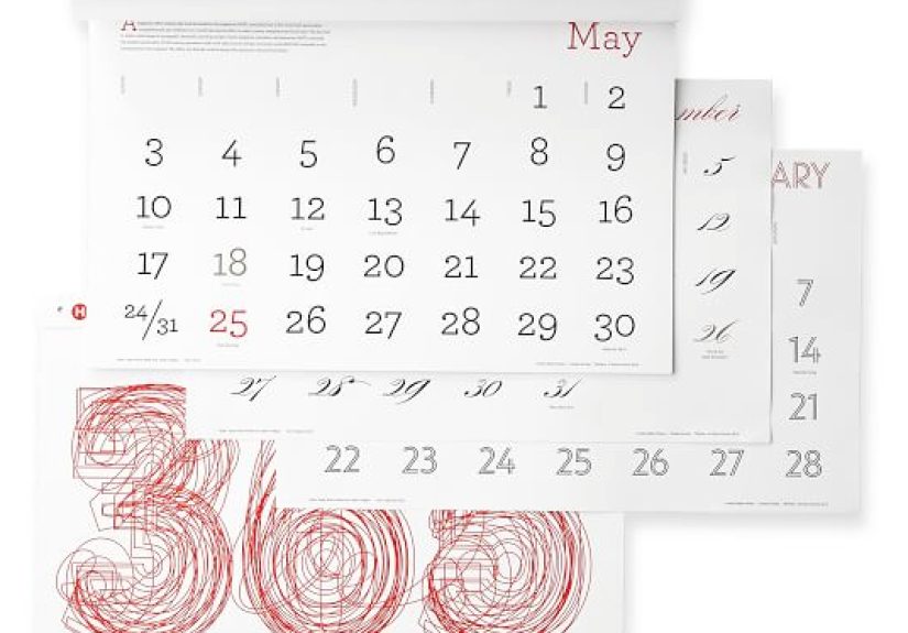
The 2015 edition is part of the celebrated annual calendar series created by Kit Hinrichs, the acclaimed designer behind Studio Hinrichs and a longtime force in American graphic design. The concept is refreshingly smart: each month highlights a different typeface, then layers in context that makes the calendar feel editorial rather than merely functional. Instead of leaving typography in the background, the design puts it front and center, where all good letterforms secretly believe they belong.
That approach is the calendar’s biggest strength. Every month becomes a mini feature on a chosen face, supported by information about the type and the designer behind it. The format transforms the calendar into something between a reference piece, a poster, and a beautifully restrained lesson in visual culture. It is useful, yes, but it is also quietly educational. You can plan your dentist appointment while learning that type design is not magic. It just looks like magic when done well.
The Studio Hinrichs 2015 Typography Calendar was also designed to work in more than one setting. It could sit on a desk for close viewing or hang on a wall for broader visual impact, which matters because typography this thoughtful should not be forced to live a cramped life. It is the kind of object that belongs in studios, home offices, libraries, architecture firms, and any workspace where people care about how ideas look on paper.
Why This Calendar Feels Different From Ordinary Calendars
It treats type as the hero, not the garnish
Many calendars use typography as a support system. Studio Hinrichs flips that logic. Here, the typeface is the attraction, and the dates politely make room. That choice instantly changes the tone of the piece. Instead of acting like a generic planning tool, the calendar behaves more like a curated monthly exhibition.
It mixes function with design education
A strong graphic design calendar should do more than tell you it is Tuesday. The 2015 edition gives each month a voice by pairing the featured typeface with background information and designer details. That added layer makes the calendar memorable. It rewards repeat viewing, and that is a big deal. Most calendars become invisible after a week. This one keeps earning your attention.
It understands scale
One reason the 365 Typography Calendar series built such a loyal following is simple: the format lets type breathe. The calendar was offered in a smaller desk-friendly size and a larger poster-like version, which gave it a flexibility many design objects lack. Whether displayed up close or across a room, the design could still feel intentional rather than cramped.
It respects the intelligence of the viewer
The Studio Hinrichs 2015 Typography Calendar does not scream for attention with gimmicks. It assumes you are curious, visually literate, or at least willing to become both. That confidence is part of its charm. It does not try to entertain you with a joke on every square. It trusts the power of composition, hierarchy, spacing, and typographic personality to do the work.
Design Analysis: What Makes the 2015 Edition Special
Published descriptions of the 2015 edition emphasize a lively mix of classic typefaces, revival faces, and distinctive display designs. That combination matters because it reveals a curatorial point of view. This was not a calendar assembled around one visual mood or one historical period. It was built to show range.
And range is exactly what makes typography fascinating. A calendar that only celebrates one typographic flavor would feel narrow by February. By contrast, a mix of historical influence, revival energy, and contemporary display work creates a more complete picture of what typography can do. It reminds viewers that type is not a frozen museum piece. It evolves, reacts, borrows, reinvents, and occasionally shows off.
This curatorial balance also gives the calendar long-term value. Even after 2015 passed into history, the pages remained worth revisiting because the content was not tied only to appointments and deadlines. The object retained meaning as a design artifact. In other words, the dates expired, but the ideas did not.
That is one reason collectors and design lovers still search for older editions of the series. The Studio Hinrichs calendar is interesting not just because it marked a year, but because it captured a way of thinking about design. It shows how a familiar format can become more intelligent, more beautiful, and more useful simply by taking typography seriously.
Why Designers and Typophiles Still Love It
The easiest answer is that it does something digital tools rarely do: it slows you down in a good way. You do not swipe past a page like this. You look at it. You notice details. You register the proportions of letters, the rhythm of spacing, the personality of serifs or the confidence of a sans. The calendar creates a small daily pause for visual attention, and that pause feels luxurious now.
It also carries the appeal of a smart studio object. A laptop is necessary. A sticky note pad is practical. But a wall calendar for designers that teaches type history while making the room look sharper? That has character. It says the person who hung it up probably notices kerning mistakes in restaurant menus, but in an endearing way.
Another reason the 2015 edition still resonates is its place within a respected series. The 365 Typography Calendar has been admired in design media, recommended in modern calendar roundups, and recognized in award contexts connected to the broader line. That kind of sustained attention does not happen by accident. It happens when a design object finds the rare balance between usefulness, consistency, and creative freshness.
Is the 2015 Edition Still Relevant Today?
As a practical calendar for current scheduling, absolutely not. Unless you have discovered a wormhole, 2015 is not coming back. But as a typeface calendar, collectible print object, and piece of graphic design history, it remains surprisingly relevant.
In fact, age may improve its appeal. A dated calendar from a forgettable brand becomes clutter. A dated calendar from a respected design series becomes a snapshot of editorial taste, typographic curation, and print culture from a specific moment. The 2015 edition reflects what Studio Hinrichs chose to celebrate that year: a conversation between heritage and contemporary expression in type design.
That gives it value for students, art directors, design writers, and collectors. It can serve as inspiration for layout, a reference for typographic voice, or even a reminder that paper objects can still create emotional connection in an era dominated by screens. Put plainly, the Studio Hinrichs 2015 Typography Calendar may be old, but it is not obsolete.
Who Will Appreciate This Calendar Most?
This calendar is especially well suited to:
- Graphic designers who love seeing type given center stage.
- Typography students who want everyday exposure to different typographic personalities.
- Collectors of print ephemera and well-designed calendars.
- Architects, editors, and art lovers who want functional décor with brains.
- Gift shoppers looking for something smarter than another mug that says “Creative Genius.”
Even people outside the design world can enjoy it. You do not need a degree in typography to appreciate when something is thoughtfully made. The calendar works because it is generous to experts and approachable to curious newcomers. That is not easy to pull off. Many design objects either show off too hard or explain too little. This one lands in the sweet spot.
Final Thoughts on the Studio Hinrichs 2015 Typography Calendar
The Studio Hinrichs 2015 Typography Calendar succeeds because it understands something many products miss: utility does not have to be boring, and education does not have to feel like homework. By turning twelve months into a typographic showcase, it elevates the everyday calendar into something collectible, instructive, and visually satisfying.
Its lasting charm comes from that blend of intelligence and restraint. It celebrates type without becoming pretentious, stays useful without becoming plain, and looks refined without losing warmth. For anyone interested in the history, craft, and personality of letterforms, this calendar remains a small but memorable triumph of editorial thinking and print design.
And maybe that is the best compliment possible: even years after its dates stopped being useful, people still want to talk about it. That is not just good calendar design. That is good design, period.
Experience: Living With the Studio Hinrichs 2015 Typography Calendar
The experience of living with the Studio Hinrichs 2015 Typography Calendar is very different from living with an ordinary planner. A normal calendar fades into the wall after a few days. This one keeps pulling your eye back. You glance at it to check the date, then stay an extra beat because the letterforms have presence. They are not filler. They are mood, voice, posture, and attitude all at once. One month may feel elegant and composed, another sharp and modern, another warm and historical. The experience becomes less about counting days and more about noticing how design changes atmosphere.
That is part of the fun. You are not just flipping to a new month; you are entering a new typographic personality. The page turn feels ceremonial, almost like changing the print in a frame. In a home office or studio, that shift subtly refreshes the room. Suddenly the wall looks different. The desk feels newly curated. Even if the rest of your workspace is full of cables, coffee mugs, and papers doing their best impression of modern sculpture, the calendar introduces order with style.
There is also a tactile, analog pleasure in the format. You can stand close to it, study the way the page is organized, and appreciate that typography works best when it has space to breathe. On screen, people often experience fonts as quick choices in a dropdown menu. On paper, especially at this scale, type becomes physical. You notice weight, tension, proportion, and rhythm in a more human way. That makes the calendar feel intimate, even when it is hanging across the room.
Another experience tied to this calendar is conversation. Visitors who might ignore a generic planner often stop at a Studio Hinrichs calendar and ask about it. Designers want to know which face is featured. Non-designers ask why it looks so unusually polished. Suddenly you are talking about typefaces, designers, and why certain letterforms feel trustworthy while others feel playful or dramatic. Few calendars earn that kind of attention. This one does because it has an opinion.
There is also a quiet educational effect that builds over time. A single glance does not teach much, but repeated exposure does. Over a year, and even long after the year itself has passed, the calendar trains your eye. You become more aware of type choices in books, packaging, signs, and magazines. You start noticing where a font feels formal, where one feels nostalgic, where another feels engineered or theatrical. The calendar does not lecture. It simply keeps good typography in your field of vision until your eye becomes sharper almost by accident.
Emotionally, the experience is oddly reassuring. In a fast digital world, a paper object devoted to letterforms feels grounded. It suggests patience, care, and craft. It reminds you that design is not only about speed or convenience. It is also about attention. The Studio Hinrichs 2015 Typography Calendar captures that feeling beautifully. Even now, as an older edition, it can still function as a monthly gallery, a collectible design object, or a quiet source of daily inspiration. Not bad for a thing whose main job was originally to tell you when it was Wednesday.