Table of Contents >> Show >> Hide
- Start With the Room, Not the Paint Chip
- Understand Lighting Before You Commit
- Learn the Secret Language of Undertones
- Pick the Mood Before You Pick the Shade
- Use the 60-30-10 Mindset for Balance
- Choose a Color That Works With the Size and Shape of the Space
- Test Paint Samples Like a Professional
- Do Not Forget Paint Sheen
- Create Whole-Home Flow Without Making Every Room Identical
- Common Paint Color Mistakes to Avoid
- Quick Designer Formula for Choosing the Right Paint Color
- Real-Life Experiences and Lessons From Picking Paint Colors
- Conclusion
- SEO Tags
Note: Original, web-ready article in standard American English. Unnecessary citation artifacts removed for publication.
Choosing paint color sounds easy until you’re standing in front of 4,000 tiny paper squares wondering why “soft white” has suddenly become an emotional event. One chip looks creamy, another looks gray, and a third somehow looks both minty and pink depending on whether you’ve had coffee. Welcome to paint selection: part science, part style, part mild personal crisis.
The good news is that interior designers do not possess magical wall-reading powers. They simply follow a smart process. Instead of chasing whatever shade is trending this week, they study the room, the light, the fixed finishes, and the feeling they want the space to create. That’s how they avoid costly mistakes and end up with rooms that feel intentional instead of “accidentally lavender at sunset.”
If you want to know how to pick paint color like a pro, this guide will walk you through it step by step. We’ll cover lighting, undertones, room mood, paint sheen, sampling tricks, and the most common mistakes homeowners make. By the end, you’ll be far less likely to choose a color that looked heavenly on a sample card and suspiciously like wet concrete on your living room wall.
Start With the Room, Not the Paint Chip
One of the most helpful interior designer tips is also one of the least glamorous: do not start with the wall color. Start with the room itself. Paint is usually the most flexible design element, which means it should respond to the things that are not changing.
Look at your flooring, countertops, tile, fireplace stone, cabinets, trim, upholstery, rugs, and large furniture pieces. Those fixed finishes already have color information built into them. If your wood floors lean honey-gold, your wall color needs to cooperate with that warmth. If your kitchen backsplash has cool gray veining, a creamy yellow-beige may feel awkward next to it.
This is where many paint projects go off the rails. People fall in love with a paint chip in isolation, bring it home, and only then discover that their “perfect greige” fights with their espresso floors like two reality-show contestants trapped in the same villa.
Designer move:
Pull inspiration from what already exists. If your sofa, stone, or rug is staying, let that item help lead the palette. Paint should connect the room, not start an argument with it.
Understand Lighting Before You Commit
If paint color had a favorite trick, it would be changing its personality throughout the day. Morning light, afternoon light, cloudy weather, lamp light, and overhead LEDs can all alter how a color reads. That is why interior designers obsess over lighting. They are not being dramatic. The walls are.
Natural light direction matters. North-facing rooms usually feel cooler and can make paint appear a little grayer, bluer, or flatter. South-facing rooms get warmer, brighter light and can handle cooler tones without feeling icy. East-facing rooms are often warm and golden in the morning, then softer later in the day. West-facing rooms can feel neutral in the morning and much warmer in the afternoon and evening.
Artificial lighting matters just as much. Warm bulbs can make whites feel creamier and bring out yellow or peach undertones. Cooler bulbs can emphasize blue or gray undertones. So if your house uses warm ambient lighting and you choose a white that already leans creamy, you may end up with a shade that feels butterier than you planned.
What to do:
- Observe the room in the morning, midday, late afternoon, and evening.
- Look at the paint candidate with both natural and artificial light on.
- Test near windows, dark corners, and next to trim or cabinets.
A color is not just a color. It is a color in a specific room, at a specific time, under a specific lamp, beside a specific floor. That is the whole game.
Learn the Secret Language of Undertones
If you have ever painted a room gray and watched it turn purple by dinner, undertones are the culprit. Undertones are the subtle colors hiding beneath the main color. They are why one white looks crisp, another looks creamy, and another suddenly seems a little green once it is next to your cabinets.
This is especially important with neutrals. Beige, greige, taupe, white, off-white, and gray are not “safe” because they are neutral. In fact, they can be the trickiest because their undertones become more noticeable once they are placed next to real materials and real light.
Common undertone families:
- Warm undertones: yellow, red, peach, beige, or pink
- Cool undertones: blue, green, violet, or gray
The easiest way to spot undertones is comparison. Hold your paint sample next to a true white sheet of paper, your trim color, and other similar paint chips. Suddenly the “plain white” reveals its secret life.
Interior designers also know that contrast helps. A warm white can look beautifully soft next to natural wood. The same white can look dingy beside a bright, cool countertop. Context changes everything.
Pick the Mood Before You Pick the Shade
Before you choose a specific paint color, decide what the room should feel like. Not what it should look like on social media. What it should feel like when you are actually living in it.
Do you want a bedroom that feels calm, cozy, and sleepy? A kitchen that feels bright and social? A dining room that feels moody and intimate? A home office that feels clear and focused? Designers start with emotion because color is not just decorative. It changes the atmosphere.
General mood guidelines:
- Soft warm neutrals: cozy, welcoming, relaxed
- Cool blues and greens: calm, fresh, peaceful
- Deep colors: dramatic, cocooning, sophisticated
- Lighter tones: airy, open, bright
- Earthy mid-tones: grounded, timeless, comfortable
This does not mean every bedroom must be pale blue and every office must be serious gray. It simply means the emotional goal should guide the color decision. Trendy paint colors come and go. A room that feels right tends to last much longer.
Use the 60-30-10 Mindset for Balance
Interior designers often think in proportions, not isolated colors. A helpful guideline is the classic 60-30-10 approach. Roughly speaking, 60 percent of the room is the dominant color, 30 percent is the secondary color, and 10 percent is the accent.
In many rooms, the wall color becomes the dominant 60 percent. Upholstery, drapery, or large furniture may take the 30 percent role. Accessories, artwork, lamps, or pillows become the 10 percent accent. This mindset keeps you from expecting the wall color to do every job at once.
If you adore bold color but worry about commitment, let paint be the backdrop and use stronger colors in easier-to-swap pieces. Or reverse it: use a richer wall color and keep furniture more neutral. The point is balance, not color chaos.
Choose a Color That Works With the Size and Shape of the Space
Paint cannot physically move a wall, but it can definitely mess with your perception of one. Lighter paint colors often make rooms feel larger and brighter because they reflect more light. Darker shades can make a room feel cozier, moodier, and more wrapped in color.
That said, small rooms do not automatically require white paint. Sometimes a compact room looks better in a rich, enveloping color because the boldness feels intentional rather than apologetic. A tiny powder room can absolutely pull off dramatic green, inky blue, or warm terracotta if the overall design supports it.
Think about these effects:
- Light colors usually make a room feel more open.
- Dark colors can blur edges and create intimacy.
- Painting trim, walls, and ceiling similar tones can make a room feel more seamless.
- High contrast trim highlights architecture and makes lines feel crisper.
So yes, pale paint can brighten a dark room. But sometimes the smarter choice is to lean into the room’s natural personality instead of fighting it.
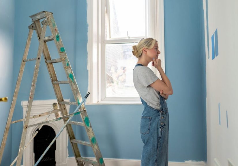
Test Paint Samples Like a Professional
This is the step designers never skip. Ever. Because tiny paint chips lie. They do not mean to. They are just wildly optimistic.
Instead of judging color from a one-inch square, test large samples in your actual space. Paint poster boards, removable sample boards, or sizeable areas of wall. Then move them around the room and look at them for a couple of days. Morning. Evening. Sunny day. Rainy day. Lamp on. Lamp off. Pajamas. Full confidence. Mild regret. All the conditions.
Best sample-testing habits:
- Test at least 2 to 4 similar shades, not just one.
- View samples vertically, because walls are vertical.
- Look at them next to flooring, trim, counters, and furniture.
- Wait for paint to dry fully before judging.
- Do not trust the store lighting alone.
Designers often choose a few options in the same family because paint selection is usually about nuance, not giant leaps. The winner may be the one that is just slightly softer, slightly muddier, or slightly warmer than your original pick.
Do Not Forget Paint Sheen
Color gets most of the attention, but sheen matters more than people think. Sheen affects how much light bounces off the wall, how imperfections show up, and how scrubbable the finish will be.
Flat or matte finishes tend to absorb more light and hide surface flaws better, which makes them popular for many walls and ceilings. Eggshell and satin offer a bit more durability and a subtle glow. Semi-gloss and gloss are usually used for trim, doors, and cabinets because they are easier to clean and create contrast.
Here is the catch: the glossier the finish, the more every bump, patch, and roller mark may become visible. So if your wall texture is less “smooth gallery finish” and more “historic mystery,” an ultra-shiny sheen may not be your best friend.
Create Whole-Home Flow Without Making Every Room Identical
A home feels polished when the paint colors relate to one another, even if each room is different. That does not mean every room needs the exact same wall color. It means the palette should feel like family, not strangers waiting for an elevator.
Designers often repeat undertones throughout a home. For example, they may use a warm white in one room, a warm greige in the next, and a muted clay color elsewhere. Different shades, same general temperature. That shared undertone creates visual flow.
If you prefer variety, try choosing a simple thread that links the rooms together:
- a consistent trim color
- similar undertones
- repeated natural materials
- a restrained neutral base with bolder accents by room
This approach gives you personality without making the house feel like it was painted by committee.
Common Paint Color Mistakes to Avoid
- Picking the brightest sample on the strip: Once spread across four walls, it may feel much stronger than expected.
- Ignoring undertones: This is how “perfect neutral” becomes “why is my hallway pink?”
- Matching trends instead of the room: Trend-driven choices often age faster than thoughtful ones.
- Testing only once: Paint changes with light and time of day.
- Forgetting adjacent spaces: Open layouts make color transitions more noticeable.
- Choosing in-store only: Store lighting is not your living room.
- Skipping sheen decisions: The same color looks different in matte versus satin.
Quick Designer Formula for Choosing the Right Paint Color
- Study the room’s fixed finishes first.
- Decide the mood and function of the space.
- Identify whether the room needs warm or cool balance.
- Narrow to 3 or 4 shades in the same family.
- Test large samples in real lighting.
- Compare them against trim, floors, and furniture.
- Choose the color that feels easiest in the room, not the one shouting for attention.
That last point matters. Great paint colors often feel surprisingly natural once they are right. They support the room rather than performing in it.
Real-Life Experiences and Lessons From Picking Paint Colors
I have seen more than one “simple repaint” turn into a surprisingly educational experience. One homeowner started with a mission to modernize a living room and confidently chose a cool gray from a tiny sample card. In the store, it looked polished and sophisticated. On the wall, next to warm oak floors and a tan stone fireplace, it looked cold and slightly purple by evening. The lesson was immediate: the room had warm fixed finishes, and the paint needed to respect them. After testing a softer greige with warmer undertones, the whole space relaxed. The fireplace looked intentional, the floors looked richer, and the furniture suddenly made sense again.
Another memorable example came from a small bedroom with very little natural light. The first instinct was to paint it bright white to make it feel bigger. Reasonable idea. Common idea. Not always the best idea. Once painted, the room felt flat and sterile, almost chalky, especially under warm bedside lamps. The second round used a muted, warm off-white with a touch of depth. Same general family, totally different outcome. Instead of looking dim and tired, the room felt soft and cocooning. It did not become larger, exactly, but it became much more inviting, which mattered more.
Kitchens are where people really learn to respect undertones. A homeowner once chose a white that looked crisp on the sample and elegant online, but their cabinets had a creamy ivory finish and the countertops had gold-beige flecks. The new wall color made the cabinets look yellowed, which was deeply unfair to the cabinets. After testing several whites side by side, the fix was obvious: the right choice was not the coolest white, but the one that echoed the warmth already in the room. Suddenly everything looked coordinated instead of accidentally assembled.
There is also the classic “painted too dark” story, which is more complicated than people think. Sometimes the problem is not that the color was dark. The problem is that it was the wrong dark. In one dining room, a homeowner wanted mood and drama but picked a muddy shade that swallowed the trim and made the room feel tired. A richer, cleaner deep green with a better sheen transformed it. Same drama, better energy. That experience taught a great lesson: saturated colors need confidence, and they need the right supporting cast.
One of the smartest experiences I’ve seen involved a cautious homeowner who tested huge sample boards in every room before making a final choice. At first it seemed excessive. Then the afternoon sun hit one wall, the hallway stayed shadowy, and the family realized their favorite sample only worked in half the house. Because they tested thoroughly, they avoided repainting later. That is exactly how designers think. They do not assume. They observe.
In the end, the most successful paint color stories rarely come from lucky guesses. They come from patience, comparison, and a willingness to admit that the “perfect color” on a screen may not be the perfect color on your wall. Paint selection gets easier when you stop hunting for a magical universal shade and start choosing a color that belongs to your home, your light, and your daily life.
Conclusion
If you want to pick paint color like an interior designer, the trick is not secret genius. It is process. Start with the room’s fixed finishes, study the light, understand undertones, think about mood, and test generously before committing. The right paint color does not just look pretty on a fan deck. It works with your floors, flatters your lighting, supports your furniture, and makes the room feel the way you want to live in it.
So the next time you’re tempted to choose a color because it looked amazing on your phone at 11:48 p.m., take a breath, grab some samples, and let the room vote. Your walls will thank you. Your trim will stop panicking. And you may finally enjoy picking paint without needing a recovery snack afterward.