Table of Contents >> Show >> Hide
- What Does It Mean to Link Within a Page?
- Why In-Page HTML Links Still Matter
- How to Link Within a Page Using HTML: 8 Steps
- Step 1: Decide Where You Want Users to Land
- Step 2: Add a Unique ID to the Target Element
- Step 3: Create the Link With the Hash Symbol
- Step 4: Use Clear, Descriptive Anchor Text
- Step 5: Build a Mini Table of Contents for Long Pages
- Step 6: Add a “Back to Top” Link
- Step 7: Make It Friendly for Accessibility and User Experience
- Step 8: Test the Link on Desktop, Mobile, and Keyboard Navigation
- Common Mistakes When Creating Same-Page Links
- Example of a Complete In-Page Link Setup
- Advanced Tip: IDs Are More Durable Than Fancy Tricks
- Extra Experience: What Long-Term Use of In-Page Links Teaches You
- Conclusion
- SEO Tags
If you have ever built a long web page and thought, “Wow, this is beautiful, but also a scroll marathon,” then in-page links are your new best friend. These handy little links let users jump straight to a section on the same page instead of dragging their mouse wheel into early retirement. In HTML, this is done with anchor links, fragment identifiers, and the humble but powerful id attribute.
Whether you are making a table of contents, a FAQ page, product details, documentation, or a “Skip to main content” link for accessibility, learning how to link within a page using HTML is one of those small skills that pays off forever. It improves usability, helps readers find content faster, and gives your page a cleaner structure. In other words, it is tiny code with big main-character energy.
In this guide, you will learn how to link within a page using HTML in 8 simple steps, plus best practices, common mistakes, examples, and real-world lessons that make your internal page navigation work smoothly for both people and search engines.
What Does It Mean to Link Within a Page?
Linking within a page means creating a hyperlink that jumps to a specific section of the same document. Instead of sending users to a new URL, the link points to a fragment identifier, which is the part of a URL that appears after the # symbol.
For example, if you click a link like #contact, the browser looks for an element with id="contact" and scrolls to it. That is the entire magic trick. No confetti cannon required.
This technique is commonly used for:
- Table of contents links on long articles
- Jump links in FAQs and documentation
- Skip links for keyboard users
- One-page websites with sections like About, Services, and Contact
- Glossaries, indexes, and long product pages
Why In-Page HTML Links Still Matter
Some web techniques come and go like strange haircut trends. In-page links are not one of them. They remain useful because they solve a basic user problem: finding the right content quickly.
They also support a better page experience in a few important ways:
- Improved navigation: Readers can jump to the exact section they need.
- Better accessibility: Skip links help keyboard and assistive technology users bypass repetitive navigation.
- Clearer structure: A page with headings and anchor links is easier to scan.
- Stronger UX: Long-form content feels less overwhelming when users can hop around it.
- Helpful internal linking signals: Clear anchor text makes content easier for users and search engines to understand.
How to Link Within a Page Using HTML: 8 Steps
Step 1: Decide Where You Want Users to Land
Start by identifying the section you want the link to jump to. Usually this is a heading, a paragraph, a section, or a main content area. Think of it like choosing a destination before writing the directions.
Good landing spots include:
- An
<h2>or<h3>heading - A
<section>element - A
<main>region for skip links - A FAQ answer block
If your page already has clean headings, congratulations: past-you was looking out for future-you.
Step 2: Add a Unique ID to the Target Element
Next, give the destination element an id attribute. This ID is what your link will point to.
The most important rule here is simple: each ID should be unique on the page. If you reuse the same ID more than once, browsers may jump to the first matching element, which is not the kind of surprise users enjoy.
Tips for better IDs:
- Keep them short and descriptive
- Use lowercase letters when possible
- Separate words with hyphens, like
customer-reviews - Avoid spaces
Technically, HTML allows many forms of IDs, but readable, hyphenated names are easier to maintain and less likely to cause confusion in CSS, JavaScript, and content editing.
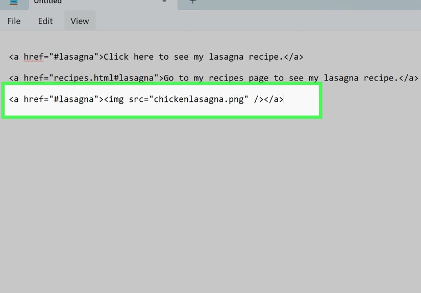
Step 3: Create the Link With the Hash Symbol
Now create a normal anchor element using the <a> tag. In the href value, add a hash symbol followed by the target ID.
That is the core syntax for linking within the same page. The browser reads #pricing, finds the element with id="pricing", and scrolls there.
This is the step where people often overcomplicate things. Resist the urge. It is not a heist movie. It is just a hash and an ID.
Step 4: Use Clear, Descriptive Anchor Text
The clickable text of your link matters. Instead of vague text like “Click here” or “Read more,” use words that describe the destination.
Better examples:
<a href="#faq">Jump to FAQ</a><a href="#contact">Go to Contact Information</a><a href="#setup-steps">See the Setup Steps</a>
Descriptive anchor text helps users know where they are going before they click. It also creates cleaner internal page navigation and supports better SEO signals because the link text communicates meaning.
Step 5: Build a Mini Table of Contents for Long Pages
If your page is long, do not make visitors scroll blindly like they are searching for buried treasure with no map. Add a table of contents near the top.
This works especially well for tutorials, policy pages, help centers, academic pages, and long-form blog posts. It improves scannability and makes the page feel far less intimidating.
Step 6: Add a “Back to Top” Link
Once users jump down a long page, give them an easy way back to the top. First, create a top target:
Or place the ID on a top-level heading or wrapper element:
Then add your return link lower on the page:
This is simple, helpful, and deeply appreciated on long mobile pages where scrolling back up feels like climbing a digital mountain.
Step 7: Make It Friendly for Accessibility and User Experience
In-page links are not just about convenience. They are also a big deal for accessibility. One classic example is the skip link, which lets keyboard users bypass repeated navigation and jump directly to the main content.
If you visually hide a skip link, make sure it becomes visible when focused. Otherwise, keyboard users may technically reach it but never actually see it. That is less “accessible design” and more “invisible trap door.”
You can also improve the user experience by highlighting the section that was jumped to. A little CSS with :target makes the destination easier to notice:
This is especially useful when sticky headers or long layouts make it unclear where the browser landed.
Step 8: Test the Link on Desktop, Mobile, and Keyboard Navigation
Finally, test everything. Click each in-page link. Tab through the page using your keyboard. Check the behavior on mobile. Confirm that the browser lands on the correct section and that the destination is easy to identify.
Watch for these common issues:
- The ID is misspelled
- The
hrefvalue does not match the target ID exactly - Duplicate IDs exist on the page
- A sticky header covers the target heading
- The link text is too vague
- The jump feels confusing because there is no visible context
Testing takes two minutes and prevents that awkward “Why does this link go nowhere?” moment later.
Common Mistakes When Creating Same-Page Links
Even though the code is small, a few tiny mistakes can break in-page navigation. Here are the biggest offenders:
- Using spaces in IDs: Avoid them. Hyphens are cleaner and safer.
- Forgetting the hash symbol:
href="contact"is not the same ashref="#contact". - Duplicating IDs: Every target should have its own unique identifier.
- Using non-descriptive link text: “Click here” tells users almost nothing.
- Ignoring fixed headers: A sticky nav bar can cover the heading you jump to.
- Skipping testing: The fastest way to look silly is to publish broken jump links with confidence.
Example of a Complete In-Page Link Setup
This pattern is clean, readable, and easy to scale. You can use it on blog posts, documentation pages, tutorials, and landing pages without adding unnecessary complexity.
Advanced Tip: IDs Are More Durable Than Fancy Tricks
Modern browsers support deep-link features like text fragments, which can jump to highlighted text in some cases. That sounds flashy, and sometimes it is useful. But for pages you control, the classic id-based approach is more stable, easier to maintain, and better for long-term internal page navigation.
In plain English: if you own the page, use IDs. Save the fancy wizardry for special cases.
Extra Experience: What Long-Term Use of In-Page Links Teaches You
Once you start using anchor links regularly, you notice something funny: the code is easy, but the page structure is the real challenge. In-page links expose messy content fast. If your headings are vague, repetitive, or out of order, your jump links will feel awkward too. A link that says “Section 3” is technically functional, but it is about as helpful as labeling every drawer in your kitchen “stuff.”
On long articles, the biggest win usually comes from building a simple table of contents at the top. Readers love knowing what is ahead and being able to jump around without friction. It lowers the intimidation factor of long-form content. A 2,000-word page can look overwhelming at first glance, but a tidy set of internal links quietly says, “Relax, you do not have to read this like a hostage note from start to finish.”
Another lesson is that IDs should be treated like tiny promises. Once a page is published and shared, those fragment links may get copied into emails, documentation, search results, and bookmarks. If you later rename or remove those IDs carelessly, you break those promises. That is why stable IDs matter. They are not just for the current layout; they become part of how people access your content over time.
Accessibility also stops being a theory and becomes very practical. A skip link can look like a tiny detail, but for keyboard users it can be the difference between a smooth visit and a frustrating obstacle course. The same goes for visible focus states and clear destination cues. If the page jumps and users cannot tell where they landed, the feature technically works but still feels broken. Good UX is not only about movement; it is about orientation.
Sticky headers are another classic gotcha. They look great in polished designs, but they have a bad habit of sitting right on top of the section users just jumped to. Then everyone wonders why the heading vanished. The fix is usually simple, such as adding scroll offset spacing with CSS, but it is one of those details you learn after testing a few pages and muttering at your screen.
And finally, internal page links tend to improve writing. Really. When you know a page needs a logical list of destinations, you naturally write better headings, cleaner sections, and more useful labels. So while anchor links look like a tiny HTML technique, they often push the whole page toward better structure, clearer SEO signals, and a friendlier reading experience. Not bad for one little hash symbol.
Conclusion
Learning how to link within a page using HTML is one of the simplest ways to improve navigation, accessibility, and user experience. With just an id on the target element and an <a> tag pointing to that ID, you can create jump links, table of contents navigation, skip links, and back-to-top buttons that make long pages far easier to use.
The secret is not just making the link work. It is making the destination clear, the anchor text descriptive, the structure logical, and the experience smooth across devices. Do that well, and your page becomes easier to scan, easier to understand, and a lot less likely to make readers rage-scroll.
At the end of the day, in-page links are not flashy. They are useful. And on the web, useful wins.