Table of Contents >> Show >> Hide
- Who Is the Turkish Artist Behind the Buzz?
- Why Geometric Line and Dot Tattoos Feel So Modern
- Why “Less Is More” Actually Works on Skin
- Popular Design Motifs in This Style
- What Makes This Style Harder Than It Looks
- How to Borrow This Look Without Copying the Artist
- Why This Style Resonates Beyond Tattoo Trends
- Experiences People Commonly Have With Geometric Line and Dot Tattoos
- Conclusion
Some tattoos enter the room like a rock band. Others walk in quietly, straighten a picture frame, and somehow become the most interesting thing there. That second category is where geometric line and dot tattoos live. They do not scream for attention. They do not arrive covered in every flourish known to humankind. They simply exist with confidence, precision, and the kind of visual balance that makes you stare a little longer than you planned.
That is exactly why the viral fascination with geometric line and dot tattoos by Turkish artist Bicem Sinik has lasted. Her work shows that minimalist tattooing is not the same thing as boring tattooing. In fact, it is often the opposite. When an artist strips away heavy shading, loud color, and visual clutter, every line has to earn its place. Every dot has a job. Every curve either sings or it flops. There is nowhere for sloppy design to hide. Skin is not a notebook margin, and minimalism on the body is not lazy. It is high-wire art with a tattoo machine.
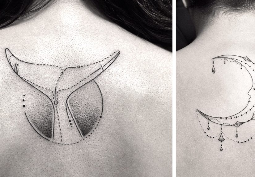
What makes this style so appealing is its mix of restraint and imagination. These tattoos often use delicate black lines, tiny clusters of stippled dots, geometric framing, and just enough negative space to let the skin breathe. The result can look airy, architectural, and surprisingly emotional all at once. A wolf can feel softer. A moon can feel smarter. A simple abstract figure can somehow look like it has its taxes filed and its life together.
Who Is the Turkish Artist Behind the Buzz?
When people talk about geometric line and dot tattoos by a Turkish artist proving that less is more, they are usually referring to Bicem Sinik. Her name has circulated in art and tattoo roundups because her work takes familiar tattoo ideas, especially animals, symbols, and nature-inspired forms, and rebuilds them with a cleaner visual language. Instead of packing the skin with ink, she uses fine monochromatic lines, subtle dot shading, and carefully structured compositions.
That approach matters because it turns the tattoo into something closer to visual poetry than visual shouting. A deer is no longer just a deer. It becomes a study in balance. A bird is not merely outlined. It appears suspended inside a system of lines, circles, and tiny marks that make it feel both organic and designed. The style sits somewhere between illustration, geometry, and modern minimalism, which is a very fancy way of saying it looks cool without trying too hard.
Why Geometric Line and Dot Tattoos Feel So Modern
Precision Beats Excess
Modern tattoo culture has made room for every possible aesthetic, from bold traditional pieces to hyperrealistic portraits. Geometric line and dot tattoos stand out because they refuse visual excess. They rely on precision instead of volume. There is no heavy color fill to carry the design. No dense blackwork to force the eye into submission. The beauty comes from clean execution, proportion, spacing, and rhythm.
That is also why this style photographs so well online. It feels crisp, intentional, and graphic. On social media, where attention spans are shorter than some people’s commitment to bangs, tattoos with a strong visual identity do especially well. Fine lines, symmetry, and dotwork create immediate contrast without looking chaotic, which makes these pieces feel contemporary and highly shareable.
Dotwork Adds Depth Without Weight
Dots are the secret sauce. Or, if we are staying on theme, the secret spice blend. Dotwork can create shadow, texture, softness, and movement without turning the piece into a dark block of ink. In the hands of a skilled artist, a scatter of dots can suggest light, fur, atmosphere, or dimension. That matters in minimalist tattooing because it allows the design to feel alive while still remaining airy.
In geometric compositions, dotwork also helps soften the rigidity of straight lines and perfect circles. Without it, a tattoo can look too technical, almost cold. With it, the design becomes more human. The geometry gives the structure. The dots give the breath.
Why “Less Is More” Actually Works on Skin
Minimalism can be misunderstood as doing less work. In good design, it usually means doing less nonsense. On skin, that distinction is huge. A tattoo has to move with the body, age over time, and still make visual sense years later. Overly busy designs can lose clarity. Tiny details can blur together. Elements that looked dramatic in a close-up photo may become muddy from across the room.
That is why geometric line and dot tattoos often feel smarter than trendier designs that throw everything into one piece. They are built around control. They make room for negative space, which is not empty space. Negative space is what gives the eye a place to rest. It helps shapes stay readable. It creates contrast. It lets the tattoo feel elegant instead of crowded.
There is also something emotionally modern about a restrained tattoo. People are often drawn to symbols that feel private, subtle, and personal rather than loud and literal. A geometric fox, a constellation framed by fine lines, or a minimalist eye with stippled details can carry meaning without turning the body into a billboard.
Popular Design Motifs in This Style
One reason this aesthetic has endured is that it works across many subjects. Some of the most striking examples use animals, especially wolves, foxes, birds, deer, and insects. The living form brings warmth, while the geometry adds order. Nature and math become roommates, and surprisingly, they get along.
Celestial imagery is another favorite. Moons, stars, planetary alignments, eclipses, and radiating dots all fit naturally into a line-and-dot vocabulary. These tattoos can feel spiritual without being overly ornate. Botanical themes also work beautifully, particularly stems, leaves, branches, and flowers rendered in fine contour lines with light stippling.
Abstract human figures, eyes, sacred-looking symbols, architectural frames, and compass-inspired layouts also thrive in this format. The common thread is balance. The best designs are not minimal because they are empty. They are minimal because they are edited well.
What Makes This Style Harder Than It Looks
Fine-Line Tattooing Demands Skill
Here is the part where reality enters wearing sensible shoes. Fine-line geometric tattooing is gorgeous, but it is not forgiving. When a design is built from delicate lines and tiny dots, technical mistakes become obvious fast. A shaky line cannot hide behind heavy shading. Uneven spacing cannot be distracted away by color. If an artist lacks control, the tattoo will tell on them immediately.
That is why choosing the right tattoo artist matters more than chasing the right tattoo trend. A strong portfolio should show healed work, not just fresh tattoos under flattering studio lighting. The lines should look deliberate. The symmetry should make sense on the body. The designs should still read clearly even when they are small and delicate.
Aging Is Part of the Conversation
Minimal tattoos can age beautifully, but they need realistic expectations. Fine lines are often more vulnerable to softening over time, especially if the design is too tiny, the placement takes constant friction, or the artist goes too light. Fingers, hands, and high-wear areas can be especially tricky. Sun exposure also loves to ruin a good thing, because apparently sunlight has chosen chaos.
That does not mean you should avoid this style. It means you should design responsibly. Slightly larger scale, smart spacing, and thoughtful placement can make a huge difference. So can following aftercare instructions like your tattoo paid your rent. Clean it properly, keep it moisturized, avoid soaking it too early, and protect it from the sun once healed. Minimalism is beautiful, but it is not magic.
How to Borrow This Look Without Copying the Artist
If you love Bicem Sinik’s aesthetic, the move is not to copy one of her tattoos line for line. The better move is to understand what makes the style compelling and then translate that into something personal. Start with a subject you genuinely care about. Maybe it is a bird that reminds you of home, a moon phase that marks a turning point, or a fox because you enjoy looking mysterious in photos.
Then think about structure. Could the design be framed with a circle or a vertical axis? Could dots create atmosphere instead of heavy shading? Could negative space do some of the storytelling? Could the tattoo curve with the body instead of sitting on it like a sticker? These are the questions that turn “I want something minimalist” into “I want something memorable.”
A great artist can help refine scale, line weight, placement, and flow. In this style, even small adjustments matter. A circle shifted slightly can improve balance. A cluster of dots can add softness. An extra centimeter of spacing can keep a design readable for years.
Why This Style Resonates Beyond Tattoo Trends
Geometric line and dot tattoos endure because they tap into something bigger than trend cycles. They connect art, symbolism, and body placement in a way that feels thoughtful. They appeal to people who want their tattoo to look designed, not just decorated. They also fit the way many people think about beauty now: clean lines, intentional choices, fewer but better details.
There is also a quiet confidence in a tattoo that does not beg for validation. Minimal geometric work invites a double take. It rewards closeness. It often feels more like a personal object than a performance. In a very loud visual culture, that kind of restraint can feel refreshing.
And that may be the real reason this Turkish artist’s work keeps catching people’s attention. It reminds us that restraint is not the enemy of expression. Sometimes the strongest statement is the one that trusts the viewer to come closer.
Experiences People Commonly Have With Geometric Line and Dot Tattoos
For many people, getting a geometric line and dot tattoo feels different from getting a louder, more conventional piece. The experience often starts with a long period of looking, saving, zooming in, and wondering whether a tiny line can really carry a big idea. Then comes the consultation, where the artist starts talking about spacing, needle choice, body flow, healing, and placement. That is usually the moment when clients realize minimalist tattoos are not casual little doodles. They are highly edited designs that demand serious attention.
During the tattoo session itself, people often describe the process as surprisingly intense in a mental way, even when the piece is small. Because the design is delicate, there is a lot of focus on precision. A single line may take longer than expected. The artist wipes, checks, adjusts, and keeps chasing symmetry. Clients sometimes walk in expecting a fast appointment and walk out with deep respect for how much patience it takes to make something simple look effortless.
Once healed, the tattoo experience becomes even more interesting. Owners of minimalist geometric tattoos often talk about how often strangers lean in for a second look. These pieces do not always announce themselves from across a crowded room, but up close they create conversation. People ask what the design means, why the lines are so fine, or how the dots create that soft shadow. The tattoo becomes less of a spectacle and more of an invitation.
Another common experience is emotional surprise. Because these tattoos are usually quiet in scale and black in palette, people sometimes assume they will feel less significant than larger work. But that is often not what happens. Many wearers say a geometric tattoo ends up feeling more personal because it is subtle. It does not explain itself too quickly. It sits on the skin like a private symbol, something meaningful without being loud about it.
There is also a practical side to the experience. People quickly learn that minimalist does not mean maintenance-free. They become protective of the tattoo while it heals. They notice how clothing rubs against it. They think about sunlight differently. They may even become the sort of person who recommends sunscreen with the solemn energy of a public service announcement. For fine-line work, that care matters.
Over time, many collectors grow attached not just to the image but to the discipline behind it. A geometric line and dot tattoo can become a reminder of balance, restraint, clarity, or a personal turning point. It can mark grief, growth, identity, or a new beginning without spelling everything out. That is part of the charm. The tattoo says enough, then lets silence do the rest.
In the end, the experience of living with this style tends to mirror the style itself. It is quiet but memorable. Delicate but intentional. Minimal on the surface, yet full of meaning once you stay with it long enough. And honestly, that is a pretty good recipe for art.
Conclusion
Geometric line and dot tattoos by Turkish artist Bicem Sinik prove that minimalism is not about doing the bare minimum. It is about editing with confidence. Through fine lines, subtle dotwork, careful structure, and clean negative space, this style turns simple forms into powerful body art. The appeal is easy to understand: these tattoos feel modern, elegant, and deeply personal without overexplaining themselves.
They also offer an important lesson for anyone considering new ink. The best tattoos are not always the biggest, boldest, or busiest. Sometimes the most memorable designs are the ones that trust precision over excess. In tattooing, as in life, adding more is not always the same thing as making it better. Sometimes less really is more.