Table of Contents >> Show >> Hide
- Why Mae Engelgeer Became a Cult Favorite
- From Amsterdam Training to a Distinct Design Language
- The Power of Graphic Textiles
- From Throws and Tea Towels to Rugs and Contract Textiles
- What Makes Her Work Feel So Amsterdam?
- Why Her Work Still Feels Relevant
- Living With Edgy Graphics: A More Personal Experience
- Conclusion
Note: Body-only HTML for direct web publishing; source-link placeholders removed.
Some designers whisper. Mae Engelgeer does not. Her work walks into a room wearing geometric confidence, color-blocked nerve, and just enough texture to make your fingertips jealous. If you have ever looked at a rug, throw, wall covering, or textile panel and thought, Well, that escalated beautifully, you are already in her territory.
Engelgeer has built a reputation as one of Amsterdam’s most recognizable design voices by treating textiles less like polite background material and more like visual conversation starters. Her signature language is immediate: sharp graphic patterns, bold but balanced color, soft materials with hard-edged structure, and compositions that feel playful without drifting into chaos. That mix is exactly why she inspires cult-like loyalty among design fans. Her pieces do not just decorate a room. They tune it.
And that is what makes the phrase “edgy graphics” so interesting here. We are not talking about posters screaming from a club wall at 2 a.m. We are talking about woven surfaces, rugs, and domestic objects that deliver the same kind of energy. Engelgeer translates graphic design logic into tactile form. A line becomes rhythm. A block of color becomes mood. A pattern becomes architecture. Suddenly your blanket is not just a blanket anymore. It is a tiny act of rebellion folded over the back of a chair.
Why Mae Engelgeer Became a Cult Favorite
Design culture loves a giant gesture, but it adores a signature even more. Engelgeer’s work is memorable because it manages to be both disciplined and emotional. Her patterns are grounded in grids, stripes, repeating shapes, and formal contrast, yet the finished pieces never feel cold. They feel human. You can see the hand, the eye, and the instinct behind the geometry.
That instinct matters. Plenty of designers can arrange shapes on a surface. Far fewer can make those shapes feel alive. Engelgeer’s designs often land in that sweet spot between order and surprise. A composition may begin with a familiar modernist structure, then veer into richer texture, an unexpected lilac, a moody rust, a dusty blue, or a line that refuses to stay perfectly obedient. In less skilled hands, this could look fussy. In hers, it looks confident.
That confidence is one reason her work resonates with people who want their interiors to feel curated rather than copy-and-paste. Engelgeer’s textiles are graphic, yes, but they are also atmospheric. They make a room feel composed without making it feel stiff. Think less museum rope barrier, more chic friend’s apartment where even the tea towel has an opinion.
From Amsterdam Training to a Distinct Design Language
Part of Engelgeer’s strength comes from the way she was trained. Her background includes textile design studies in Amsterdam and postgraduate work in applied arts, and that combination shows up in the way she moves between craft, concept, and production. She understands material, but she also understands image. She can think like a maker and like an art director at the same time, which is a dangerous combination in the best possible sense.
Her process has often been described as intuitive rather than rigidly academic, and that feels right when you look at the work. There is structure everywhere, but it never feels trapped inside theory. She collects references from daily life, visual culture, fashion, and material fragments, then filters them through a highly personal sense of balance. Inspiration can come from wrapping paper, vintage scarves, museum visits, sponge-like textures, or the broader culture of Amsterdam itself. That range matters because it keeps the work from becoming too precious. It is modern, but it is also observant. It notices the world.
There is also a distinctly Dutch clarity running through her output. Not a cliché version of Dutchness with windmills and tulips politely waiting offstage, but a sharper modern design inheritance: clean lines, disciplined composition, openness, and a comfort with abstraction. You can trace echoes of Dutch modernism in the restraint, yet the work never feels like a tribute act. Engelgeer is not decorating the past. She is remixing it.
The Power of Graphic Textiles
Geometry That Does Not Sit Quietly
One of the defining qualities of Engelgeer’s work is her ability to use geometry as a mood-maker rather than a rulebook. Rectangles, stripes, dots, layered bands, and asymmetrical divisions appear frequently, but they do not behave like textbook exercises. They create tension, motion, and soft drama. A repeated mark can feel almost musical. A shifted block can make a textile seem like it is breathing.
This is where the “edgy” part becomes real. Her designs are rarely loud in a cheap way. They are edgy because they are exact. They know where to push and where to pause. She understands that a calm neutral field can make a burst of color feel electric. She knows that a woven surface with subtle dimensional changes can make even a minimal pattern feel rich. It is contrast, not clutter, that gives the work its punch.
Color That Knows What It Is Doing
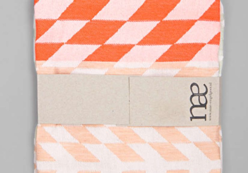
Color is another reason Engelgeer’s work stands out in a crowded design landscape. She uses palettes that feel intentional rather than trendy. You often see dusty pastels meeting darker anchors, earthy tones interrupted by saturated accents, or muted backgrounds sharpened by a single unexpected note. Her colors are modern without feeling sterile and lively without looking sugar-rushed.
That kind of color intelligence is harder than it looks. Bold palettes can easily turn childish or chaotic. Engelgeer avoids that trap by pairing adventurous combinations with compositional discipline. The result is work that feels stylish in a durable way. A rug or throw may feel fresh the first time you see it, but it also suggests it could still look right five years later, which is the design equivalent of aging well and not bragging about it.
Texture as a Graphic Tool
What makes Engelgeer especially compelling is that she does not treat texture as an afterthought. In her world, tactility is part of the graphic system. Different pile heights, metallic threads, wool blends, matte versus shine, soft versus crisp surfaces, all of these become compositional elements. You do not simply see the design. You register it physically.
This approach helps explain why her work adapts so well across categories. A graphic idea that might feel flat in print gains complexity when translated into upholstery, a hand-knotted rug, or a woven throw. Texture creates depth. Depth creates atmosphere. Atmosphere makes the object memorable.
From Throws and Tea Towels to Rugs and Contract Textiles
Engelgeer first caught many design-watchers’ attention through home textiles and soft accessories: blankets, shawls, tea towels, and cushions that made everyday utility look unexpectedly glamorous. These pieces helped establish her public identity because they were accessible expressions of her visual language. A tea towel became a miniature canvas for her geometry. A throw became a room’s instant focal point.
From there, the work expanded in smart directions. Her rugs pushed the language further, giving her more room to explore asymmetry, shifting edges, pile variation, and sculptural effects. Some designs leaned into a kind of modern primitive energy, with bold shapes and an almost architectural sense of mass. Others played with Memphis-inspired irreverence without becoming costume pieces from the 1980s. They felt graphic, but grounded.
Her collaborations with Wolf-Gordon were especially important because they showed how her visual sensibility could function in contract and commercial settings without losing personality. Collections such as Level and Matter translated traditional weaving references, linear elements, and Dutch modernist cues into upholstery textiles, drapery, and wall coverings suited for more demanding environments. That is not a small accomplishment. Commercial textiles often flatten individuality in the name of broad usability. Engelgeer proved that performance and character can, in fact, stop arguing and work together.
She has also moved across exhibitions, installations, flooring collaborations, ceramics presentations, and design-week showcases, which reinforces a key point: Engelgeer is not merely a maker of pretty patterns. She is building a broader design vocabulary that can live on objects, surfaces, spatial elements, and interior experiences. Once you understand that, her career makes perfect sense. She thinks in systems.
What Makes Her Work Feel So Amsterdam?
Amsterdam is one of those cities that knows how to keep contradiction looking elegant. It is historic but restless, orderly but experimental, deeply visual yet often understated. Engelgeer’s work carries some of that same energy. There is a straightforwardness to it, an openness, but there is also a refusal to settle for blandness.
Her designs feel urban in the best sense: alert, edited, layered, and visually literate. They absorb fashion, architecture, craft, and street-level observation without turning into an overworked collage. That may be why her pieces feel so at home in contemporary interiors. They understand modern life. They are not nostalgic escapes from it.
At the same time, her work never chases roughness for its own sake. “Edgy” here does not mean abrasive. It means sharp-minded. It means willing to create friction between softness and structure, elegance and experimentation, craft and graphic punch. That is a more durable kind of edge than trend-driven shock value.
Why Her Work Still Feels Relevant
In a period when many interiors slide toward one of two extremes, either sterile beige minimalism or hyperactive social-media maximalism, Engelgeer offers a more intelligent middle path. Her work proves that bold design does not have to be messy, and calm design does not have to be boring. That balance is one reason designers, editors, and collectors keep returning to it.
She also reminds us that textiles deserve more respect than they usually get. Fabrics and rugs are often treated like finishing touches, the last-minute outfit accessories of an interior. Engelgeer turns them into the main event. In her hands, a woven surface can organize a room’s whole emotional structure. That is powerful design, even if it happens to be soft enough to nap on.
Most of all, her work remains relevant because it is anchored in principles rather than gimmicks: composition, material intelligence, color control, and a strong personal point of view. Trends come and go. Good visual instincts hang around and make themselves useful.
Living With Edgy Graphics: A More Personal Experience
Now for the part design writing sometimes forgets: what it actually feels like to live around work like this. Not photograph it. Not pin it. Not whisper “interesting” at a trade fair while clutching a coffee you paid too much for. Live with it.
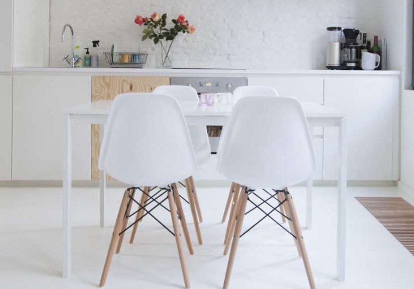
Imagine walking into an apartment on a gray Amsterdam morning. Outside, the sky is doing its favorite trick, which is looking like someone smudged the whole city with a soft pencil. Inside, though, there is an Engelgeer-style rug underfoot with blocks of clay, charcoal, pale lavender, and sand. The room wakes up differently because of it. The rug does not merely fill the floor. It sets the tone, like the first chord in a song.
The same thing happens with smaller pieces. A graphic tea towel hanging in a kitchen suddenly makes the kitchen feel designed, not just assembled. A throw folded on a sofa turns a neutral room from “nice” into “who lives here and how did they become cooler than me?” A cushion with a disciplined stripe or an offset shape can make an ordinary chair look like it has strong opinions about modern art.
That is the hidden pleasure of Engelgeer’s world: her work changes your relationship to routine. You notice surfaces more. You appreciate contrast more. You become a little more aware of how color changes your mood at different times of day. Morning light softens a pattern. Evening shadows pull depth out of texture. Even the practical use of an object feels upgraded, as if daily life has accidentally wandered into a better outfit.
There is also something reassuring about design that feels thoughtful without feeling fragile. Many visually striking interiors create low-grade anxiety. You are afraid to sit down, spill coffee, or breathe too enthusiastically. Engelgeer’s aesthetic, by contrast, tends to invite use. It feels refined, but it still belongs to real life. That balance matters. The best design should improve living, not bully it.
And perhaps that is the most lasting experience of all: her work makes you feel more visually awake. It trains the eye. After spending time with textiles and rugs this considered, you start spotting dead zones in generic interiors. You realize how many rooms rely on furniture alone and forget the emotional force of pattern and material. You begin to understand that softness can carry structure, and that decoration is not superficial when it is doing real spatial work.
So yes, “edgy graphics” may sound like a headline built for attention. But in Engelgeer’s case, it points to something real. Her work has edge because it sharpens space. It gives rhythm to quiet rooms, tension to polished ones, warmth to minimal ones, and identity to all of them. That is not a small gift. That is design doing what it is supposed to do: making the everyday look a little braver.
Conclusion
Mae Engelgeer’s appeal lies in the way she turns graphic instinct into tactile atmosphere. She borrows the decisiveness of modernist composition, softens it with material richness, and then injects enough color and asymmetry to keep the whole thing from behaving too politely. The result is a body of work that feels unmistakably contemporary, deeply livable, and just strange enough to stay interesting.
In other words, she makes textiles that do what the best design always does: they make you look twice, then live better.