Table of Contents >> Show >> Hide
- What Is Commune Abstrakt Tile 1?
- Why This Tile Feels So Different
- Why Cement Tile Changes the Whole Conversation
- Where Commune Abstrakt Tile 1 Works Best
- How to Style It Without Creating a Pattern Emergency
- What to Know Before You Buy
- Care and Maintenance Tips
- The Experience of Living With Commune Abstrakt Tile 1
- Final Thoughts
If most tile is happy to behave, Commune Abstrakt Tile 1 did not get that memo. This is not the kind of surface that quietly disappears behind your faucet, nods politely at your cabinetry, and keeps its opinions to itself. No, this is a bold, art-forward cement tile that arrives with color, geometry, and enough personality to make a plain backsplash feel underdressed.
That is exactly the appeal. In a design world crowded with safe neutrals, barely-there veining, and “timeless” finishes that sometimes look suspiciously like fear, Commune Abstrakt Tile 1 offers something more spirited. It feels collected, cultured, and slightly mischievous. It has the kind of visual energy that can wake up a powder room, give a kitchen a pulse, or turn a small entryway into a memorable first impression.
But a tile like this is not just about looks. The story behind it matters, the material matters, the installation matters, and the way it will age matters too. If you are considering Commune Abstrakt Tile 1 for your home, this guide breaks down what it is, why it stands out, where it works best, and what real-life ownership is likely to feel like once the dust settles and the grout haze is gone.
What Is Commune Abstrakt Tile 1?
Commune Abstrakt Tile 1 is a handmade cement tile created in collaboration with Los Angeles design firm Commune. It belongs to the Abstrakt collection, a series rooted in original artwork by Commune co-founder Steven Johanknecht. The tile is made in Vietnam and presented as part of a larger Commune collection that leans into graphic pattern, historical references, and decorative surfaces with serious visual confidence.
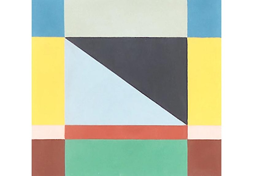
On paper, the specifications are straightforward: the tile is roughly 7 7/8 inches by 7 7/8 inches and about 5/8 inch thick. In practice, it reads less like a standard finish and more like a small piece of repeatable art. Its pattern combines angled and rectangular forms in a composition that feels painterly, rhythmic, and intentionally imperfect in spirit, even when the geometry is crisp.
That balance is the magic trick. Commune Abstrakt Tile 1 feels disciplined enough for architecture and expressive enough for art lovers. It can anchor a room, but it also rewards close looking. There is structure, but there is also movement. It is the rare surface that gives you both order and a little rebellion.
Why This Tile Feels So Different
It starts with art, not trend-chasing
Many patterned tiles are designed backward. First comes the need for a “statement,” then the pattern gets drafted to satisfy the mood board. Abstrakt Tile 1 feels more thoughtful because its roots are artistic. The collection draws from Johanknecht’s small-scale paintings created during the pandemic period, then translated into repeatable patterns that still retain a hand-touched quality.
The result is more emotionally interesting than a typical geometric tile. It does not look like it was generated to fill an e-commerce filter called “modern pattern.” It feels composed. It has memory in it. It has reference points. And in the right room, that gives the space depth beyond simple decoration.
It borrows from Scandinavian and Swedish design without feeling nostalgic
Commune Abstrakt Tile 1 also nods to traditional Scandinavian and Swedish pattern language, especially in its bright, graphic rhythm. But this is not a museum-piece interpretation. The tile feels current because the palette and arrangement push it away from quaintness and toward something more contemporary. It references history without getting stuck in it.
That makes it useful for people who want warmth and tradition without ending up in “charming cottage gift shop” territory. In other words, it has heritage, but it still knows how to use the internet.
Why Cement Tile Changes the Whole Conversation
Material is part of the charm
A big part of what makes Commune Abstrakt Tile 1 compelling is that it is cement tile, not printed porcelain pretending to have a personality. Cement tile has a matte, velvety appearance that gives color real depth. Instead of looking glossy or overly manufactured, it tends to feel grounded, tactile, and architectural.
That tactile quality matters. In patterned tile, surface finish can make or break the effect. A loud pattern on a shiny material can feel hectic fast. The softer, more natural look of cement helps bold graphics read as sophisticated instead of cartoonish. It gives the pattern room to breathe.
Handmade means variation is part of the deal
Commune Abstrakt Tile 1 is made through a labor-intensive process in which cement, stone powder, and pigment are hand-poured into molds, layered, pressed, and cured. That handmade method creates subtle tonal variation from batch to batch. Translation: your tile will not look like a digitally printed sticker with delusions of grandeur. It will have shifts, nuance, and a little unpredictability.
For design people, that is good news. Variation gives the installation life. For control freaks, it is a moment of personal growth. Either way, the irregularity is not a flaw to panic over; it is part of the reason handmade tile feels richer than mass-produced alternatives.
Patina is not damage, it is character
Cement tile also develops patina with use, especially in moderate- to high-traffic areas. If you want a finish that looks exactly the same forever, this may not be your soulmate. But if you appreciate materials that age with grace, cement tile can be deeply satisfying. It wears in rather than merely wearing out.
That patina is one reason designers continue to reach for cement in spaces that need warmth and texture. A surface that changes gently over time often feels more human than one that stays frozen in showroom mode.
Where Commune Abstrakt Tile 1 Works Best
This tile is versatile, but it is not shy. The smartest use of Commune Abstrakt Tile 1 is in places where you actually want a focal point.
Powder rooms
If there were a dating app for bold tile, powder rooms would be the perfect match. Small footprint, high impact, low risk. Use Commune Abstrakt Tile 1 on the floor or as a feature wall and suddenly the tiniest room in the house becomes the one guests remember.
Kitchen backsplashes
In a kitchen, this tile can do serious visual heavy lifting. It pairs especially well with simple millwork, warm wood, matte cabinetry, plaster walls, or unlacquered brass. If the cabinetry is already busy, proceed carefully. If the room is calm and streamlined, this tile can provide exactly the jolt it needs.
Entryways and mudrooms
A patterned cement tile in an entryway creates instant identity. Commune Abstrakt Tile 1 is especially strong here because it feels artistic without becoming precious. It can handle being seen, stepped on, and admired in quick succession.
Bars, fireplace surrounds, and accent moments
Not every tile needs to cover a whole floor to matter. A bar front, fireplace surround, or niche treatment can be enough to let the pattern shine. In fact, if you love the tile but fear full-room commitment, a smaller decorative application is a smart move.
How to Style It Without Creating a Pattern Emergency
Let the tile be the star
One of the best design lessons from patterned tile inspiration across leading American design publications is simple: when the tile is bold, give the eye a place to rest. White subway tile, plain walls, quiet cabinetry, or restrained fixtures can all help create balance. Commune Abstrakt Tile 1 does not need competition. It already brought enough charisma for the entire room.
Use grout strategically
Grout is not just filler. It changes how a patterned installation reads. A close color match can help the overall composition feel more continuous, while a high-contrast grout can outline every edge and intensify the graphic effect. If your goal is to celebrate the pattern itself, a quieter grout choice is usually the safer bet.
Repeat color somewhere else in the room
Abstract patterned tile feels most intentional when at least one of its tones appears elsewhere, whether in paint, textiles, hardware, or wood finish. You do not need a perfect match. You just want the room to feel in conversation with the tile rather than startled by it.
Mix modern with warm
Because Commune Abstrakt Tile 1 has both geometry and hand-crafted texture, it plays nicely with a mix of cleaner modern forms and warmer natural materials. Think slab-front oak vanity, creamy walls, linen shower curtain, matte black mirror, soft brass lighting. The tile gets to be vivid, while the rest of the room acts like a good supporting cast.
What to Know Before You Buy
This is the sensible part of the article, where we all agree that beauty is lovely, but so is not making expensive mistakes.
First, cement tile is porous. That means sealing matters. A lot. It also means installation should be handled by someone who understands cement tile specifically, not someone who says, “Tile is tile,” moments before making your backsplash cry.
Second, sample first. Handmade products vary in tone, texture, and shade, and online images can only tell you so much. If you are building an entire room around this pattern, you want to see the material in your light, with your finishes, and ideally near your coffee maker so you can stare at it with proper seriousness.
Third, think through the room’s traffic and maintenance demands. Cement tile can be durable and beautiful, but it is not a zero-thought surface. If you want something nearly carefree in a high-splash, high-chaos zone, porcelain may be easier. If you want material depth, patina, and artistry, cement is worth the extra attention.
Care and Maintenance Tips
Once installed and properly sealed, Commune Abstrakt Tile 1 is not fragile, but it does appreciate respectful treatment. The basic routine is refreshingly boring: sweep or vacuum loose debris regularly, wipe up spills quickly, and clean with gentle, pH-neutral or manufacturer-approved products. Skip harsh acidic cleaners. Vinegar is not a design personality, and on cement tile it is not your friend.
Use soft cloths, gentle mops, and non-abrasive tools. Pay attention to grout lines, especially in kitchens and baths. Periodic resealing may be part of the long-term care plan, depending on where the tile is installed and how hard the space is used.
The happy news is that maintenance is often more about consistency than drama. A little regular care usually beats the heroic panic-clean that happens five minutes before guests arrive.
The Experience of Living With Commune Abstrakt Tile 1
Now for the part design descriptions often skip: what it actually feels like to live with a tile like this. Not the showroom fantasy version, where the sun always hits at the perfect angle and nobody has ever dropped pasta sauce, but the real version where mornings are rushed, groceries are heavy, and bathrooms occasionally host existential crises.
The first thing people notice about Commune Abstrakt Tile 1 is that it changes the pace of a room. A bland room is passive. You walk through it and move on. A room with a strong patterned tile slows you down. Even if only for a second, your eyes register it. That alone can make a home feel more intentional. The room feels designed, not merely assembled.
In a kitchen, the experience is especially satisfying because the tile can offset the mechanical feeling that kitchens sometimes develop. Appliances, outlets, stone slabs, and flat cabinet fronts can make a space feel a little too efficient, like it is preparing to ask for your password. A tile like this adds warmth, play, and personality. Suddenly the kitchen feels like a place where food and conversation both belong.
In a bathroom, the effect is different. Commune Abstrakt Tile 1 can make a small room feel curated instead of forgotten. Powder rooms are often where homeowners take risks they would never attempt in a living room, and that sense of bravery can be a delight. You walk in and the room feels witty, layered, and just a little glamorous. It says someone cared enough to make even this tiny square footage interesting.
There is also a tactile experience to cement tile that is hard to fake. It does not have the slickness of glossy surfaces or the slightly cold perfection of some machine-made materials. It feels grounded. That makes the pattern easier to live with over time, because the surface itself has enough softness and depth to keep the design from becoming visually exhausting.
Then there is the aging process. People who love handmade materials often describe a shift after the first few weeks: they stop asking whether the tile is staying perfect and start appreciating how it is settling in. A little patina, a tiny shift in sheen, the sense that the room is becoming more itself rather than less pristine. For the right homeowner, that is not compromise. That is the reward.
Of course, there is a psychological experience too. Choosing a tile like this can make you bolder elsewhere. Once you commit to something with pattern and color, the rest of the room often comes together more confidently. You stop hedging every decision. The vanity can be warmer. The mirror can be more sculptural. The paint can have actual opinions. The tile gives the whole room permission to stop being polite and start being memorable.
And perhaps that is the real value of Commune Abstrakt Tile 1. It is not just a finish material. It is a mood-setter. A conversation starter. A daily reminder that functional surfaces do not have to be boring. They can be expressive, thoughtful, and a little joyful. Which, frankly, is more than can be said for most grout.
Final Thoughts
Commune Abstrakt Tile 1 is not a universal crowd-pleaser, and that is precisely why it works. It is for homeowners, designers, and renovation dreamers who want more than a safe backdrop. It offers color, craft, history, and artistic energy in a format sturdy enough for real interiors.
If you want a tile that feels handmade, layered, and visually alive, this is a compelling option. If you are willing to plan the installation carefully, embrace variation, and maintain it properly, the payoff is a surface that looks far richer than something chosen merely to avoid offense. Commune Abstrakt Tile 1 does not whisper. It does not blend in. It does not apologize. And in the right room, that is exactly the point.