Table of Contents >> Show >> Hide
- Why Yellow Works So Well in Home Design
- How to Choose Colors That Complement Yellow
- Best Colors That Complement Yellow
- Best Neutrals to Pair with Yellow
- Room-by-Room Ideas for Yellow Color Combinations
- Mistakes to Avoid When Pairing Colors with Yellow
- Final Take: The Best Colors That Complement Yellow
- Experiences and Practical Lessons from Decorating with Yellow
- Conclusion
Yellow is the extrovert of the color world. It walks into a room like it owns the lease, borrows the good light, and somehow makes even a sleepy corner feel awake. But decorating with yellow can also feel a little like handling a very enthusiastic puppy: delightful, yes, but best managed with a plan. The good news is that yellow is more flexible than many people think. It can read buttery and soft, mustard and grounded, lemony and crisp, or golden and dramatic.
If you have been wondering which colors complement yellow without making your home look like a highlighter exploded, you are in the right place. The best colors that go with yellow depend on the shade, the undertone, the room, and the mood you want. Some combinations create contrast and energy. Others calm yellow down and let it behave like a surprisingly charming neutral. In this guide, we will break down the best yellow color combinations, explain why they work, and show you how to use them in real spaces without losing your nerve or your taste level.
Why Yellow Works So Well in Home Design
Yellow has a reputation for being cheerful, and honestly, it has earned it. Even muted yellows can warm up a room that feels flat or cold. That is one reason yellow keeps showing up in kitchens, breakfast nooks, entryways, and anywhere else people want a little more life. But yellow is not just about energy. Softer versions like butter, straw, and pale gold can feel cozy, nostalgic, and even elegant.
The trick is to stop thinking of yellow as one single color. A crisp, cool lemon yellow behaves differently than a mustard yellow with brown undertones. A creamy butter yellow can act almost like a neutral, while a saturated sunflower yellow wants a stronger supporting cast. Once you match the right yellow with the right companion color, the palette starts to make sense fast.
How to Choose Colors That Complement Yellow
Start with the Yellow’s Undertone
Some yellows lean warm with hints of orange, gold, or brown. Others lean cool with touches of green. Warm yellows usually look best with earthy tones, warm woods, brass, cream, rust, and rich blues. Cooler yellows often pair beautifully with crisp white, sage green, gray, and fresh blues. If a color combo feels “off,” the undertones are usually the culprit.
Decide Whether You Want Contrast or Harmony
Blue and purple tones create stronger contrast with yellow, which gives you a bolder look. Green and yellow feel more harmonious because they sit closer together visually and in nature. Neutrals like white, gray, beige, taupe, brown, and black help yellow breathe and keep it from dominating the room.
Use Saturation Wisely
A bright yellow paired with an equally loud color can feel exciting in small doses, but it can also become visually exhausting if you use it everywhere. In most rooms, it helps to let one shade lead and let the others support. If yellow is the star, give it a backup band, not another lead singer.
Best Colors That Complement Yellow
1. Blue
Blue is one of the most classic colors that go with yellow because it balances yellow’s warmth with coolness. But this category has range. Pale sky blue and butter yellow feel airy and relaxed, almost cottage-like. Navy and mustard feel tailored and timeless. Cobalt with golden yellow looks bold and playful. If you want a room with personality but not chaos, blue is a safe bet.
Try this combination in living rooms, bedrooms, and kitchens. A navy sofa with pale yellow pillows feels polished. Butter yellow walls with blue-and-white textiles feel fresh without trying too hard. If you like coastal design but want something sunnier than the usual all-white-and-blue routine, yellow is your plot twist.
2. Gray
Gray is the diplomat of yellow pairings. It softens yellow’s intensity and gives it a more grown-up feel. This is especially helpful if you love yellow in theory but fear it will come off too loud in practice. Light gray and soft yellow feel clean and contemporary. Charcoal and mustard feel moody, rich, and a little bit sophisticated in a “yes, I do own linen napkins” kind of way.
Use gray when you want yellow to feel modern rather than country sweet. In bathrooms, yellow and gray can look bright but balanced. In bedrooms, this combo keeps yellow from becoming too stimulating. Add texture through wool, linen, velvet, or natural wood so the palette feels layered instead of chilly.
3. White and Cream
If yellow had a best friend who never steals the spotlight, it would be white. White lets yellow glow without competition. Cream does the same thing, but with a softer, warmer mood. This pairing works especially well with butter yellow, pale gold, and lemon shades. It is clean, easy, and hard to mess up, which is always a nice feature in home design.
For a bright kitchen, pair yellow cabinetry or accents with white walls and warm metal hardware. For a bedroom, try soft yellow bedding against ivory or off-white walls. Want a breezy entryway? Add yellow flowers, a cream runner, and a white console. Done. Instant sunshine without the UV damage.
4. Green
Green and yellow feel natural together because, well, plants have been proving the point for a while now. Sage, olive, moss, forest green, and even jade can all complement yellow beautifully. Softer greens create a calm, garden-inspired palette. Deeper greens make yellow feel richer and more dramatic.
This combo is especially strong if you want yellow to feel grounded. A pale yellow wall with sage trim can look charming and relaxed. Mustard paired with olive upholstery feels collected and slightly vintage. Bright yellow with leafy green accents feels cheerful and youthful. It is an easy way to bring an outdoorsy freshness inside without wallpapering your room in giant bananas.
5. Brown and Wood Tones
Brown may not sound flashy, but it is one of the best colors that complement yellow because it adds warmth, depth, and stability. Espresso, walnut, caramel, camel, and tan all work well depending on the shade of yellow. Mustard and deep brown can feel cozy and refined. Butter yellow with lighter oak feels casual, inviting, and very livable.
Wood furniture is especially useful with yellow because it helps the room feel natural rather than overly themed. If you have yellow walls or upholstery, wood tones can be the quiet hero that keeps everything looking expensive instead of accidental.
6. Black
Black and yellow is a high-contrast pairing, which means it can look sharp, graphic, and modern when used thoughtfully. The key word here is thoughtfully. Too much black with bright yellow can start to feel like a caution sign. But a little black trim, lighting, hardware, or furniture can make yellow look cleaner and more intentional.
Butter yellow and black create a contemporary contrast without feeling harsh. Mustard with matte black accents can look dramatic in dining rooms or powder rooms. If you want yellow to feel less sweet, black is a smart balancing move.
7. Pink and Blush
This pairing used to surprise people. Now it just looks smart. Yellow and pink can be soft and romantic or lively and eclectic depending on the tones. Blush and butter yellow feel gentle and elegant. Dusty rose and mustard have a designerly, collected look. Hot pink and bright yellow are more daring, but they can work in playful spaces when tempered with neutrals.
This is a lovely combination for bedrooms, sitting rooms, and creative spaces. It feels cheerful without relying on the usual blue-yellow formula. If you want something warm, charming, and a little unexpected, pink deserves a serious look.
8. Purple and Lavender
Purple is a classic contrast to yellow, but the mood changes depending on the shade. Soft lavender paired with pale yellow feels sweet, airy, and surprisingly elegant. Aubergine or plum with mustard feels dramatic and rich. This is not the most obvious pairing, which is exactly why it works so well when done right.
If you want a room to feel artistic or a little more adventurous, yellow and purple tones can create that effect. Use this combination in smaller doses first: pillows, art, throws, lampshades, or an accent chair. It is a stylish way to add tension without making the room feel stressed out.
9. Teal and Turquoise
Teal and turquoise bring out yellow’s fun side. They are lively, fresh, and a little fearless. Marigold with teal can feel globally inspired and richly layered. Pale yellow with turquoise looks beachy and energetic. If your space needs a personality boost, this pairing is not shy about volunteering.
Because both colors are expressive, it helps to use one as the dominant shade and the other as an accent. Add white, wood, or cream to keep the look grounded. This pairing works beautifully in guest rooms, breakfast areas, powder rooms, and other spaces where you can afford a little more color drama.
Best Neutrals to Pair with Yellow
If bold color pairings are not your style, yellow still has plenty of options. Some of the best neutral colors that complement yellow include:
- Warm white: bright, clean, classic
- Cream: soft, cozy, and inviting
- Greige: modern and subtle
- Taupe: warm and polished
- Beige: easy and timeless
- Charcoal: dramatic and grounding
- Black: crisp and contemporary in small doses
These neutrals are especially useful if you want yellow to act as an accent rather than take over the room. Think yellow pillows on a taupe sofa, a yellow throw in a cream bedroom, or mustard bar stools in a white kitchen.
Room-by-Room Ideas for Yellow Color Combinations
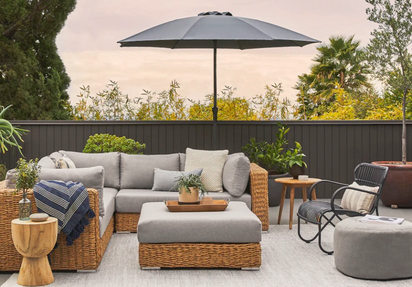
Living Room
For a living room, yellow often works best as an accent unless you truly love color. Try mustard with navy and walnut for a tailored look. Or use butter yellow with cream, sage, and oak for something softer and more relaxed. If your room lacks natural light, yellow can help warm it up without making it feel small.
Kitchen
Yellow is a natural fit in kitchens because it feels warm, optimistic, and welcoming. Pair pale yellow walls with white cabinets and brass hardware for a classic look. Try golden yellow with wood cabinetry and soft gray counters for something more modern. Even a few yellow accessories can wake up an all-neutral kitchen.
Bedroom
Bedrooms need a gentler touch. Pale yellow, butter, or muted gold are usually better than bright lemon here. Pair them with gray, cream, dusty blue, or blush for a soothing atmosphere. If you want more contrast, try mustard accents with deep blue bedding or olive textiles.
Bathroom
Yellow can make a small bathroom feel cheerful instead of cramped. Gray-and-yellow is a smart combination here, as is yellow with white and black accents. If you want a cleaner look, lean toward cooler yellows and crisp whites. If you want warmth, choose a buttery yellow with brass and cream.
Entryway
An entryway is a great place to experiment. Yellow on a front door, console, or accent wall creates a welcoming first impression. Pair it with white, black, green, or warm wood for a look that feels intentional from the second someone walks in.
Mistakes to Avoid When Pairing Colors with Yellow
- Ignoring undertones: a cool yellow and a warm gray can clash even if both look nice on their own.
- Using too much saturation everywhere: if yellow is bright, let other colors be calmer.
- Forgetting texture: yellow can feel flat if everything around it is smooth and shiny.
- Skipping samples: yellow changes dramatically in different light, so test before committing.
- Over-accessorizing: once yellow is in the room, it does not need a marching band behind it.
Final Take: The Best Colors That Complement Yellow
The best colors that complement yellow are not limited to one tidy list. Blue offers contrast and timelessness. Gray makes yellow feel modern. White and cream let it glow. Green creates a natural harmony. Brown and wood tones make it richer. Black sharpens it up. Pink adds softness, purple adds drama, and teal brings the fun. What matters most is choosing the right shade of yellow and pairing it with colors that support the mood you want.
Yellow can be bold, soft, nostalgic, elegant, playful, or surprisingly neutral. That is exactly why it remains such a useful color in home design. When paired well, yellow does not just brighten a room. It changes the room’s attitude. And frankly, some rooms need a little attitude.
Experiences and Practical Lessons from Decorating with Yellow
One of the most common experiences people have with yellow is underestimating how much the light in a room changes it. A butter yellow that looks creamy and subtle in a morning-lit breakfast nook can look far more golden by late afternoon. In a north-facing room, the same color may feel quieter and a touch grayer. That is why yellow often teaches decorators their first big lesson in patience: sample first, admire later. People who skip that step sometimes end up with walls that feel more school-bus than soft sunshine.
Another relatable experience is falling in love with yellow through accessories before committing to paint. A mustard throw, lemon-toned vase, or ochre pillow can be the gateway into a yellow room. Once people see how the color changes the mood of a space, they often become more confident about using it in curtains, upholstery, cabinetry, or an accent wall. Yellow has a funny way of sneaking into a home politely, then becoming the guest everyone likes best.
There is also the emotional side of decorating with yellow. Many people choose it because they want a room to feel happier, warmer, or more welcoming. In real homes, that often works. A dim hallway can feel friendlier with pale yellow walls. A kitchen with yellow accents can feel more sociable. A guest room with yellow mixed with blue or cream often feels less formal and more inviting. The experience is less about following rigid color rules and more about creating a response. Yellow tends to get noticed, but when paired well, it also gets remembered.
Some decorators discover that yellow becomes easier to use once they stop trying to make it the entire story. A little yellow can go a long way. A navy room with one mustard chair can feel smarter than a room painted head to toe in bright yellow. A cream bedroom with soft yellow bedding can feel more restful than four loud yellow walls. People often report the best results when yellow is allowed to punctuate the room instead of shouting over every other element.
Then there is the experience of finding the “right” companion color. Many homeowners assume they should pair yellow only with white, but that can be limiting. Once they try sage green, dusty blue, charcoal, warm wood, blush, or even plum, the color suddenly feels more nuanced. Yellow stops looking juvenile and starts looking intentional. That moment is usually when people realize yellow is not difficult. It is just selective. It wants the right company, like any strong personality.
Perhaps the most practical lesson of all is that yellow rewards restraint. The homes that use it best usually mix it with texture, natural materials, and breathing room. Woven baskets, linen drapes, wood furniture, matte finishes, and soft neutrals keep yellow from becoming visually tiring. In that sense, decorating with yellow is a bit like seasoning food. A little brightens everything. Too much and the room starts yelling.
Still, when yellow works, it really works. It can soften a serious room, energize a dull one, and give personality to spaces that feel generic. People who live with yellow often describe it as uplifting, cozy, or just plain pleasant to wake up to. That may be the best argument for it. Yellow is not only stylish when paired with the right colors. It feels good to live with, which is a pretty impressive trick for a paint chip.
Conclusion
If you are choosing colors that complement yellow, think beyond the stereotype of “bright and loud.” Yellow can be buttery, earthy, elegant, playful, or almost neutral depending on what you pair it with. For timeless contrast, choose blue. For modern balance, choose gray. For softness, go with cream or white. For a nature-inspired palette, bring in green. For richness, layer in brown and wood tones. And for a more daring look, explore pink, purple, teal, or black accents.
The best yellow color combinations come down to undertones, light, and restraint. Test samples, pay attention to texture, and let yellow support the mood of the room rather than overwhelm it. Done right, yellow does more than brighten a space. It makes the whole room feel more alive.