


Why do smart people often seem a little unusual? This in-depth article explores 10 surprising reasons highly...
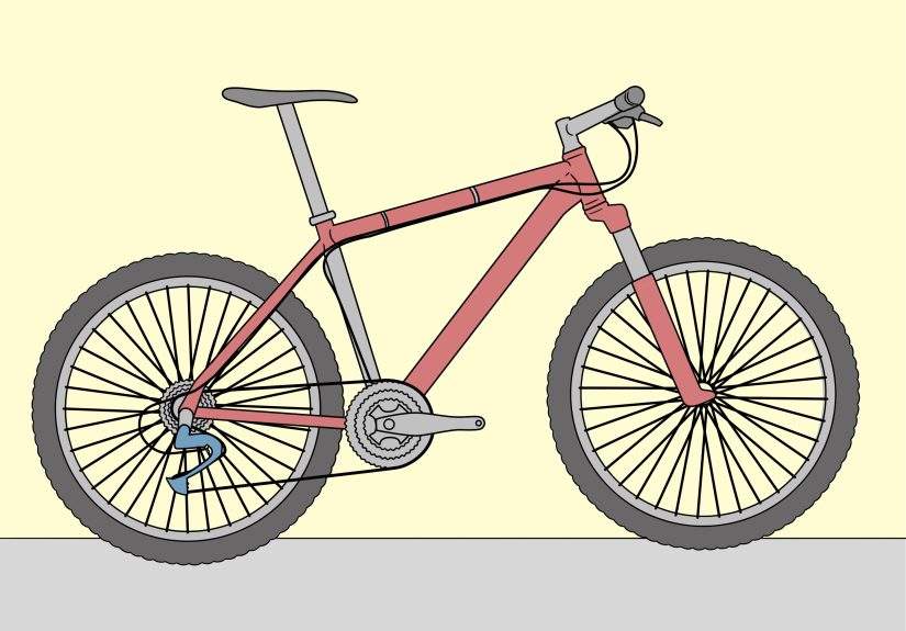
A tangled bike chain can ruin a ride fast, but it usually comes down to one of...
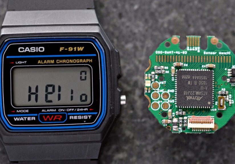
Wristwatch PCB swaps are turning classic digital watches into programmable, low-power wearable platforms without losing their retro...
A part-time job in college can do far more than pad your wallet. It can teach time...
Gross Operating Income (GOI) is the income a rental property is expected to actually collect after accounting...

Exocrine pancreatic insufficiency, or EPI, can turn everyday meals into a source of bloating, greasy stools, weight...

Nighttime teething can turn a peaceful bedtime into a drooly, fussy marathon. This in-depth guide explains how...
Need to mute sound fast in Windows 7? This guide explains exactly how the system volume tray...

Is your lawn looking tired after a long, hot summer? Fall is the perfect time to reset...

Cell-cultured meat has moved from science-fiction headline to real U.S. menu item, but the biggest questions remain...