Table of Contents >> Show >> Hide
- 1. Curtains That Are Too Short, Too Skinny, or Just Plain Awkward
- 2. Vinyl Vertical Blinds That Scream “Rental Office Energy”
- 3. Heavy Swags, Puffy Valances, and Tassel Tiebacks
- 4. Curtain Rods Hung Too Low or Too Narrow
- 5. Cheap Shiny Fabrics, Flimsy Tension Rods, and Mass-Produced Grommet Panels
- 6. Dark, Bulky, or Functionally Wrong Treatments That Fight the Room
- How to Make Window Treatments Look Expensive Without Overspending
- Real-Life Experience: What Actually Makes Window Treatments Feel Tacky
- Conclusion
Window treatments are the eyebrows of a room. Done well, they frame the view, lift the ceiling, soften the light, and make everything look more intentional. Done badly, they sit there above the window looking confused, wrinkled, too short, too shiny, or weirdly formallike a prom dress at a grocery store.
The tricky part is that many tacky window treatments are not dramatic disasters. They are small, common choices: curtains that stop awkwardly above the floor, rods mounted too low, plastic blinds that rattle in the breeze, or swags that look like they escaped from a 1980s banquet hall. Designers often point out that window treatments affect proportion, light, privacy, texture, and mood. In other words, they are not just “something to cover the glass.” They are a major design decision.
Below are six window treatments that can instantly make a room look tacky, according to widely shared designer adviceplus smarter alternatives that make the same space feel polished, current, and expensive without necessarily requiring a royal budget.
1. Curtains That Are Too Short, Too Skinny, or Just Plain Awkward
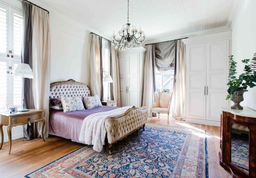
Few things make a room look unfinished faster than curtains that hover several inches above the floor. They create the same visual effect as pants that shrank in the wash: technically present, but deeply suspicious. Designers often recommend that full-length curtains should kiss the floor, hover just slightly above it, or puddle only when the room and fabric can support that more romantic look.
Why short curtains look tacky
Short curtains break the vertical line of the wall. Instead of helping the room feel taller, they chop the space into pieces. They also draw attention to measurement mistakes. Even if the fabric is beautiful, the wrong length can make the entire treatment feel like an afterthought.
Skinny panels create another problem. If the curtains barely cover the window when closed, they look cheap and strained. Fabric should have enough fullness to create soft folds, even when pulled across the glass. Flat, tight panels can make a living room feel more like a temporary dorm setup than a finished home.
What to use instead
Choose curtain panels that are long enough to meet the floor cleanly. For a tailored look, aim for panels that just touch or hover about half an inch above the floor. For width, use enough fabric so the panels look full when closed. As a general styling rule, curtains should extend beyond the window frame on both sides so they can open without blocking too much natural light.
Example: In a small bedroom with one standard window, replacing two narrow 84-inch panels with wider 96-inch panels hung higher can make the ceiling appear taller and the whole room feel calmer. No sledgehammer required.
2. Vinyl Vertical Blinds That Scream “Rental Office Energy”
Vertical blinds have a reputation, and unfortunately, it is not “quiet luxury.” They can work in certain practical situations, especially on sliding glass doors, but the basic white vinyl version often makes a room feel dated, noisy, and commercial. One slat twists the wrong way, another disappears behind the sofa, and suddenly the entire window looks like it is having a bad Monday.
Why vertical blinds often feel outdated
The issue is not only the style. It is also the movement and material. Thin vinyl slats can clatter, crack, bend, or hang unevenly. They tend to draw attention to themselves for the wrong reasons. Instead of adding softness or architectural interest, they can make a room feel temporary.
In living rooms, bedrooms, and dining areas, vertical blinds often compete with the rest of the decor. They introduce a hard, repetitive line that can feel more like an office partition than a cozy home detail.
What to use instead
For sliding doors or wide windows, consider ripple-fold drapery, woven shades, panel track shades in better materials, or layered sheers with heavier side panels. These alternatives still provide privacy and light control, but they look more intentional.
If replacing vertical blinds is not possible right away, soften them by adding stationary drapery panels on both sides. This frames the opening, adds texture, and helps the blinds fade into the background instead of starring in the room’s least flattering role.
3. Heavy Swags, Puffy Valances, and Tassel Tiebacks
Some window treatments look less like decor and more like a theatrical curtain waiting for a tiny opera to begin. Heavy swags, puffy valances, ornate jabots, shiny tassels, and layered fabric loops can instantly date a room when they are not handled with extreme care.
Why overly ornate top treatments look tacky
These treatments add visual weight at the top of the window. In rooms with low ceilings, they can make the walls feel shorter and the windows feel smaller. They also tend to block natural light, which is not ideal unless your design goal is “fancy cave.”
The problem is not that all valances are bad. Structured top treatments, tailored cornices, and thoughtfully designed fabric details can look beautiful in the right setting. The tacky effect usually comes from excess: too much fabric, too much shine, too many swoops, and a level of drama the room did not ask for.
What to use instead
Swap heavy swags for cleaner silhouettes. Try simple pleated drapery panels, Roman shades, woven wood shades, or tailored cornices with a crisp shape. If you love traditional design, choose one refined detail rather than five competing flourishes.
Example: A dining room with floral swags and gold tassels can feel instantly fresher with full-length linen-blend drapes in a warm neutral or muted pattern. The room still feels elegant, but it no longer looks like it is auditioning for a historical reenactment.
4. Curtain Rods Hung Too Low or Too Narrow
Even beautiful curtains can look tacky when the hardware is placed badly. A curtain rod mounted directly on top of the window frame can make the window look squat. A rod that is too narrow forces the curtain panels to cover the glass even when open, stealing daylight and making the room feel smaller.
Why bad rod placement ruins the room
Window treatments are powerful because they trick the eye. Hang them higher, and the ceiling feels taller. Extend them wider, and the window feels larger. Hang them low and tight, and the room can feel visually squeezed.
This is one of the most common mistakes because many people assume the rod belongs exactly where the window begins. Designers usually prefer to mount rods several inches above the frame or closer to the ceiling when appropriate. The rod should also extend beyond the window so the fabric can stack mostly outside the glass.
What to use instead
Mount curtain rods higher and wider than the window frame. The exact placement depends on ceiling height, molding, and the room’s proportions, but the goal is simple: make the window look generous and intentional. For a polished look, choose hardware that is sturdy enough for the fabric and visually compatible with the room’s finishes.
If your curtains look “off” and you cannot figure out why, check the rod before blaming the fabric. Sometimes the fix is not new curtains; it is moving the hardware up and out.
5. Cheap Shiny Fabrics, Flimsy Tension Rods, and Mass-Produced Grommet Panels
Budget-friendly does not have to mean tacky. But certain low-cost window treatments broadcast “quick fix” from across the room. Shiny polyester panels, sagging tension rods, thin tab-top curtains, and stiff grommet panels can make a space feel less finished, especially when the rest of the room is more elevated.
Why flimsy materials look cheap
Fabric matters. Curtains should hang with some weight and movement. Very thin synthetic fabric can look flat, wrinkled, or overly shiny under natural light. Grommet panels are not automatically terrible, but the large metal rings can feel casual and mass-produced when the room needs something softer or more tailored.
Tension rods can also be useful in specific places, such as inside a small bathroom window or under a sink skirt. But when used for main living room or bedroom drapery, they often sag, slip, and make the whole treatment look temporary.
What to use instead
Look for better texture and better construction. Cotton blends, linen blends, velvet, wool blends, lined panels, bamboo shades, and pleated headers can all look more refined. If custom drapery is not in the budget, upgrade ready-made panels with curtain rings, hooks, proper hemming, or a better rod.
Example: A pair of inexpensive linen-look panels can look surprisingly high-end when they are steamed, hemmed to the correct length, hung on rings, and mounted high and wide. The secret is not always price. It is fit, fullness, and finish.
6. Dark, Bulky, or Functionally Wrong Treatments That Fight the Room
A window treatment can be technically stylish and still wrong for the room. Heavy dark drapes in a tiny, dim living room may make the space feel smaller. Unlined woven shades in a bedroom may look pretty during the day but fail at privacy at night. Sheer curtains in a media room may be lovely until the sun hits the TV and turns movie night into a squinting contest.
Why function matters as much as style
Designers often stress that window treatments need to solve real problems: privacy, glare, insulation, light filtering, sleep quality, and softness. When a treatment ignores the room’s needs, it feels wrong even if it is attractive on its own.
For example, a nursery may need blackout lining. A kitchen may need washable cafe curtains or moisture-friendly shades. A street-facing living room may benefit from light-filtering shades paired with decorative panels. A room with radiators, vents, or built-ins below the sill may not be the best candidate for full drapery at all.
What to use instead
Choose window treatments based on both mood and purpose. In small or dark rooms, lighter fabrics and shades can preserve natural light. In bedrooms, lined or blackout options can improve comfort. In layered spaces, combining shades with drapery panels adds depth while allowing more control over privacy and light.
The best window treatments do not simply cover a window. They support the way the room is used every day.
How to Make Window Treatments Look Expensive Without Overspending
You do not need a mansion, a decorator on speed dial, or a fabric budget that causes emotional damage. You need better proportions and a few smart upgrades.
Measure before buying
Measure the window, the wall, the ceiling height, and the distance from the rod placement to the floor. Measure in more than one spot because floors and ceilings are not always perfectly level. This one step prevents most curtain disasters.
Steam or iron the fabric
Wrinkled curtains can make even expensive fabric look neglected. Steaming panels after installation helps them fall properly and instantly makes the treatment look more finished.
Layer for depth
Layering shades with curtains can create a designer look. Woven shades add texture, sheers soften daylight, and lined drapery brings polish. The mix also gives you more control over privacy.
Match the treatment to the architecture
A modern apartment may call for clean ripple-fold panels or simple Roman shades. A cottage kitchen may look charming with cafe curtains. A traditional dining room can handle tailored pleats. The goal is not to follow one rule blindly; it is to choose a treatment that belongs to the room.
Real-Life Experience: What Actually Makes Window Treatments Feel Tacky
In real homes, tacky window treatments usually happen for one of three reasons: rushing, guessing, or treating the window as a separate object instead of part of the whole room. People often buy curtains after the sofa, rug, paint, lighting, and art are already chosen. By then, they are tired, slightly annoyed, and ready to grab whatever panels are on sale. That is how a carefully decorated room ends up with curtains that look like they were selected during a mild emergency.
One common experience is the “almost right” curtain. The color works. The fabric is fine. The pattern is not offensive. But the length is wrong by four inches, and now the entire room feels unsettled. Guests may not say, “Your drapery hem is visually interrupting the vertical rhythm of the wall,” because normal people do not speak like design textbooks at dinner. But they will sense that something feels unfinished.
Another familiar mistake is choosing window treatments only for privacy. Someone moves into a new apartment, realizes the neighbors can see directly into the living room, and immediately buys the cheapest blinds available. Problem solvedsort of. Privacy improves, but the room loses softness, light, and personality. A better solution might be light-filtering shades with side panels, or cafe curtains in a kitchen where full coverage is unnecessary.
Then there is the “fancy equals better” trap. A homeowner wants the room to feel elegant, so they choose heavy fabric, ornate rods, tassels, and a dramatic valance. But elegance usually comes from restraint, proportion, and qualitynot from piling every decorative detail onto one poor window. The result can feel more dated than luxurious.
From experience, the best approach is to stand back and look at the entire wall before choosing anything. Ask what the room needs. Does it need height? Softness? Privacy? Darkness? Texture? Warmth? A cleaner line? The answer should guide the treatment. For a small room, hang panels high and wide in a lighter fabric. For a bedroom, prioritize blackout lining and fullness. For a kitchen, consider cafe curtains or Roman shades that offer charm without blocking all the light.
It also helps to think of window treatments as tailoring. A simple outfit can look expensive when it fits perfectly. The same is true for curtains and shades. A basic panel that is the right length, properly steamed, and hung on good hardware will usually look better than a costly panel installed badly. Fit beats fuss almost every time.
Finally, remember that “tacky” is not about personal taste being wrong. If you love color, pattern, vintage details, or dramatic drapery, use them. The problem is when the treatment looks accidental, poorly scaled, cheaply made, or disconnected from the room. A bold floral Roman shade can be gorgeous. A shiny, wrinkled, too-short floral curtain on a sagging rod is another story. Same general category, very different outcome.
The most stylish rooms make window treatments feel intentional. They frame the view, support the architecture, and improve the way the room works. When that happens, nobody walks in and says, “Nice curtains.” They say, “This room feels amazing.” That is the quiet magic of getting the windows right.
Conclusion
Window treatments can elevate a room or quietly sabotage it. Curtains that are too short, vertical vinyl blinds, heavy swags, low curtain rods, flimsy fabrics, and treatments that ignore function are all common reasons a space can look tacky. The good news is that most of these mistakes are fixable. Hang curtains higher and wider, choose fuller panels, avoid overly ornate details, use better hardware, and match the treatment to the room’s real needs.
When in doubt, aim for clean lines, proper scale, natural texture, and enough fabric to look intentional. Your windows do not need to shout. They just need to stop whispering, “I was bought in a panic.”