Table of Contents >> Show >> Hide
- The Quick Take: What’s In and What’s Out for 2026
- Paint Colors That Are In for 2026
- 1. Warm Khaki and Sanded Neutrals
- 2. Creamy Whites and Soft Ivories
- 3. Chocolate Brown, Mahogany, and Rich Espresso Tones
- 4. Smoky Teal and Blue-Green Paint Colors
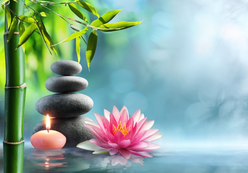
- 5. Olive, Eucalyptus, Moss, and Restorative Greens
- 6. Terracotta, Clay, Earthy Reds, and Muted Burgundy
- 7. Plum, Aubergine, and Refined Purple Accents
- Paint Colors That Are Out for 2026
- How to Use 2026 Paint Trends Without Regretting It Later
- Room-by-Room Paint Ideas for 2026
- Real-Life Experiences With 2026 Paint Colors
- Final Verdict
Paint trends in 2026 are having a bit of a personality glow-up. After years of cool grays, cautious greiges, and whites so stark they practically asked you to remove your shoes, the mood is shifting. Today’s most stylish paint colors feel warmer, deeper, softer, and more human. In plain English: homes are starting to look less like sterile rental listings and more like places where actual people drink coffee, read books, and leave a throw blanket somewhere slightly dramatic.
If you’re wondering what paint colors are in for 2026 and which ones are quietly being escorted out the side door, the short answer is this: earthy neutrals, smoky greens, blue-greens, rich browns, terracotta tones, and creamy whites are in. Cool gray, flat builder greige, crisp blue-white, washed-out pastels, and a few overused “safe” shades are heading out. Not banned. Just… no longer the life of the party.
This guide breaks down the biggest paint color trends for 2026, the hues that feel dated, and how to use current shades in a way that still looks smart two years from now.
The Quick Take: What’s In and What’s Out for 2026
- In: warm khaki, creamy ivory, soft taupe, paper-bag brown, chocolate brown, mahogany, smoky teal, olive green, eucalyptus, moss, terracotta, clay, muted burgundy, and select plums
- Out: cool gray, icy charcoal, flat greige, stark blue-based white, gray-leaning sage, sugary blush pink, washed-out butter yellow, and overly one-note navy rooms
The biggest shift is emotional, not just visual. Interior paint trends in 2026 are all about comfort, tactility, and warmth. People still want timeless rooms, but they no longer want them to feel bland. The new goal is a home that feels grounded, layered, and a little more personal.
Paint Colors That Are In for 2026
1. Warm Khaki and Sanded Neutrals
One of the strongest color directions for 2026 is the rise of warm, tailored neutrals. Think khaki, sand, oat, camel, parchment, and those light browns that make a room feel calm instead of sleepy. These shades are replacing cooler beige and gray blends because they have more depth and a more natural connection to wood, linen, stone, and handmade finishes.
This is the kind of neutral that works hard without showing off. It can look soft and understated in a bedroom, polished in a dining room, and surprisingly elegant in a hallway. If you want a “safe” paint color that still feels current, warm khaki is your overachiever.
Why it works in 2026: it feels livable, timeless, and warm without turning yellow or muddy.
2. Creamy Whites and Soft Ivories
White is not dead. It just got better manners. The best wall colors for 2026 include whites with warmth and softness rather than icy sharpness. Cream, chalk white, ivory, ecru, and off-white shades with subtle beige or almond undertones are replacing harsh bright whites that can make a room feel clinical.
These warmer whites are especially good for open-concept homes, ceilings, trim, and small rooms that need light without losing coziness. They also play beautifully with natural wood cabinetry, limewash textures, woven accents, and warmer metals like brass or aged bronze.
In other words, white is still invited. It just has to be charming now.
3. Chocolate Brown, Mahogany, and Rich Espresso Tones
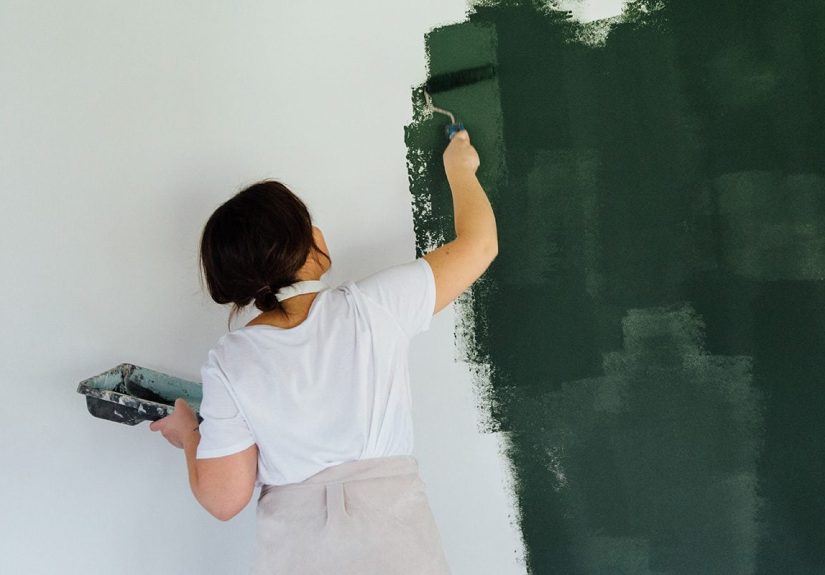
Brown is having a major comeback, and honestly, it deserves one. For a while, brown was treated like the old sofa in your aunt’s den. In 2026, though, brown looks sophisticated, cocooning, and downright stylish. We’re seeing everything from cocoa and tobacco to mahogany, burnt umber, and espresso-inspired shades show up in trend forecasts and designer recommendations.
These colors bring depth without the coldness of black and feel more interesting than basic charcoal. They work especially well in libraries, dining rooms, powder rooms, offices, and color-drenched spaces where you want drama with warmth. Even in smaller spaces, these tones can look luxurious if you balance them with lighter upholstery, warm lighting, and natural texture.
If gray made your home feel emotionally unavailable, brown may be the rebound that actually lasts.
4. Smoky Teal and Blue-Green Paint Colors
Blue isn’t disappearing, but it is getting moodier and greener. One of the standout trending paint colors for 2026 is the smoky blue-green family: teal, jade, mineral blue, blue-charcoal, and dusky aqua tones that feel calm but still rich.
These shades are popular because they bridge two design desires at once: color and serenity. A smoky teal can read classic in a traditional home, modern in a minimal space, and eclectic in a room with vintage furniture. It also pairs beautifully with walnut, oak, marble, leather, and even blush-toned accents if you want contrast without chaos.
Use it on cabinetry, entryways, powder rooms, or a full room if you like a cocooning mood. This is a color family with range.
5. Olive, Eucalyptus, Moss, and Restorative Greens
Green continues to dominate, but the version that feels most current in 2026 is warmer, earthier, and more grounded. Olive green, eucalyptus, moss, herbaceous green, and muted forest tones feel more sophisticated than the cool, grayish sage tones that ruled the early 2020s.
These greens support the ongoing love for biophilic design and nature-inspired interiors. They help rooms feel restorative, especially when paired with plaster walls, terracotta, warm whites, or wood furniture. They’re also remarkably flexible. A soft olive can work like a neutral, while a deeper eucalyptus can add depth to a kitchen or study without feeling gloomy.
If you’ve wanted green but feared your home might turn into a juice bar, this new generation is much more elegant.
6. Terracotta, Clay, Earthy Reds, and Muted Burgundy
Warm reds are rising fast in 2026, but not the loud cherry reds that shout at you from across the room. The current versions are earthier and more grounded: terracotta, clay, rust, red ochre, muted burgundy, and red-brown shades with a dusty finish.
These colors feel rooted, comforting, and expressive. They’re especially effective in entryways, dining rooms, powder rooms, and accent walls where you want warmth with character. They also pair beautifully with woven textures, natural stone, aged wood, and creamy trim.
For homeowners bored with beige but scared of bright color, earthy reds are the stylish middle ground.
7. Plum, Aubergine, and Refined Purple Accents
Purple is entering the chat again, but in a much more grown-up outfit. Deep plums, aubergines, amethyst-browns, and tinted mauves are popping up as interesting alternatives to navy and charcoal. These shades work best when they feel dusty, moody, or wine-inspired rather than sugary or overly saturated.
You do not need to paint your entire living room grape soda purple. A plum powder room, aubergine office, or mauve-toned bedroom can look rich, unexpected, and very 2026 without veering into costume territory.
Paint Colors That Are Out for 2026
1. Cool Gray Everything
Cool gray had a long run, but many of those icy, blue-based grays now make rooms feel flat, cold, and smaller than they are. In 2026, they often read more dated than modern, especially when paired with gray flooring, gray furniture, and gray backsplash tile. That whole look had its era. The era has ended.
If you still like gray, go warmer. Taupe-gray, mushroom, and brown-based grays feel much more current.
2. Builder Greige
Greige isn’t universally bad, but the overly safe, middle-of-the-road versions are losing favor. Why? Because they often look generic. In many homes, builder greige doesn’t feel thoughtfully chosen; it feels like the paint equivalent of “select all.”
For 2026, richer beige, warm taupe, and creamy off-whites are replacing these flatter hybrids. The goal is still neutrality, just with a little pulse.
3. Stark Blue-Based White
Bright, cold white walls can still work in certain modern spaces, but in everyday homes they often feel sterile. In 2026, people want whites that flatter natural materials and soften a room, not whites that make every lamp look guilty.
Swap stark white for ivory, chalky white, soft linen white, or a creamy tone with a whisper of warmth.
4. Gray-Leaning Sage
Sage green is not completely “out,” but the pale, dusty, gray-green version that was everywhere for years is losing freshness. It can now feel tied to an earlier trend cycle, especially when the whole house leans muted and desaturated.
The replacement is cleaner and warmer: olive, eucalyptus, moss, and other greens with more life in them.
5. Sugary Pinks and Thin Pastels
Millennial pink and overly sweet blush shades are starting to feel too trend-specific. The same goes for pastel colors that read more nursery than nuanced. In 2026, pink works better when it’s chalky, plaster-like, peach-leaning, or clay-based.
Translation: pink can stay, but it needs more maturity and better shoes.
6. Washed-Out Butter Yellow
Soft buttery yellows had a nostalgic moment, but many pale versions can look weak in real lighting. The 2026 update is stronger and earthier: bronze ochre, deep straw, and golden tones that feel intentional rather than faint.
7. Heavy Navy Used Everywhere
Navy still has style, especially on cabinetry, doors, or built-ins. But full-room navy is starting to feel a bit expected, particularly when there’s no contrast or warmth to support it. Many designers are shifting toward teal, blue-charcoal, or plum-based shades for the same drama with more nuance.
How to Use 2026 Paint Trends Without Regretting It Later
The smartest way to use 2026 paint color trends is not to chase every headline. Instead, choose one trend color that fits your home’s architecture, your lighting, and your furniture. Warm neutrals are the easiest long-term choice. Smoky blue-greens and earthy greens are excellent if you want color that still feels restful. Browns, terracottas, and burgundies are strongest in rooms where mood matters more than brightness.
Also, please test paint in real light. Morning light, afternoon light, lamp light, cloudy-day light, “why does this wall suddenly look olive soup?” light. Paint chips lie. Walls tell the truth.
Room-by-Room Paint Ideas for 2026
Living Room
Go for warm taupe, olive, smoky teal, or a soft khaki neutral. These shades create a welcoming backdrop and make layered decor feel intentional.
Kitchen
Try rich browns, grounded greens, creamy whites, or blue-green cabinetry. Kitchens in 2026 are leaning warmer and more expressive.
Bedroom
Look at eucalyptus, dusty teal, mauve-tinted neutrals, soft clay, or warm off-white. Bedrooms should feel restful, not like a fluorescent waiting room.
Bathroom
Inky blue-charcoal, soft green, ivory, and earthy neutrals all work beautifully. Pair with layered lighting and polished metal finishes for extra depth.
Entryway
Paper-bag brown, plaster pink, smoky teal, and pale powder blue are all strong choices if you want a stylish first impression.
Real-Life Experiences With 2026 Paint Colors
What’s especially interesting about the paint colors in and out for 2026 is how differently they feel once they’re actually on the wall. On paper, a warm khaki might sound a little boring, a chocolate brown might sound risky, and a smoky teal might sound like you’re one impulsive decision away from living inside a boutique hotel. But in real homes, these colors often behave better than expected.
One of the most common experiences people have with 2026’s warmer neutrals is relief. Rooms that once felt cold in cool gray or bright white suddenly feel softer and more settled with a creamy beige, warm ivory, or sanded khaki. Furniture looks richer. Wood tones look less orange. Art looks more expensive. Even a simple sofa can look intentionally styled instead of just… present.
Brown tones create a different kind of reaction. Homeowners are often nervous before using chocolate, umber, or mahogany, especially on large walls. But once the room is painted and the lighting is right, these colors tend to feel enveloping rather than heavy. Dining rooms become moodier in a good way. Offices feel focused. Bedrooms feel quiet and protected. The surprise is that dark warm colors often feel more elegant than dramatic, especially when balanced with cream bedding, brass accents, or natural oak.
Green is where experience really starts to matter. A cool sage that seemed perfect in 2022 can now look sleepy or washed out, particularly in north-facing rooms. By contrast, eucalyptus, olive, and moss usually hold up better throughout the day. In morning light they can feel fresh and botanical; by evening they become calm and grounded. People often say these shades make a room feel more “finished,” which is design-speak for “I no longer feel like something is off every time I walk in here.”
Smoky teal and blue-green shades tend to win over skeptics fast. On a paint chip, they can look too bold. On cabinetry, built-ins, or an entry ceiling, they often read far more sophisticated than expected. They add personality without the chaos of a bright color. Many people discover that blue-green is the rare shade that feels both stylish and relaxing, which is basically the paint equivalent of finding jeans that look good and have pockets.
Then there’s the white issue. A lot of homeowners who repaint from stark white to a warm ivory or chalk white say the same thing: the room finally feels alive. It still looks bright, but no longer sterile. That small undertone shift can change everything, especially in homes with wood floors, stone counters, or vintage furniture.
The biggest lesson from real-life use is simple: 2026 colors work best when they interact with texture, light, and materials. The most successful rooms are not relying on paint alone. They pair warm walls with linen, wood, plaster, marble, leather, or woven elements. That is why these trending shades feel so current. They don’t just color a room. They help a room feel inhabited, layered, and real.
Final Verdict
So, what paint colors are in and out for 2026? The short answer is warmth is in, coldness is out. The freshest homes are leaning into earthy neutrals, creamy whites, rich browns, restorative greens, smoky teals, terracotta reds, and a few well-placed plums. Meanwhile, cool gray, generic greige, stark white, and overly sugary pastels are losing their grip.
If you’re repainting this year, don’t think in terms of trendy versus untrendy. Think in terms of whether a color makes your home feel better. In 2026, the best paint shades are the ones that create comfort, depth, and personality. Basically, the walls are finally allowed to have a point of view.