Table of Contents >> Show >> Hide
- How 2014 Paint Trends Were Chosen (Hint: It’s Not a Dartboard)
- The Four Headline Colors of 2014 (and What They Said About Us)
- The Palettes That Defined 2014 (Because One Color Never Travels Alone)
- Behr’s 2014 Color Trends: Four Themes, Twenty Colors, Zero Boredom
- Valspar’s 2014 Outlook: Zenergy, Time Traveler, Yours Truly
- Better Homes & Gardens’ 2014 “Color Palette of the Year”: A Ready-Made Mix
- Benjamin Moore’s Supporting Cast: Calm Bases, Crisp Whites, and Soft Contrast
- PPG’s “Pause & Refresh”: Five Palettes Built Around Rest, Warmth, and a Dash of Drama
- The Real Trends Behind the Trend Lists
- How to Use 2014 Paint Trends Like a Pro (Without Turning Your Home Into a Time Capsule)
- Quick 2014 Color Cheat Sheet
- What 2014 Got Right (and Why These Colors Still Matter)
- Real-Life Lessons From 2014’s Paint Trends ( of Experience, Minus the Regret)
- Conclusion
If you time-traveled back to 2014 with a paint fan deck in your pocket, you’d notice something immediately:
we were officially over “sad beige everything.” (No offense to beige. Beige had a long run. Beige paid its taxes.
Beige simply needed to stop being the only option.)
Paint trends in 2014 split into two very human moods that somehow got along in the same house:
soft, breathable, spa-like pastels for everyday calmand dramatic, jewel-toned accents for personality,
confidence, and a little “yes, I meant to do that” flair. The result was a year of color that felt both
livable and brave: airy blues, orchard greens, buttercream yellows, coral pops, deep plums, and a renewed love for
complex neutrals that weren’t just “gray,” but “gray with a backstory.”
Below is a deep dive into the biggest paint color trends for 2014what the headline shades were, what palettes were driving the look,
and how homeowners and designers actually used these colors without turning their living rooms into a set from a pop music video.
(Unless that was the goal. In which case: proceed.)
How 2014 Paint Trends Were Chosen (Hint: It’s Not a Dartboard)
Big color calls usually come from a mix of forecasting, trade-show spotting, retail data, and cultural mood-reading.
In 2014, editors and color teams were openly talking about pulling inspiration from trend forecasts, trade shows,
and industry gatheringsthen refining those “seen everywhere” hues into palettes that worked in real homes.
Translation: the colors were meant to be trendy, but not exhausting.
The themes that rose to the top reflected what people wanted their homes to do in 2014:
feel like a retreat, feel more personal, and feel a little more optimistic. That’s why you see so many
“pause and refresh” shadescool, filtered colors and soft warm tones that read as comforting instead of loud.
The Four Headline Colors of 2014 (and What They Said About Us)
1) Radiant Orchid: The Confident Purple That Refused to Whisper
If 2014 had a party outfit, it was Radiant Orchid: a purple with pink undertones that felt bright,
modern, and upbeat. Purple can be trickytoo royal and it gets theatrical; too gray and it gets gloomy. Radiant Orchid
landed in that sweet spot where it felt energetic and creative, which is exactly why it showed up across design and fashion talk
that year.
How it showed up on walls: rarely as “paint every wall orchid and pray.” More often as an accent wall,
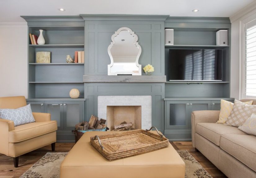
a powder room moment, painted furniture, or accessories that tied a room togetherespecially paired with soft grays,
creamy whites, or deep teals for contrast.
2) Exclusive Plum: Moody, Sophisticated, and Weirdly Versatile
At the darker end of the purple spectrum, Exclusive Plum brought a richer, grown-up drama.
Deep plum reads as cozy at night and luxe in daylight, especially when balanced with pale neutrals and warm metals.
In 2014, this kind of color was a signal that accent walls were evolving: less “random red wall” and more
“intentional depth.”
Where it worked best: dining rooms, libraries, bedrooms, and small spaces that benefit from saturationlike a hallway
or powder roomwhere a darker shade can feel curated rather than cave-like.
3) Breath of Fresh Air: The Pastel Blue That Became a “New Neutral”
The most easy-to-live-with star of 2014 was Breath of Fresh Air, a light, ethereal blue that
felt calming without being cold. This shade (and its many cousins) signaled a bigger shift:
pastels were graduating from “nursery only” to “whole-house neutral.”
In practice, filtered blues like this became the backdrop that let other colors shinewood tones, crisp whites,
navy accents, even warmer corals. It was the paint equivalent of taking a deep breath and deleting 47 unread emails.
4) Turning Oakleaf: Buttercream Yellow for Optimism (and Actual Warmth)
2014 also leaned into warmer, sunnier colorespecially soft yellows that could behave like neutrals.
Turning Oakleaf (a buttercream yellow) was framed as energetic yet gentle, tapping into a broader move toward
warmer, more optimistic interiors after years of muted, recession-era restraint.
Why it mattered: it made “yellow” feel usable again. Not neon. Not school-bus. More like morning light through linen curtains.
The Palettes That Defined 2014 (Because One Color Never Travels Alone)
Behr’s 2014 Color Trends: Four Themes, Twenty Colors, Zero Boredom
Instead of naming one single color as the year’s mascot, Behr leaned into four themed collections that ranged from coastal-calm
to bold-and-playful. The takeaway: 2014 wasn’t about one “correct” lookit was about matching color to lifestyle.
- Seaside Harmony: crisp blues and greens plus soft warm neutrals (the “my living room is a vacation rental” vibe).
- Urban Alternative: deeper, dramatic, sophisticated hues (for people who like their neutrals with complexity).
- Grand Reign: classic, old-world charm (traditional palettes with richness and polish).
- Natural Avocation: bold, energetic hues (accent colors that look like confidence in paint form).
What’s interesting is how these themes anticipated two decorating behaviors that became more common later:
color zoning (using different palettes for different rooms) and high-impact accents (small doses of intense color).
Valspar’s 2014 Outlook: Zenergy, Time Traveler, Yours Truly
Valspar’s 2014 sets were grouped into three ideas that basically describe how we all decorate when left unsupervised:
simplify, nostalgia, and personal expression.
Across the group you saw watery blues, fresh greens, indigo/ink tones, and flexible “not-quite-gray” neutrals.
The real trend here wasn’t a single shadeit was a strategy: pick a restful base, then add one color that feels like
you (navy, teal, coral, chartreuse… you’re allowed to have fun).
Better Homes & Gardens’ 2014 “Color Palette of the Year”: A Ready-Made Mix
Better Homes & Gardens curated a seven-color set that captured what was showing up across home and fashion in 2014:
bold blues, warm yellow, gentle lavender, apple green, chambray, coral, and a naturally warm beige.
It was designed to be mixed and matchedlike a capsule wardrobe, but for your walls.
The seven hues and example paint matches included:
- Cobalt (example: Valspar “Indigo Cloth 4009-7”)
- Yellow (example: Behr “Sunday Afternoon T14-19”)
- Lavender (example: Sherwin-Williams “Obi Lilac SW6556”)
- Apple Green (example: Ace Hardware “Elm Valley B32-6”)
- Chambray (example: Benjamin Moore “Blue Jean 2062-50”)
- Coral (example: Pratt & Lambert “Haiku 4-7”)
- Beige (example: Olympic “Navajo White D12-1”)
That list is basically 2014 in a nutshell: blue anchored everything, pastels softened the edges,
and warm accents kept it from feeling too icy.
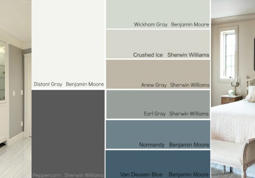
Benjamin Moore’s Supporting Cast: Calm Bases, Crisp Whites, and Soft Contrast
Beyond the Color of the Year, the broader 2014 palette favored “breathable” combinations:
misty blues, light grays, softened corals, and dependable whites. Pairings like
White Dove with a blue-gray (think “Wickham Gray”) or a deeper historical blue (like “Van Deusen Blue”)
made it easy to create layered rooms that still felt quiet.
PPG’s “Pause & Refresh”: Five Palettes Built Around Rest, Warmth, and a Dash of Drama
PPG framed its 2014–2015 trend story around stepping back from the busy grind and using color to create a more restorative home.
That translated into five palettes (with Turning Oakleaf as the Color of the Year) that ranged from earthy-organic to bold-artisan.
- New Spirit: earthy, organic references; buttercream yellow + greens + a bold reddish-brown.
- Hi-Breed: organic meets man-made; soft pinks/creams + orange + dark gray contrast.
- Mosaic: bold and dynamic; bright primaries balanced by a sandy neutral.
- Magnifigance: lavish and historical; dramatic accents + creamy neutrals + black/white contrast.
- Theorem: clean and minimal; blues, grays, creams, and deep accents for precision.
The Real Trends Behind the Trend Lists
Trend #1: “New Neutrals” Meant Filtered Color, Not Colorless Rooms
2014 neutrals weren’t just beige, gray, and whitethey were blue-grays, green-grays,
misty pastels, and soft warm tones that still counted as “neutral” because they played nicely with everything else.
Breath of Fresh Air is the poster child for this: light enough to be background, but colorful enough to feel intentional.
Trend #2: Ocean + Sky Influence (Sea Glass Was Basically a Lifestyle)
Coastal-inspired palettesturquoise, teal, watery blues, and driftwood neutralsshowed up everywhere in 2014 collections.
The twist was that many of these shades were slightly muted or grayed, making them easier to live with year-round.
Trend #3: Optimism Through Warmth (Hello, Yellow and Coral)
Soft yellow and coral weren’t random. They were part of a broader push toward warmth and “sunshine energy”
without the headache of truly bright paint. Buttercream yellows could act like neutrals in kitchens and living rooms,
while coral often appeared as a punchy accent (pillows, a painted chair, a front door) rather than a full-room commitment.
Trend #4: Dark Accents Got More Sophisticated
Deep plums, inky indigos, and near-black shades weren’t about making rooms gloomythey were about giving rooms
contrast and structure. Think of them like eyeliner for your architecture: a little definition goes a long way.
How to Use 2014 Paint Trends Like a Pro (Without Turning Your Home Into a Time Capsule)
Start with a Calm Base, Then Add One “Hero” Color
A 2014-friendly formula still works today: choose a soft neutral (warm beige, blue-gray, or pale pastel),
then add one saturated color as a statement. That hero color can be orchid, plum, cobalt, teal, or even buttercream yellow
but keep it purposeful: one wall, built-ins, a door, or a piece of furniture.
Use Pastels Where You Want Light to Bounce
Filtered blues and gentle lavenders shine in bedrooms, bathrooms, and smaller rooms where you want an airy feel.
Pair them with crisp white trim and natural textures (wood, linen, woven baskets) and the color looks elevated, not sugary.
Let Warm Yellow Behave Like a Neutral
If you want warmth without going full gold, use a buttercream yellow in spaces that get less sunlight.
It can make a north-facing room feel friendlier, especially with white cabinets, warm metals, or medium wood tones.
Remember the Lighting Rule (Because Paint Loves to Prank You)
Many of 2014’s best neutrals were complexblue-green-grays, warm-cool hybrids, and softened pastels.
That means they shift through the day. Test large samples on multiple walls before committing.
The goal is “beautifully dimensional,” not “why is my living room mint at 9 a.m. and gray at 4 p.m.?”
Quick 2014 Color Cheat Sheet
- Want the signature “2014 calm” look? Misty blue + crisp white + light gray + natural textures.
- Want the confident “2014 statement” look? Orchid/plum accent + creamy neutral + brass/wood.
- Want the fashion-forward palette? Cobalt + chambray + coral + warm beige (with white to keep it breathable).
- Want the fresh-and-natural vibe? Apple green + soft yellow + driftwood neutrals.
What 2014 Got Right (and Why These Colors Still Matter)
The best part about 2014’s paint trends is that they weren’t built on gimmicks. They were built on
livability: softened color for everyday spaces, plus deeper accents for personality.
If you loved the year’s palettes, you weren’t just following a trendyou were adopting a way of decorating that still makes sense:
create calm, then add character.
Real-Life Lessons From 2014’s Paint Trends ( of Experience, Minus the Regret)
The funniest thing about paint trends is how quickly they go from “bold new idea” to “oh… this is my house now.”
And 2014 was a year where that transition was surprisingly pleasantmostly because the trend colors were built for real life,
not just magazine spreads.
Take the wave of airy, filtered blues. People tried shades like Breath of Fresh Air in bathrooms and small bedrooms
because they wanted the room to feel bigger and calmer. The “experience” lesson was immediate:
light blue doesn’t just look soothingit changes how you use the space. A tiny bath suddenly felt less like a closet with plumbing,
and more like a place you could actually breathe in. The trick most homeowners learned was to keep the surrounding elements simple:
white trim, light towels, warm wood accents. When the styling stayed clean, the color felt modern. When the styling got busy,
the same blue could start reading a little nursery-ish. So the practical takeaway became:
pastels love uncluttered rooms.
Then there were the plums and orchidsthe colors people were fascinated by but nervous to commit to.
In 2014, the most successful “I tried a jewel tone” stories usually started small: a single accent wall behind a bed,
a painted dresser, or a front door that quietly announced, “Yes, I have opinions.” What surprised people was how
flexible deep plum could be. Paired with crisp white and warm wood, it looked classic. Paired with gray and chrome,
it looked sleek. Even paired with blush or coral accents, it looked intentionallike you hired someone with strong glasses
and stronger confidence.
Buttercream yellow had its own learning curve. Homeowners who remembered the aggressive yellows of earlier decades approached
Turning Oakleaf-type shades like they were handling a fragile artifact. But the “buttercream” family behaved differently:
it read as warm light rather than loud pigment. People found it especially helpful in darker rooms that didn’t get much sun.
The lived-in lesson: soft yellow can function like a warm neutral, especially when you anchor it with whites and natural materials.
The moment it went wrong was when someone paired it with too many other warm tonesgolden wood, tan fabrics, and warm lightingcreating
an overall “everything is toast” effect. The fix was simple: bring in a cooler counterbalance (a blue-gray, black accents, or crisp white).
Finally, the most enduring 2014 experience wasn’t about any single colorit was about how people started thinking in
palettes instead of one-off paint picks. Collections like Behr’s themed sets and curated editorial palettes taught homeowners
to build a room the way you build an outfit: a base, a mid-tone, and one statement. That approach reduced regret dramatically.
Instead of “I picked a color I liked,” it became “I picked a color story.” And honestly, that’s the real reason 2014 paint trends still feel relevant:
they made color feel approachablelike something you could live with, not just look at.
Conclusion
Paint color trends in 2014 balanced comfort and confidence: breathable blues and softened pastels became everyday neutrals,
while orchid, plum, cobalt, and coral delivered personality in smart doses. Warm buttercream yellow and natural greens
added optimism and life, and curated palettes made it easier to combine colors without guessing. If you’re borrowing from 2014 today,
the secret is the same as it was then: start calm, then choose one color that feels unmistakably you.