Table of Contents >> Show >> Hide
- Why Do Some Company Mascots Feel So Creepy?
- The Creepiest Company Mascots (And Why They Work Anyway)
- 1) The Burger King “King” (Burger King)
- 2) Ronald McDonald (McDonald’s)
- 3) Chuck E. Cheese (Chuck E. Cheese)
- 4) The Noid (Domino’s)
- 5) The Quiznos Spongmonkeys (Quiznos)
- 6) Mr. Peanut (Planters)
- 7) The Michelin Man (Michelin)
- 8) The Pillsbury Doughboy (Pillsbury)
- 9) The Kool-Aid Man (Kool-Aid)
- 10) Mr. Mucus (Mucinex)
- 11) The Jolly Green Giant (Green Giant)
- 12) Little Caesars’ Mascot (Little Caesars)
- What These Creepy Mascots Teach Us About Branding
- How to Talk About Creepy Mascots Without Being a Jerk
- Extra: of “Creepy Mascot” Experiences (The Kind People Actually Have)
- Conclusion
Company mascots are supposed to be friendly little brand ambassadorswalking, talking reminders to buy pizza, cereal, or tires
(because nothing screams “self-care” like responsible tread). And yet, every so often, a mascot slips past the marketing meeting
and arrives in the world with the energy of a porcelain doll that definitely moved when you blinked.
This article is a guided tour through the creepiest company mascots: the characters that live rent-free in our
brains, pop up in late-night commercials, and make you wonder who signed off on those eyes. We’ll break down what makes a brand
character unsettling, why companies keep using them, and which mascots are creepy in that “I can’t look away” kind of way.
Why Do Some Company Mascots Feel So Creepy?
Not all mascots are scary. Some are cozy (hello, cartoon geckos) or nostalgic (hello, cereal elves). The creepy ones usually
share a few design and storytelling traits that hit our brains like a jump-scare that’s also trying to sell you a combo meal.
1) The Uncanny Valley Effect
If a mascot looks almost humanbut not quiteour instincts go on high alert. Perfectly smooth skin, frozen smiles, glassy eyes,
and “I learned emotions from watching humans through a window” vibes all contribute. The result: your brain reads “threat,” while
the mascot reads “two-for-one deal.”
2) Forced Friendliness
“Hi, kids!” can be wholesome. But when it’s delivered by a costumed character who appears uninvited at your birthday party,
friendliness becomes a hostage negotiation. Mascots that push too hard for charm can feel like they’re trying to distract you
from the fact that they just crawled out of a supply closet.
3) Anthropomorphic Food That Shouldn’t Have a Face
A smiling sandwich is one thing. A melting blob of dough giggling in your kitchen is another. The moment food has teethor worse,
gumsour comfort levels drop like a coupon that expired in 2009.
4) Outdated Design Choices That Aged… Strangely
Some mascots were created in a different era of animation, advertising, and taste. When those designs get updated with modern CGI
(or they don’t get updated at all), they can look like a nostalgic memory that got rendered by a haunted graphics card.
The Creepiest Company Mascots (And Why They Work Anyway)
“Creepy” doesn’t always mean “bad marketing.” In fact, the most unsettling brand mascots are often unforgettablewhich is exactly
what advertising wants. Below are some of the most notorious scary brand mascots and why they still stick around
in the cultural imagination.
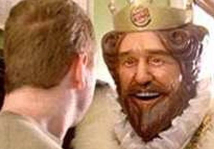
1) The Burger King “King” (Burger King)
The King is a masterclass in “smiling, but at what cost?” With his oversized royal head, frozen expression, and tendency to appear
silently in places where he absolutely does not pay rent, he feels like a mascot designed by someone who asked, “What if fast food
were a mild psychological thriller?”
Why it works: the King is instantly recognizable and meme-friendly. He’s weird enough to be shareable, which turns discomfort into
brand recall. If marketing has a love language, it’s “you’ll never forget this, even if you try.”
2) Ronald McDonald (McDonald’s)
Clowns are already a polarizing genre. Ronald adds bright colors, a painted smile, and the ability to show up at a children’s event
without anyone asking first. For some people, he’s cheerful nostalgia. For others, he’s the mascot equivalent of a balloon animal
made out of dread.
Why it works: clowns are attention magnets, especially to kids. Ronald became a massive brand symbol for decades, and even when
brands lean away from clown imagery, the cultural memory stays strong.
3) Chuck E. Cheese (Chuck E. Cheese)
A mouse in a t-shirt isn’t inherently terrifyinguntil you put that mouse in a full-size costume with a head the size of a
beanbag chair and the obligation to hug strangers. Chuck E. Cheese has gone through redesigns over the years, but the core concept
(giant animatronic rodent performing for pizza) remains a little… intense.
Why it works: the character is tied to a specific experiencebirthday parties, arcade noise, and sugar-fueled chaos. That’s strong
brand identity, even if it comes with mild nightmares.
4) The Noid (Domino’s)
The Noid is a mischievous little gremlin whose job is to ruin your pizza. As a concept, it’s hilarious. Visually, it’s also the
kind of creature you’d expect to find living behind a vending machine, collecting lost quarters and secrets.
Why it works: “avoid the Noid” is a simple story. It turns fast delivery into a hero narrative. Plus, the character’s weirdness
makes the campaign memorablean essential ingredient in advertising.
5) The Quiznos Spongmonkeys (Quiznos)
If you ever saw the Spongmonkeys singing about subs, you know exactly why they’re here. Those bug-eyed, jittery creatures looked
like they were drawn during a power outage and then given a jingle as a coping mechanism.
Why it works: pure attention hacking. The ads were so bizarre that people talked about them. They became a cultural moment, which
is basically the marketing version of catching lightning in a sandwich wrapper.
6) Mr. Peanut (Planters)
Mr. Peanut is a peanut with a monocle, top hat, and cane. Classy, yes. Also unsettling, because it raises questions like:
“Does he own a tiny peanut mansion?” and “How old is this peanut?” Anthropomorphic food with aristocratic accessories has a
surprisingly eerie edgelike a Victorian ghost story, but crunchy.
Why it works: the design is iconic. It signals “premium snack” with a single glance. And even when the brand experiments with
variations, the core silhouette remains instantly recognizable.
7) The Michelin Man (Michelin)
The Michelin Man (also known as Bibendum) is literally a stack of tires shaped like a person. That’s creative! It’s also the kind of
character your brain struggles to categorize. Is he soft? Is he rubber? Would he squeak if you hugged him? Why does he look like
he knows the secrets of the highway?
Why it works: it’s a visual metaphor you can’t miss. Tires = tire man. Simple. Powerful. Slightly unsettling when rendered in
certain styles, but absolutely unforgettable.
8) The Pillsbury Doughboy (Pillsbury)
The Doughboy is adorableuntil you remember he’s a sentient lump of dough that giggles when poked. If you think about that for more
than five seconds, you either smile… or you stare into the middle distance and whisper, “Why does the dough laugh?”
Why it works: it’s charming and tactile. The “poke” moment is a signature brand action, which builds familiarity and comfort.
(Even if it also feels like you’re interacting with a tiny bread spirit.)
9) The Kool-Aid Man (Kool-Aid)
“Oh yeah!” is a fun catchphrase. The Kool-Aid Man also breaks through walls like an enthusiastic home-invasion. He’s a smiling
pitcher with limbs whose favorite hobby is structural damage. That juxtapositionfriendly face, chaotic behaviorcreates a weirdly
creepy comedic energy.
Why it works: high energy, instant recognition, and slapstick chaos that kids remember. He’s basically a sugar-powered superhero
with a demolition permit.
10) Mr. Mucus (Mucinex)
Some mascots are creepy because they’re too human. Mr. Mucus is creepy because he’s too mucus. He’s the personification of chest
congestion: a slimy little tenant living in your lungs like it’s a rental property. It’s gross, vivid, and hard to forgetwhich is
exactly the point.
Why it works: it turns an invisible problem into a visible villain. When a brand can show you “the enemy,” the solution feels more
concrete. Disgust becomes clarity, and clarity sells medicine.
11) The Jolly Green Giant (Green Giant)
A towering green man emerging from the mist to deliver vegetables is the kind of concept that could go either way. Sometimes it’s
comforting and mythic. Other times it’s “why is this forest deity so invested in my freezer section?”
Why it works: it suggests freshness, nature, and abundance. It’s a brand shorthand for “green equals healthy,” with a dash of
folklore.
12) Little Caesars’ Mascot (Little Caesars)
The toga-wearing Caesar with a laurel crown feels like a cartoon relic from a different era of advertisingbold lines, exaggerated
features, and a grin that says “I have seen empires rise and fall, but your pizza is ready in five minutes.” It’s more “odd” than
horrifying, but it earns creep points for being timeless in a slightly unsettling way.
Why it works: it’s consistent and instantly tied to the brand name. The character reinforces the Roman theme and the “hot-and-ready”
vibe with a memorable visual cue.
What These Creepy Mascots Teach Us About Branding
If you’re wondering why companies keep characters that make some people uncomfortable, here’s the honest answer:
attention is currency. In a crowded ad landscape, being mildly unsettling can be a feature, not a bug.
Memorability Beats “Perfectly Pleasant”
Plenty of mascots are nice. Few are unforgettable. The creepiest company mascots are stickypeople talk about them, joke about them,
and share clips of them. That conversation becomes free marketing, even when it’s wrapped in nervous laughter.
Creepiness Can Signal Personality
A mascot’s weirdness can communicate a brand’s tone: playful, edgy, retro, or absurd. When done intentionally, an unsettling mascot
becomes a kind of shorthand for the brand’s identity.
Nostalgia Makes Things Spookier (and Sweeter)
A lot of mascot creepiness is tied to childhood memory. You remember that commercial. You remember that costume. You remember how
it felt when the character stared directly into your soul between Saturday morning cartoons. Nostalgia amplifies emotionboth warm
and weird.
How to Talk About Creepy Mascots Without Being a Jerk
Mascots often reflect the design trends of their timeand sometimes those trends age awkwardly. If you’re writing about
unsettling mascots (or just debating them with friends), focus on design and storytelling choices:
- Visual design: eyes, smile, proportions, textures, animation style.
- Behavior: does the mascot act unpredictably, appear silently, or break things?
- Context: late-night ads, outdated CGI, or real-life costumes can intensify the creep factor.
- Intent: was it meant to be weird and memorable, or did it become creepy over time?
Also: it’s okay to be scared of a mascot. Fear is a valid emotion. So is laughing at your own fear while you buy the product anyway.
Humans contain multitudesand apparently, so do giant heads and talking dough.
Extra: of “Creepy Mascot” Experiences (The Kind People Actually Have)
If you want proof that the creepiest company mascots aren’t just an internet debate, listen to how people describe encountering them.
Not in a dramatic “I was chased through the woods” waymore like “I was trying to enjoy my day and then a giant character appeared
in my peripheral vision like a pop-up ad in real life.”
One of the most common experiences is the unexpected mascot appearance. You’re at a grand opening, a parade, or a
community event. Someone hands you a coupon. You turn around. There it is: a seven-foot-tall brand character with a smile that never
changes because it physically cannot. The mascot waves. You wave back because you’re polite. Your brain quietly files the moment
under “important for survival later.”
Another classic is the childhood commercial memory. Lots of people remember seeing a mascot on TV at exactly the
wrong timelate at night, in a dark living room, when the volume is too loud and the ad break feels longer than it should. A mascot
like the King or the Noid appears, and suddenly your snack run becomes a core memory. It’s not even that the character is “scary”
in the traditional senseit’s the combination of silence, surprise, and that eerie feeling that the mascot is staring at you
specifically, as if you personally owe it brand loyalty.
Then there’s the restaurant mascot meet-and-greet, which can be magical or mildly horrifying depending on your
tolerance for foam costumes. Kids often love the spectacle: big character, bright colors, high energy. Adults, meanwhile, are doing
mental math: “That head is huge. How does the person inside see? Is it hot in there? Why is it leaning closer?” It’s not cruelty
it’s the uncanny reality of translating a cartoon into a physical object that exists in your space.
Some experiences are more “gross-out” than “spooky,” like the way people react to characters such as Mr. Mucus. You can almost hear
the collective response: “I understand what you’re doing, and I respect the clarity… and also please stop.” But even that reaction
proves the strategy works, because you remember the message, you remember the villain, and you remember the product that promised
to evict him.
Finally, there’s the social media afterlife of creepy mascots. People share old ads, compare redesigns, and debate
which era was the most unsettling. That conversation becomes its own experience: laughing with friends at a mascot you once feared,
discovering you weren’t the only one creeped out by a frozen grin, and realizing that “weird” is often the secret ingredient that
keeps a character culturally alive. In the end, creepy mascots do what mascots are designed to do: they sticksometimes in your
heart, sometimes in your nightmares, and occasionally in both.
Conclusion
The creepiest company mascots sit at a strange intersection of nostalgia, marketing psychology, and design choices that either aged
poorly or aged too well. Whether it’s an aristocratic peanut, a pizza gremlin, a wall-smashing beverage, or a silent king,
these characters prove that branding isn’t always about being likableit’s about being unforgettable.
And if you ever feel judged by a mascot’s stare in a commercial break, remember: it’s not personal. That’s just brand identity
doing cardio.