Table of Contents >> Show >> Hide
- How the Pros Pick Colors for White Cabinets
- 1. Deep Olive Green for Tailored Contrast
- 2. Dusty Blue for Calm, Coastal Energy
- 3. Soft Blush and Dusty Pinks for a Gentle Glow
- 4. Charcoal and Near-Black for Graphic Contrast
- 5. Moody Blue-Gray for Sophisticated Depth
- 6. Sage and Herbal Greens for a Nature-Inspired Kitchen
- 7. Warm Greige Neutrals for Soft, Tonal Contrast
- 8. Warm White-on-White for an Airy, Gallery-Like Feel
- 9. Terracotta and Clay Tones for Cozy Warmth
- 10. Jewel-Tone Berry and Violet for Bold Personality
- How to Choose the Right Color for Your White Kitchen
- Real-World Experiences with Paint Colors and White Cabinets
- Final Thoughts
If you’ve landed on white kitchen cabinets, congratulations: you picked the jeans of the design world. They go with almost everything, never really go out of style, and somehow look even better when you dress them up. The only problem? Standing in the paint aisle, staring at 4,000 near-identical swatches, wondering which one will actually work with your crisp white doors instead of fighting them.
Color experts and paint pros agree on one big rule: don’t choose wall and accent colors in a vacuum. You need to understand the undertones in your white cabinets (warm, cool, or neutral) and pick paint shades that either harmonize or deliberately contrast in a controlled way. Designers also point out that trendy hues like deep greens, dusty blues, and muted clay tones pair beautifully with white cabinetry and show up again and again in real kitchens, not just Pinterest boards.
Below, you’ll find 10 paint color families that pros love with white kitchen cabinetsplus tips on which white works with which shade, how lighting changes everything, and a few “learn from my disaster” stories at the end.
How the Pros Pick Colors for White Cabinets
Before we dive into specific color ideas, here’s how designers say to narrow your choices:
- Match undertones, then play with contrast. Warm white cabinets (think creamy or slightly buttery) generally look best with warm greiges, sages, and terracottas. Cool whites (crisper, with gray or blue undertones) are happier with cool blues, blue-greens, and charcoal.
- Let the cabinets lead. White cabinets dominate the visual field. Pros suggest treating them as the “boss” and choosing walls, islands, and accent colors that supportnot fightthe existing white.
- Test in real light. That gorgeous sage or dusty blue will look different in a north-facing kitchen than in a sunny south-facing one. Designers routinely recommend sampling at least two or three shades on poster board and living with them for a few days.
- Think about the rest of the house. If your kitchen opens to the living or dining room, wall color needs to flow with nearby spaces so it feels intentional, not like a new episode every time you walk through a doorway.
1. Deep Olive Green for Tailored Contrast
Want drama without going full goth? A blackened olive green is one of the chicest ways to offset white cabinetry. Paint-color specialists at major brands highlight dark, slightly muted olives as a modern neutral: they bring the mood of black, but with a softer, organic feel.
Shades in this family pair beautifully with warm white cabinets, marble or quartz counters, and wood floors. The green reads sophisticated, not “forest theme,” especially when you keep hardware simplethink brushed brass or matte black.
Best for:
- Traditional or modern European-style kitchens
- Warm white cabinets with creamy or beige undertones
- Kitchens with medium to good natural light
Where to use it:
- All walls for a cocooning, library-meets-kitchen vibe
- On the island or lower cabinets with white uppers for a tuxedo look
- Behind open shelving to frame dishes and décor
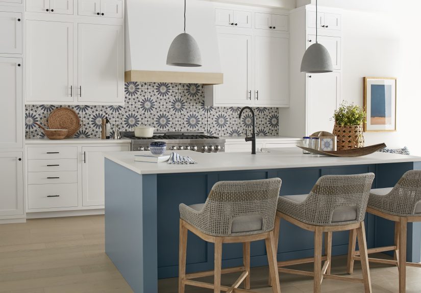
2. Dusty Blue for Calm, Coastal Energy
If your dream kitchen mood board says “calm, but make it Instagrammable,” dusty blue is your friend. Color directors at Sherwin-Williams and other major paint brands frequently point to soft, slate-leaning blues as a go-to with white cabinetry because they bridge warm and cool undertones.
These blues are muted enough not to scream “nursery,” but colorful enough to keep a white kitchen from feeling flat. They’re especially flattering with cooler whites and polished nickel or chrome hardware.
Best for:
- Coastal, cottage, or transitional kitchens
- Cooler white cabinets and gray veined countertops
- Smaller spaces that need a color boost without feeling busy
Pro tip:
Pair dusty blue walls with a slightly warmer white on the cabinets to keep things from feeling too chilly. A subtle contrast in temperature can make the space feel more layered and lived-in.
3. Soft Blush and Dusty Pinks for a Gentle Glow
Blush walls in a kitchen? Paint pros say yesif you pick the right ones. Highly regarded brands highlight dusty, plaster-like pinks as an unexpectedly elegant backdrop for crisp white cabinetry. These are not bubblegum or “Barbie Dreamhouse” shades; they lean toward beige or clay with just enough pink to warm up the room.
In the right dose, a blush-tinted wall color reflects flattering light onto both the space and your face. Think of it as the kitchen equivalent of a soft-focus filter.
Best for:
- Warm white cabinets with brass or gold-toned hardware
- Homes where the kitchen flows into a feminine or design-forward living room
- Spaces with lots of natural lightthe pink will feel subtle, not loud
How to keep it grown-up:
- Anchor the sweetness with black accents (bar stools, pendants, or cabinet hardware).
- Opt for natural texturesoak, linen, stoneto keep things earthy instead of precious.
4. Charcoal and Near-Black for Graphic Contrast
For those who love a bold look, designers increasingly recommend soft blacks and charcoals behind white cabinets. Experts at major paint companies describe near-black shades as “moody but elegant”especially when used on an accent wall or lower cabinets.
Instead of pure jet black, which can feel harsh, pros tend to choose charcoals with a whisper of blue or brown in them. These subtle undertones help the color read rich rather than flat and pair nicely with both warm and cool whites.
Best for:
- Kitchens with abundant natural light or strong artificial lighting
- Modern, industrial, or minimal styles
- White shaker cabinets with simple lines
Use it wisely:
- Try a charcoal accent wall behind open shelves or the range hood.
- Paint the island in a near-black shade and keep the walls a soft neutral.
- Balance with warm wood, woven shades, or brass to avoid a stark, high-contrast “checkerboard” look.
5. Moody Blue-Gray for Sophisticated Depth
If dusty blue feels a little too airy for your vibe, moody blue-gray might be the upgrade you’re looking for. Color pros at brands like Behr and Sherwin-Williams call out steely, blue-infused grays as an ideal partner to white cabinets because they offer depth, but still feel timeless.
These hues tend to shift throughout the dayreading bluer in daylight and more neutral at nightso they keep a white kitchen visually interesting without relying on bold color.
Best for:
- Transitional kitchens with a mix of classic and modern elements
- Cooler white cabinets and stainless-steel appliances
- Open-plan spaces that need a color strong enough to hold its own
Styling ideas:
- Pair with white subway tile for a clean, tailored look.
- Add texture through patterned tile, ribbed glass, or fluted wood details.
6. Sage and Herbal Greens for a Nature-Inspired Kitchen
Sage green might be the unofficial mascot of “warm modern” kitchens. Designers and color consultants repeatedly recommend gray-green and herb-inspired shades with white cabinets because they feel grounded, calming, and timeless.
These soft greens work especially well with warm whites, butcher-block countertops, and natural stone. They’re strong enough to add personality, but quiet enough to let your cabinets, counters, and lighting shine.
Best for:
- Farmhouse, cottage, Scandinavian, and “organic modern” kitchens
- Warm white cabinets with warm metals (brass, copper, bronze)
- Homes where the kitchen looks out to a garden or yard
Where to use it:
- On the walls, with white cabinets and trim for a classic look
- On the lower cabinets or island, keeping walls off-white
7. Warm Greige Neutrals for Soft, Tonal Contrast
Not into bold color, but don’t want an all-white box? Enter greige: the love child of gray and beige. Design bloggers and color specialists single out warm, low-contrast greiges as some of the best wall colors to pair with white kitchen cabinets because they add depth without stealing focus.
These colors are particularly good with slightly creamy whites; together, they create a layered, tonal look that feels high-end and incredibly livable.
Best for:
- Homeowners who want a “can’t miss” neutral
- Warm white cabinets and wood or luxury vinyl plank flooring
- Open floor plans where one color needs to work hard across multiple rooms
Design notes:
- Greige walls can make white cabinets feel brighter and crisper by comparison.
- They’re also forgiving with everyday messsplashes and smudges are less visible than on pure white walls.
8. Warm White-on-White for an Airy, Gallery-Like Feel
Sometimes the best color with white cabinets is… another white. Manufacturers like Benjamin Moore and Sherwin-Williams highlight soft off-whites as popular choices for both cabinets and walls, especially when you want a serene, almost gallery-like space.
The key is to avoid a sterile “rental” white. Instead, designers usually choose a slightly warmer or cooler white for the walls than the cabinets. That subtle shift keeps the room from looking flat while maintaining a bright, cohesive look.
Best for:
- Minimalist or contemporary kitchens
- Spaces with limited natural light that need all the brightness they can get
- Homes where colorful art, rugs, or bar stools take center stage
How to keep white from feeling boring:
- Layer textureszellige tile, woven pendants, wood stools, stone counters.
- Play with sheen: eggshell on walls, satin or semi-gloss on cabinets and trim.
9. Terracotta and Clay Tones for Cozy Warmth
Warm, sun-baked terracotta and clay-inspired hues are trending hard in kitchensand they’re fantastic with white cabinets. Recent roundups of kitchen color ideas and editor-approved paint picks frequently point to earthy oranges, muted rusts, and clay tones as a way to cozy up otherwise all-white spaces.
On walls, these shades create a soft, enveloping warmth that makes white cabinets pop without feeling stark. They also play well with stone counters, terracotta floor tile, and black or bronze fixtures.
Best for:
- Warm white cabinets and natural woods
- Homes with Mediterranean, Southwestern, or boho influence
- Kitchens that need to feel welcoming during long, dark winters
Keep it balanced:
- Choose terracottas with plenty of gray in them so they feel sophisticated.
- Use white tile and airy window treatments to keep the room from feeling heavy.
10. Jewel-Tone Berry and Violet for Bold Personality
For color lovers, designers sometimes reach for rich berry and violet tones as a daring complement to white cabinets. Paint experts highlight deep wine and purple-leaning shades as surprisingly versatile when paired with clean whiteespecially on lower cabinets, an island, or a single feature wall.
These shades read sophisticated rather than “kids’ playroom” because they’re muted and grounded by brown or red undertones. Against white cabinets, they create that “tuxedo” effect designers love: light up top, drama below.
Best for:
- Homeowners who want a statement kitchen
- White shaker or flat-panel cabinets with simple hardware
- Spaces where the island is the visual star
Success tips:
- Pair with simple, quiet wall colorssoft white, pale greige, or light sage.
- Repeat the berry tone in small touches like art, textiles, or a runner for cohesion.
How to Choose the Right Color for Your White Kitchen
Now that you’ve seen what the pros love, how do you pick just one (or two) for your own space? Designers suggest walking through these steps:
- Identify your cabinet undertone. Compare your cabinet door to a bright, neutral white sheet of paper. If the cabinets look creamier or slightly yellow by comparison, they’re warm. If they look grayer or slightly blue, they’re cool.
- Decide on the vibe. Do you want calm and airy (white-on-white, greige, sage), cozy and cocooning (olive, terracotta), or bold and graphic (charcoal, berry, deep blue)? Your answer eliminates half the paint aisle instantly.
- Shortlist 3–5 shades. Use brand recommendations and online color guides to create a small lineup instead of starting from scratch with the full fan deck.
- Sample smart. Paint large swatches on poster board and move them around the kitchen: behind the stove, near the window, beside the fridge. Look at them morning, afternoon, and night.
- Check with your finishes. Hold samples against your countertop, backsplash, flooring, and hardware. If any pairing suddenly makes the other surface look dingy or strange, that paint’s a no.
Real-World Experiences with Paint Colors and White Cabinets
Ask any paint pro and they’ll tell you: picking colors for white kitchen cabinets is part science, part therapy. Here are some very real patterns they see over and over againand what you can learn from them.
1. The “too safe” all-white kitchen. Many homeowners start with bright white walls and bright white cabinets because it feels like the safest choice. In reality, it often ends up looking flat or clinical, especially under cool LED lighting. Pros are constantly called in to warm things up with a softer wall colorusually a greige, soft sage, or off-white with a little warmth. The moment those tones go on the wall, the cabinets suddenly look intentionally crisp instead of accidentally sterile.
2. The undertone surprise. Another common story: someone paints their walls a cool, grayish blue only to discover their “simple white” cabinets lean creamy or slightly yellow. Suddenly, the cabinets look dirty next to the new color. Designers spend a lot of time explaining that white is never truly just white; there’s always an undertone. Matching warm with warm and cool with cool avoids that awkward “my cabinets went beige overnight” effect.
3. The north-facing kitchen dilemma. North-facing kitchens naturally lean cool, so even warm colors can look a bit grayer. Homeowners who pick very cool blues or grays often feel their kitchen is dark and chilly. When pros come in, they usually steer these spaces toward warm greige, sage with a yellow undertone, or soft terracotta. Those colors counteract the cool light and make white cabinets feel cozy rather than icy.
4. The open-concept headache. In open-plan homes, people sometimes fall in love with a strong kitchen colorsay, deep olive or moody blue-grayonly to realize it clashes with their living room walls. Experienced decorators usually start by zooming out: they treat the entire open area as one big canvas. Often, the solution is a flexible neutral (like greige) out in the open, with bolder color reserved for the kitchen island, pantry door, or a single feature wall. The white cabinets then act as the “bridge” between those colors and the rest of the house.
5. The island as a test lab. Paint pros love using the island as a safe way to experiment. A homeowner who’s nervous about dark colors on the walls might try charcoal, navy, or berry just on the island while keeping the walls a soft neutral. If they love it, they can later extend that color to a pantry door or a small accent area. If they don’t, repainting one island is much less painful than repainting an entire room.
6. The “sample small, regret big” issue. One of the most common regrets is choosing paint based on a tiny swatch. Those 2-inch chips look adorable in the store but behave very differently on a full wall. Pros constantly encourage clients to paint giant samples or use peel-and-stick swatches the size of a baking sheet. You see the true personality of the colorhow sage suddenly leans gray at night, or how blush looks more like beige in bright daylightbefore investing in gallons of paint.
7. The happy ending: layered, not perfect. The success stories almost always sound the same: homeowners start with white cabinets, choose a thoughtful wall color that respects undertones, then layer in texture and accent shades slowly. Maybe a moody blue-gray on the walls, a warm wood island, brass hardware, and some terracotta pottery on the shelves. The result isn’t showroom-perfect; it’s better. It feels personal and lived-inexactly what a white kitchen is supposed to become once the right paint colors join the party.
Final Thoughts
White kitchen cabinets give you an incredibly forgiving starting point, but the paint color around them is what makes the room feel like your kitchen. Whether you’re drawn to deep olives, calm blues, soft blush, or classic greige, the trick is simple: respect the undertones, test generously, and let your lifestyle (not just the latest trend) guide your choice.
Do that, and your white cabinets won’t just look good on move-in daythey’ll keep looking right for years, even as you swap rugs, hardware, and art. Paint is the easiest part of a kitchen to change. Picking the right color just means you won’t feel like changing it every six months.