Table of Contents >> Show >> Hide
- Why Pencil Drawings Still Win (Even in a Digital World)
- Meet the Pencil Family: Grades, Types, and What They’re Good For
- Paper Isn’t Just Paper: Picking a Surface That Behaves
- The Core Skills That Make Pencil Drawings Look “Real”
- Pencil Drawing Techniques That Actually Work
- Textures You Can Create with Pencil (and How)
- Highlights and Erasing: How to “Draw with Light”
- Composition: Make It More Than a Perfect Apple
- Common Pencil Drawing Problems (and Fast Fixes)
- Finishing and Protecting Pencil Drawings
- A Simple Practice Plan (15 Minutes a Day)
- Experiences Related to Pencil Drawings (A Very Real 500-Word Vibe Check)
- Conclusion
Pencil drawings are proof that you don’t need a studio full of fancy supplies to make something that stops people mid-scroll.
With a stick of graphite (and maybe an eraser that’s seen things), you can sketch quick ideas, build photoreal textures, or
shade a sphere so convincing it deserves its own lighting crew. Pencil is humble, forgiving, and surprisingly deepkind of like
the friend who seems chill until they casually reveal they speak three languages.
This guide walks you through the real-world essentials: choosing pencils and paper, mastering values, building believable textures,
avoiding the classic “smudged palm signature,” and finishing your work so it lasts. Whether you’re brand-new or you’ve been drawing
for years, you’ll find practical techniques, specific examples, and a few laughsbecause art is serious, but you don’t have to be.
Why Pencil Drawings Still Win (Even in a Digital World)
Pencil drawing sits in a sweet spot: it’s fast enough for brainstorming, precise enough for detail work, and flexible enough for
everything from loose gesture sketches to hyper-detailed portraits. Graphite can whisper (light construction lines) or shout
(deep shadows), and it can do both on the same page without needing a recharge cable.
Plus, pencil teaches fundamentals better than almost any medium. When you don’t have color doing the heavy lifting, value,
edges, and proportions matterso your drawing skills get stronger instead of just “more complicated.”
Meet the Pencil Family: Grades, Types, and What They’re Good For
The Graphite Grade Scale (H, HB, B) in Plain English
Most drawing pencils use an H/B system. “H” pencils are harder and make lighter marks; “B” pencils are softer and make darker,
richer marks. “HB” sits near the middle (and often lines up with what many people call a “No. 2” style everyday pencil).
The reason is simple: pencil cores are typically made from a blend of graphite and clay/bindermore binder usually means harder
and lighter; more graphite usually means softer and darker.
- 2H–6H: crisp, light lines for planning, architecture-style precision, and clean underdrawings
- H–HB–F: balanced control for general sketching, writing, and light shading
- 2B–6B: the “artist comfort zone” for shading, deeper values, and soft transitions
- 8B–9B (and beyond in some brands): very dark values, expressive strokes, and bold contrast
Wood-Cased vs. Mechanical vs. Woodless
Wood-cased pencils are the classic all-rounderseasy to sharpen, easy to vary line width with the angle of your hand,
and widely available in grade sets. Mechanical pencils are great for consistent line width and fine detail, especially
for technical drawings or clean hatching. Woodless graphite (solid graphite sticks shaped like pencils) are excellent
for broad shading and dramatic coveragejust know they can be more smudge-prone because they lay down a lot of graphite quickly.
Bonus Members: Charcoal and Conté (Not the Same as Graphite)
Charcoal pencils and conté crayons can look similar on the outside, but they behave differently. Charcoal tends to be matte and
velvety with bold darks; conté is often firmer and can create crisp strokes. Graphite, on the other hand, can become shiny (“graphite
glare”) in heavy layers. Knowing which tool you’re using helps you predict the finish and the smudge factor.
Paper Isn’t Just Paper: Picking a Surface That Behaves
Paper choice can make the same pencil feel completely different. The key word is tooththe texture of the paper that
“grabs” graphite. More tooth holds more layers but can look grainier; smoother paper gives clean detail and smoother blends but may
show smudges more easily and can resist heavy layering.
Common Paper Options for Pencil Drawings
- Bristol smooth/plate: great for fine detail, clean lines, and polished realism
- Bristol vellum: a little toothiernice for layered shading and softer textures
- Drawing paper (medium texture): versatile, friendly for practice, and good for everyday sketching
- Hot-press vs. cold-press: hot-press is smoother; cold-press is rougher and more textured
If you’re making work you want to keep (or sell, or frame, or proudly show your future self), look for paper labeled acid-free
and archival. It helps reduce yellowing and brittleness over time. Also consider weight: heavier paper generally tolerates more
erasing, layering, and blending without falling apart like a sad napkin.
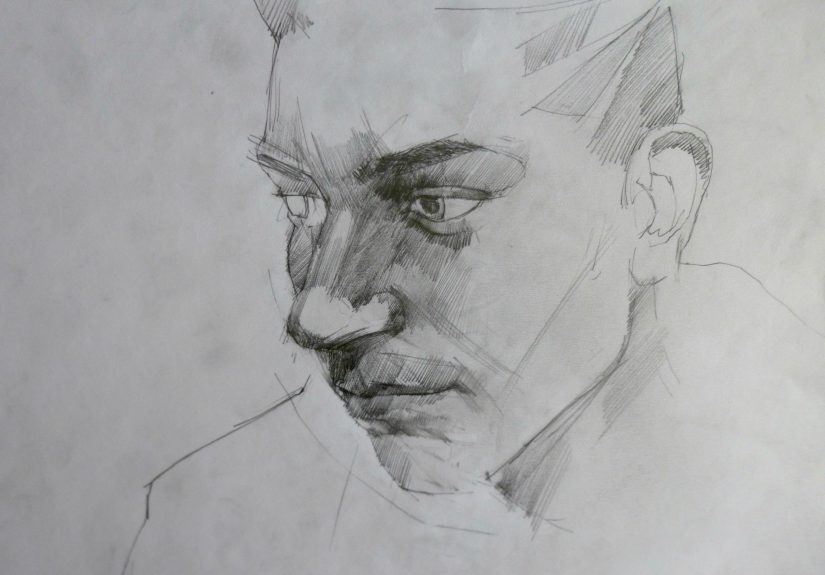
The Core Skills That Make Pencil Drawings Look “Real”
Realism is less about magical talent and more about a few fundamentals working together: shape, value,
and edges. If you nail those, texture and detail become the icingnot the entire cake.
Value: The Secret Sauce of Form
Value is how light or dark something is. A believable drawing usually has a full range: clean lights, readable midtones, and confident
darks. If everything is midtone, the drawing can feel flat. If everything is dark, it can look muddy. Aim for a deliberate range.
Edges: Where Realism Lives (and Where It Hides)
Edges tell the eye what to focus on. Sharp edges feel crisp and close; soft edges feel distant or gently turning. A common realism trick
is “lost-and-found” edges: let some contours soften or disappear into shadow so the drawing breathes instead of looking like a cutout.
Pencil Drawing Techniques That Actually Work
1) Pressure Control: Your Cheapest Upgrade
Before buying more supplies, practice controlling pressure. Light pressure gives room for correction and cleaner layers. Heavy pressure
can crush paper tooth early, making it harder to build smooth shading later. Think “sneaking up on the darks,” not “charging at them.”
2) Hatching and Cross-Hatching
Hatching is shading with parallel lines. Cross-hatching stacks layers of lines at different angles. It’s one of the best ways to create
value without smearing everything into a graphite fog.
- Example (sphere): curve your hatching around the form like latitude lines; add cross-hatching in the core shadow
- Example (fabric folds): tighten line spacing in deep creases; widen spacing on light-facing planes
- Pro tip: keep lines confidentwobbly lines read as uncertainty (even if you’re very certain you’re uncertain)
3) Stippling and Controlled Scribble
Stippling uses dots; controlled scribble uses small, consistent loops. Both can build value gradually and create organic textures.
They’re great for stone, skin pores (subtle!), and atmospheric shading without obvious directional lines.
4) Blending (Do It on Purpose, Not as a Panic Response)
Blending can create smooth gradients, but it’s easy to overdo and end up with a shiny, muddy surface. If you blend, do it intentionally:
apply graphite evenly, then blend lightly to unifynot to erase your structure. Many artists prefer tools like blending stumps, soft tissue,
or clean paper rather than fingers, since skin oils can leave uneven patches or make the graphite behave weirdly later.
- Example (cheek in a portrait): build soft midtones with light layers (HB to 2B), then blend gently to remove grain
- Example (metal spoon): blend the midtones, but keep the highlights sharp and clean for “metal” energy
Textures You Can Create with Pencil (and How)
Hair: Think “Groups,” Not “Single Strands”
Drawing every hair strand is a shortcut to exhaustion. Block in big value shapes first (the overall mass), then add a few sharp
strand accents where the light hits. Use a kneaded eraser to lift highlights in long, gentle strokes.
Skin: Softer Contrast, Cleaner Transitions
Skin usually has subtle shifts in value. Keep edges softer, avoid outlining features too harshly, and let shadows transition gradually.
Save your darkest darks for places like nostrils, lash lines, and deep creasessmall areas that make the rest feel realistic.
Wood: Value First, Grain Second
Start with the basic light-to-dark shape of the wood surface. Then suggest grain with directional lines and a few broken patterns.
Randomize the grain so it doesn’t look like a wallpaper print.
Glass and Glossy Surfaces: Contrast + Sharp Edges
Glass reads as glass when it has bold value jumps and crisp highlights. Don’t be afraid of deep darks right next to clean whites.
The “shine” is usually more about sharp edge control than about blending.
Highlights and Erasing: How to “Draw with Light”
In pencil drawings, highlights often come from the paper itself. That means you protect your lights early by drawing lightly and
avoiding smudges. Then you refine highlights with erasersyes, erasers are drawing tools, not just mistake punishers.
- Kneaded eraser: great for lifting graphite gently, softening edges, and pulling out subtle highlights
- Vinyl/plastic eraser: stronger removal for crisp highlights and clean corrections
- Precision/pen eraser: handy for tiny highlights like catchlights in eyes or sparkle on jewelry
Composition: Make It More Than a Perfect Apple
A technically good drawing can still feel “meh” if the composition is boring. Composition is how you arrange shapes, values, and focus.
Even a simple subject improves when you crop boldly, push contrast near the focal point, and simplify the background.
- Use contrast strategically: highest contrast near the focal area; softer contrast elsewhere
- Try a big value shape: one strong shadow shape can unify the whole drawing
- Leave breathing room: negative space is not “empty,” it’s “resting”
Common Pencil Drawing Problems (and Fast Fixes)
Problem: “My shading looks dirty.”
Fix: work from light to dark, keep a clean sheet under your drawing hand, and avoid grinding graphite into the paper
with heavy pressure. Also: keep your darkest values reserved for a few key areas so everything else doesn’t look smoked.
Problem: “It’s shiny in the dark areas.”
Fix: graphite can reflect light when layered heavily. Use hatching/cross-hatching instead of endless blending, and consider
using a softer pencil grade (like 4B–6B) with lighter pressure rather than pressing hard with HB. Let the pencil do the work, not your wrist.
Problem: “I can’t get smooth gradients.”
Fix: build gradients in layers. Start with a lighter pencil (HB/2B), then deepen with additional layers. Change direction
between layers (like gentle cross-hatching) and blend lightly only at the end to unify texture.
Problem: “My paper is pilling from erasing.”
Fix: use lighter pressure, a kneaded eraser for gentle lifting, and choose slightly heavier paper if you plan to erase a lot.
If a spot starts to break down, stop attacking itwork around it and soften the area instead.
Finishing and Protecting Pencil Drawings
Pencil drawings are vulnerable to smudging because graphite sits on the surface. The best protection is good handling and storage:
keep drawings flat, use clean interleaving sheets, and store them in acid-free folders or protective sleeves. If you frame a drawing,
using glazing (like glass or acrylic) helps protect it from contact and environmental grime.
What About Fixative?
Fixatives are used in many dry media workflows, but they can change values, deepen darks, or alter the surface sheenso if you use one,
test it first on a scrap piece with the same paper and pencil layers. For many graphite drawings, careful storage and framing do more
to protect the work than spraying does. If you choose to use a spray product, follow the label directions carefully and use it only in
a well-ventilated area.
A Simple Practice Plan (15 Minutes a Day)
- Day 1: draw a 5-step value scale (light to dark) using one pencil grade
- Day 2: shade a spherefocus on light/shadow separation and edge control
- Day 3: texture study: choose one (wood, hair, fabric) and build it from big values to small details
- Day 4: master study: copy a small section of a great drawing to learn mark-making
- Day 5: quick sketch session: 5-minute drawings to train observation without overthinking
Repeat weekly and swap subjects. Consistency beats marathon sessions. Your hands learn through mileage, not motivational speeches.
Experiences Related to Pencil Drawings (A Very Real 500-Word Vibe Check)
If you’ve ever started a pencil drawing feeling confident and ended it staring into the middle distance like your sketchbook just
told you a plot twist, congratulationsyou’re having a normal artist experience. Pencil drawings have a special way of making you feel
both wildly powerful and strangely humbled in the same 30 minutes.
One of the first “aha” moments many artists have is realizing that the pencil isn’t the magicthe values are. You can draw the
cleanest outline in the world, but the second you try to shade it, the truth arrives: the paper is a stage and your graphite is the
lighting designer. That’s usually when someone discovers the joy of building a value scale… and also the frustration of making the
“darkest dark” look like a polite midtone because they were scared to commit. (Pencil drawings teach commitment gently, then repeatedly.)
Another classic moment: trying a softer pencil grade for the first time. You go from HB to 4B or 6B and suddenly shadows appear with
way less effort. It feels like unlocking a secret leveluntil you realize the softer pencil also smudges if you look at it too hard.
That’s when the “clean sheet under the hand” habit is born. Many people remember the exact day they learned their palm can accidentally
become a blending tool and their drawing can become a slightly shiny fog bank. Not a tragedyjust graphite doing graphite things.
Paper surprises are part of the journey, too. Smooth Bristol might make your details crisp and your blends look silky, while a toothier
sheet can turn the same shading into a grainy texture that’s either gorgeous or confusing, depending on what you wanted. It’s common to
think, “Why does this look different than yesterday?” and then realize yesterday was on a different sketchbook, a different paper surface,
or even a different humidity level. Pencil drawing teaches you to notice materials like a scientistexcept the lab equipment is a notebook
and a slightly suspicious eraser.
And then there’s the eraser experience: discovering that a kneaded eraser isn’t just for fixing mistakes, but for pulling highlights and
shaping light. The first time you lift a soft highlight on a cheek or pop a catchlight in an eye, it feels like the drawing wakes up.
It’s also the moment many artists become emotionally attached to a small gray blob of rubber. You think you own the eraser. Soon you learn
the eraser owns you.
Over time, pencil drawings become less about “Can I make this realistic?” and more about “What do I want this to feel like?” You start
noticing edges, deciding where to sharpen and where to soften. You choose what gets detail and what stays quiet. That shift is huge:
it’s when your pencil drawings start looking intentionallike a choice, not a struggle. And yes, you’ll still occasionally smudge something
right before it’s done. But eventually you’ll laugh, fix it, and keep going… because pencil drawings don’t reward perfection. They reward
patience, observation, and the willingness to try again on a fresh page.
Conclusion
Pencil drawings are a lifelong skill: simple to start, endlessly deep to master. With the right pencil grades, a paper surface that supports
your style, and a focus on fundamentals like value and edge control, you can create drawings that feel dimensional, expressive, and clean.
Build darks gradually, protect your highlights, use erasers as tools, and practice in small, consistent sessions. The results add up fast
and your sketchbook becomes proof.