Table of Contents >> Show >> Hide
- What Exactly Is the Campaign?
- Why People Keep Calling It “Scary”
- Why the Internet Is Divided (Beyond “I Like It” vs “I Don’t”)
- The Fashion Details People Are Actually Talking About
- So…Is It Art, Marketing, or Both?
- What This Moment Says About Miley (and About the Brand)
- How to Read the Reactions Without Losing Your Mind
- of Real-World “Experience” Around This Kind of Viral Fashion Moment
- Conclusion
The internet has two modes: (1) unanimous obsession and (2) a group project where everyone chooses a different topic and still argues.
Miley Cyrus’ new Maison Margiela campaign landed squarely in mode #2.
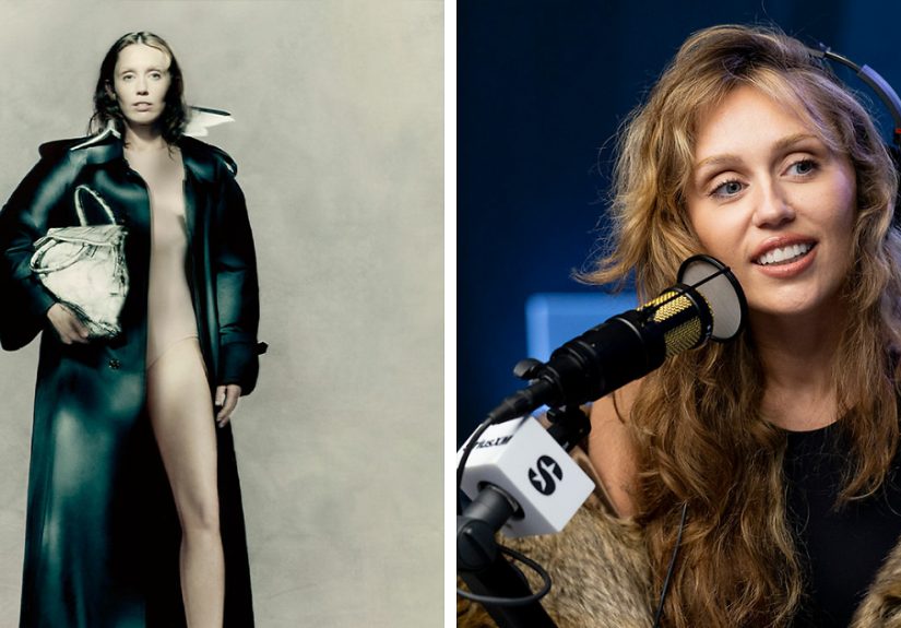
In a series of moody, painterly portraits, Cyrus appears styled with white body paint and signature Margiela cuesespecially the instantly recognizable Tabi boots.
Some viewers called it high fashion at its most daring and poetic. Others labeled it “scary,” confusing, or proof that the brand has wandered away from its famously
anti-celebrity roots. And because the internet can’t resist a good debate, the reactions multiplied faster than “tabi-toe” jokes.
What Exactly Is the Campaign?
The images are part of Maison Margiela’s Autumn/Winter 2025 campaign, shot by fashion photographer Paolo Roversi. Cyrus is presented as a kind of living canvas:
minimal styling, soft-focus lighting, and a stark palette that puts the emphasis on texture and form rather than flashy set pieces.
The campaign matters for one headline reason: Margiela has historically avoided celebrity-fronted advertising. This is widely described as the brand’s first major
celebrity “face” momentan eye-catching pivot for a house known for anonymity, subversion, and a cult-like devotion to concept over clout.
The Visual Hook: White Paint, Quiet Drama, Loud Opinions
The white paint isn’t random. It’s a clear nod to Margiela’s “bianchetto” idea: a white-overpaint approach used to create a blank surface that still hints at what
came beforelike history showing through a fresh coat. On a garment, it reads as time and wear; on a person, it reads as art, performance, and (for some audiences)
a slightly haunted porcelain-doll vibe.
Why People Keep Calling It “Scary”
“Scary” isn’t always an insult onlineit’s often shorthand for “this made me uncomfortable and I don’t know what to do with that feeling.”
Margiela’s aesthetic has long played with discomfort on purpose: deconstruction, anonymity, unusual silhouettes, and presentations that can feel like art installations.
This campaign taps that same energy, but with a global pop star as the subject, the effect gets amplified.
Three Reasons the Imagery Hits Some Viewers Like a Jump Scare
-
Uncanny minimalism: The stripped-back portraits leave fewer “normal” cues (bright color, busy styling, big accessories) for the brain to latch onto.
When a photo is too quiet, people project meaning onto itsometimes eerie meaning. -
Body-as-canvas styling: Body paint in fashion can read as artistry to one person and vulnerability to another. The same creative choice can feel
empowering or unsettling depending on the viewer’s comfort level and assumptions. -
Margiela’s signature weirdnessturned up: When a house known for conceptual design leans into stark symbolism, it can be polarizing by design.
That’s not a bug. That’s the brand language.
Why the Internet Is Divided (Beyond “I Like It” vs “I Don’t”)
The backlash isn’t just about aesthetics. The louder argument is about identity: who Margiela is, who it’s for, and what it means when a brand built
on rejecting celebrity culture makes a celebrity its centerpiece.
Team “This Is Brilliant”
Supporters see a smart collision of worlds: Cyrus has a long track record of reinvention, boundary-pushing visuals, and turning public judgment into creative fuel.
In that context, using her as a muse for a house that thrives on provocation feels less like a random stunt and more like a strategic match.
They also argue that the campaign is conceptually faithful. The bianchetto reference signals craft and heritage, not shock for shock’s sake. Roversi’s stylesoft,
intimate, and dreamlikepushes the work toward fine-art portraiture rather than typical glossy fashion ad energy.
Team “Margiela Would Never (…Would He?)”
Critics point to the house’s long-standing reputation for anonymity and anti-celebrity posture. For them, putting a megastar at the center risks flattening the
very mystery that made Margiela feel different. In other words: if the brand used to feel like an inside conversation, a celebrity campaign can feel like it just
grabbed a microphone and shouted it into a stadium.
Another critique: when a famous person anchors the message, interpretation narrows. Instead of viewers focusing on technique, construction, and concept, the internet
defaults to the celebrity’s history, persona, and past controversies. The art becomes a referendum on the personbecause the internet is extremely efficient at
turning everything into a referendum.
The Fashion Details People Are Actually Talking About
Even amid the discourse, the campaign is packed with Margiela calling cards that fashion fans recognize instantly. The styling leans into signature house codes
deconstruction, second-skin silhouettes, and the Tabi boot shape that’s basically a personality test at this point.
The Tabi Boots: Instant Margiela, Instant Debate
The Tabi is one of those design elements that doesn’t do “neutral.” You either see it as iconic craftsmanship or as the shoe version of someone saying,
“I’m not like other footwear.” In the campaign, the Tabis function like a brand signature stampproof that even when the styling is minimal, the identity is loud.
The Bianchetto Reference: A White Layer With a Message
Bianchetto is often described as a white-overpaint technique used to create a surface that changes with time, cracking and revealing what’s underneath.
In campaign form, that idea can be read as metaphor: fame as a painted layer, reinvention as a constant repaint, or authenticity as the thing that still shows through.
No wonder the internet is arguingthis is basically symbolism bait.
So…Is It Art, Marketing, or Both?
Yes.
Fashion campaigns have always lived in the overlap between creative expression and selling stuff. Margiela just tends to make that overlap feel more like a gallery
opening than a shopping mall. The Cyrus campaign doesn’t abandon that traditionit updates it for a world where attention is the main currency and celebrity is a
distribution channel.
Why This Campaign Feels Different From Typical Celebrity Ads
- It’s not “smile and hold the bag”the images are moody, minimal, and concept-forward.
- The styling is intentionally unsettling to some viewers, which is closer to avant-garde editorial than mainstream brand marketing.
- The references are insider-coded (bianchetto, house archetypes, signature boot language) rather than purely trend-driven.
What This Moment Says About Miley (and About the Brand)
For Cyrus, the campaign reinforces a familiar narrative: she’s comfortable being polarizing, and she’s willing to treat her image as a medium rather than a static
brand. That’s been a through-line of her careerwhen the public thinks it has her pinned down, she changes the frame.
For Maison Margiela, the bigger story is visibility. Luxury houses are competing in an attention economy where quiet craftsmanship often loses to loud celebrity.
Using Cyrus as a muse doesn’t automatically mean “selling out,” but it does signal a strategic shift: Margiela is willing to meet the mainstream where it lives,
then bring it back into the house’s strange, conceptual world.
How to Read the Reactions Without Losing Your Mind
If you’re watching the discourse and feeling whiplash, here’s the cheat code: people aren’t only reacting to a photograph. They’re reacting to what the photograph
representscomfort boundaries, brand authenticity, celebrity culture, and whether fashion should make you feel something (even if that something is confusion).
A Quick “Why Are People Mad?” Checklist
- Comfort level: Body paint styling is a lightning rod because it triggers different personal boundaries.
- Brand identity: Margiela loyalists care deeply about the house’s anti-celebrity mythology.
- Interpretation overload: The campaign is symbol-heavy, which invites hot takes like moths to a ring light.
- Internet incentives: Outrage travels faster than nuance. Always has, always will.
of Real-World “Experience” Around This Kind of Viral Fashion Moment
If you’ve ever opened your phone, seen a fashion image everywhere at once, and thought, “Waitare we celebrating this or calling an emergency meeting?” you already
know the emotional arc of a viral campaign. First comes the scroll-stopping image. Then comes the group chat. Then comes the one friend who’s an art-history nerd
explaining technique like they’re defending a dissertation. Then comes the other friend who says, “I don’t care what it symbolizes, it’s giving haunted mannequin.”
What’s funny (and slightly exhausting) is how quickly the conversation stops being about clothing and becomes about identity. Someone will say, “Margiela would never,”
and suddenly you’re debating not just a campaign, but the entire idea of brand purityas if fashion houses are museums instead of businesses with payrolls. Someone
else will say, “Miley’s always been fearless,” and now you’re dissecting celebrity reinvention, public judgment, and whether controversy is a creative tool or just
a recurring weather pattern.
These moments also reveal how differently people interpret the same image based on personal comfort. For some, minimal styling and body paint read as creative freedom:
the body becomes a canvas, the photo becomes portraiture, and the lack of obvious “outfit” forces you to focus on form, mood, and concept. For others, that same
minimalism feels too exposed or too confrontationalless “editorial art” and more “why do I feel like I walked into a gallery at the exact moment everyone turned
to stare at me?” Neither reaction is automatically wrong; they’re just different lenses.
The most relatable part, though, is how internet discourse makes everything feel urgent. You can appreciate a campaign and still admit it’s unsettling. You can find
it “scary” and still understand the reference. You can dislike celebrity branding and still concede that Roversi’s dreamy, soft-focus style gives the images a
painterly seriousness. In real life, most people hold mixed opinions. Online, mixed opinions get bullied by the algorithm until they choose a team.
The healthier “experience” is learning to treat polarizing fashion like spicy food: you don’t have to pretend it’s mild, and you don’t have to shame someone who
can’t handle it. If a campaign makes you feel somethingintrigue, discomfort, admiration, confusionthat’s the point. Margiela has always thrived in the space where
taste gets complicated. The only new twist is that now, thanks to Miley, the argument isn’t happening only among fashion insiders. It’s happening everywhere, all at
once, with comment sections acting like a chaotic town hall. And honestly? That might be the most Margiela outcome of all.
Conclusion
Miley Cyrus’ Margiela body paint campaign is polarizing because it presses on multiple buttons at once: art vs marketing, anonymity vs celebrity, discomfort vs
empowerment, heritage vs reinvention. If you love it, you probably love fashion that behaves like art. If you hate it, you might be reacting to the same thing
just with less patience for conceptual drama.
Either way, the campaign did what fashion campaigns are built to do: it made people look, react, and talk. And if the internet can’t agree on whether it’s genius
or terrifying… congratulations, Maison Margiela. You made a Margiela campaign.