Table of Contents >> Show >> Hide
- How This Movie Poster Project Started
- The Design Rules I Set Before Drawing a Single Line
- The 6 Reimagined Movie Posters, One by One
- The Revenant (2015): Survival in a Blizzard of Brushstrokes
- Midsommar (2019): A Festival of Flowers and Foreboding
- Crawl (2019): Flooded Horror in a Tight Frame
- It: Chapter One (2017): When the Balloon Steals the Scene
- Klaus (2019): Storybook Whimsy with Cinematic Depth
- You’re Next (2011): Masks, Patterns, and Domestic Terror
- What Reimagining These Posters Taught Me About Movie Art
- Want to Reimagine Your Own Favorite Movie Posters? Start Here
- My Personal Experience Sharing These Reimagined Movie Posters Online
Every movie lover has that one moment in the theater when the lights dim, the logo fades,
and the poster you saw in the lobby suddenly clicks into place. For me, that moment turned
into an obsession. I wasn’t just watching films – I was mentally redesigning their posters:
changing the colors, simplifying the composition, sneaking in symbols only fans would notice.
Eventually I stopped just daydreaming and actually did it. I chose six of my favorite films
and fully reimagined and illustrated their movie posters from scratch. What started as a
personal challenge ended up being featured on Bored Panda and shared around the internet by
fellow movie nerds and art lovers. No pressure, right?
In this article, I’ll walk you through how the project started, the design rules I used,
how I approached each of the six posters, and what I learned along the way. If you’ve ever
wanted to redesign a movie poster yourself, consider this your behind-the-scenes tour.
How This Movie Poster Project Started
Like a lot of illustrators, I began with big animation dreams. In school I was the student
who always spent way too long noodling on tiny details in the corner of a frame. While that
didn’t exactly fit the “animate 500 frames by Monday” culture, it did reveal something:
I’m happiest when I can obsess over one powerful image and pack it with meaning.
Movie posters turned out to be the perfect playground. A good poster is basically
visual haiku: one frame that captures the mood, genre, and emotional core of a story.
It’s not just “pretty art” – it’s marketing, storytelling, and design theory all crammed
into a vertical rectangle.
I started by making a list of films I deeply love across genres: atmospheric survival
epics, sun-drenched folk horror, creature features, cozy animated stories, and lean
home-invasion thrillers. From that list, six titles rose to the top:
The Revenant (2015), Midsommar (2019),
Crawl (2019), It: Chapter One (2017),
Klaus (2019), and You’re Next (2011).
My only rule for the project: I wasn’t allowed to simply “trace” or slightly tweak the
original posters. Each one had to feel like an alternate-universe official poster –
something that could feasibly hang in a theater, but clearly came from my own style
and storytelling priorities.
The Design Rules I Set Before Drawing a Single Line
Before I opened my sketchbook, I gave myself a simple framework so each illustrated poster
felt intentional, not just “cool for cool’s sake.” These were my guiding principles:
-
One strong concept per poster. Every design needed a single dominant
idea – a symbol, pose, or visual metaphor – that summed up the film’s emotional core. -
Color sets the mood first. I chose color palettes based on genre and
emotion: icy blues for brutal survival, sickly yellows and floral tones for folk horror,
warm reds and cozy neutrals for a holiday animated feature. -
Readable typography. Even though the illustrations are detailed, the
movie title and key credits had to be legible from across a room. If you can’t read it
at a glance, it’s not a good poster – it’s just fan art with text slapped on. -
Visual hierarchy. I arranged elements so the viewer’s eye flows from
title to central image to secondary details. Think of it like directing a little
three-second movie with someone’s gaze. -
Easter eggs for fellow fans. Each piece includes small details that only
people who know the film will catch – a pattern, prop, or bit of symbolism tucked into
the background.
With those rules in place, it was time to dive into the actual posters.
The 6 Reimagined Movie Posters, One by One
The Revenant (2015): Survival in a Blizzard of Brushstrokes
The original marketing for The Revenant leans hard into realism: icy landscapes,
Leonardo DiCaprio’s frostbitten beard, and gritty textures everywhere. For my illustrated
version, I leaned into something more symbolic and graphic.
I centered a tiny, lone figure trudging across a vast, negative-space snowfield. Above him
rises the enormous ghosted silhouette of a bear, its outline made from jagged tree branches
and claw-like shapes. The sky melts from icy blue at the top to a bruised red near the
horizon, hinting at both violence and sunset.
The title sits along the bottom in a tall, condensed typeface, reminiscent of carved wood
or trail markers. From a distance, the poster just reads as “human against something huge.”
Up close, the details reveal scars in the snow, faint tracks, and delicate texture work
that echo the raw, physical journey of the film.
Midsommar (2019): A Festival of Flowers and Foreboding
Midsommar is bright, floral, and terrifying – basically a horror film that looks
like a sun-drenched travel brochure. My poster had to be equally confusing in the best way.
I placed the protagonist in profile, wearing an oversized flower crown that dominates the
top half of the composition. But instead of ordinary blossoms, the crown transforms into
tiny illustrated scenes: ritual fires, runic symbols, dancers in white, and animal skulls
peeking out from petals.
The background is a clear, almost painfully bright sky, with the horizon line low and
minimal. The color palette is all warm yellows, soft blues, and hints of red creeping in
around the edges – like the feeling that something is very wrong, hiding in all that
sunshine.
The title is small but sharp, aligned near the bottom, as if the film itself is whispering
rather than screaming. It’s a poster that invites you to step closer, and the closer you
get, the more unsettling details you find.
Crawl (2019): Flooded Horror in a Tight Frame
Crawl is gloriously simple: woman + flooded house + alligators = nightmare.
For the poster, I wanted to capture that feeling of being trapped between just two bad
choices: up or down.
I split the composition horizontally. The top half is the storm-battered house at night,
framed in heavy rain and leaning power lines. The bottom half, beneath a thin floorboard
line, is an underwater cross-section of the crawlspace, murky with debris and shadows.
In the water, you see the main character’s flashlight beam cutting through the gloom, aimed
directly at the faint outline of an alligator’s eye. The color palette uses teal and deep
indigo with neon-like flashes of white from lightning and flashlight glare, creating a
sense of constant movement and danger.
The typography sits inside that dividing floorboard, almost like a warning label branded
between the two worlds: “Crawl.” Simple, bold, and slightly distressed, like it’s been
waterlogged too.
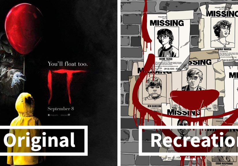
It: Chapter One (2017): When the Balloon Steals the Scene
The original It posters are already iconic, but I wanted to focus on one of the
film’s simplest yet creepiest symbols: the red balloon.
My reimagined poster is dominated by a single balloon in the center, rendered with painterly
highlights and reflections. At first glance, it’s just floating against an off-white, almost
foggy background. But if you look closely at the balloon’s surface, you see tiny distorted
reflections of the kids, the storm drain, and a hint of a wide, sharp smile.
The only other element is a thin, hand-drawn string that runs down to the bottom edge and
disappears off the page, like it’s being held just out of frame. The title sits in small,
blood-red letters at the very bottom, with “Chapter One” tucked underneath in a crisp,
serif font, echoing the feel of a novel’s first edition.
It’s minimal, but it lets the viewer do the heavy lifting in their imagination – which is
exactly what good horror, and good poster design, tends to do.
Klaus (2019): Storybook Whimsy with Cinematic Depth
Klaus has that rare mix of warmth, humor, and emotional punch – wrapped in some
of the most beautiful animation in recent years. I wanted my poster to feel like an
illustrated storybook cover that you’d want to pull off a shelf.
The composition places the characters on a narrow, snow-covered street, viewed from a
slightly bird’s-eye angle. The buildings lean inward, creating a natural frame around a
glowing postage-stamp of light at the center – the post office. Snowflakes are rendered
in soft, layered strokes that create depth without overwhelming the scene.
The color palette is mostly cool blues and purples, but the windows and central light
blaze with golden tones, pulling your eye toward the heart of the story: connection,
generosity, and the act of sending something out into the world.
The title uses a calligraphic style with looping strokes, reminiscent of hand-lettered
holiday cards, but kept clean enough to read instantly. Decorative flourishes around the
text hide small motifs: letters, toys, and tiny characters that fans will recognize.
You’re Next (2011): Masks, Patterns, and Domestic Terror
You’re Next is a home-invasion thriller that’s surprisingly stylish. For the
poster, I leaned into the contrast between “cozy family gathering” and “absolutely not
cozy at all.”
The central image is a dining table seen from above, perfectly set, with plates, candles,
and silverware arranged in an almost symmetrical pattern. At first, it looks like a
catalog shot from an upscale home goods brand.
Then you notice three of the chairs are occupied by figures in animal masks, their silhouettes
simplified but unmistakable. Their presence breaks the symmetry just enough to feel wrong.
A subtle smear of red cuts across one place setting, cleverly mirrored in the pattern on
the table runner so you’re not sure at first whether it’s blood or design.
The title appears in hand-drawn, scratchy letters along the bottom of the image, as if
carved into the table itself. It’s chaotic and human in contrast to the neatness of the
scene, hinting at the chaos to come.
What Reimagining These Posters Taught Me About Movie Art
Redesigning six movie posters from scratch was more than just a fun illustration exercise;
it doubled as a crash course in visual storytelling. Here are some of the biggest lessons
that stuck with me:
-
Less plot, more feeling. A poster doesn’t need to explain everything.
It should communicate mood and tone in a split second. If I tried to cram every plot
point into the artwork, the image fell apart. -
Color does half the talking. Warm, cozy palettes made even tense scenes
feel inviting; cold tones and high contrast pushed a design into thriller or horror
territory almost instantly. -
Typography is casting. The wrong font feels like miscasting a lead actor.
Clean, geometric type works differently from distressed, hand-lettered text, even before
you read the words. -
Details are rewards, not requirements. Fans love tiny hidden references,
but those come after the main impact. If the poster doesn’t work from across the room,
Easter eggs won’t save it. -
Constraints boost creativity. Limiting myself to one key visual metaphor
per poster forced me to think harder and design smarter, instead of just piling on more
elements.
Want to Reimagine Your Own Favorite Movie Posters? Start Here
If this kind of project sounds like something you’d love to try, good news: you don’t need
fancy gear or a Hollywood client list. You just need a film you adore and a willingness
to experiment. Here’s a simple roadmap you can follow:
-
Pick one movie you know by heart. It’s easier to design from memory
when you already understand the story’s emotional beats, visuals, and themes. -
Write a one-sentence “poster pitch.” Describe how you want the viewer
to feel when they see your poster. That sentence becomes your compass. -
Choose a single metaphor. Maybe it’s an object (a balloon), a location
(a flooded house), or a figure (a lone survivor in the snow). Build everything around
that one idea. -
Limit your color palette. Try 3–5 colors max at first. Ask yourself:
is this a cold story, a warm story, or a little of both? -
Thumbnail like crazy. Do lots of tiny sketches focusing only on
composition. Where does the eye go first, second, third? Don’t worry about details yet. -
Save typography for last – but plan for it early. Leave space for the
title and key text in your sketches so you don’t end up squeezing it in awkwardly later. -
Refine, don’t overwork. Add detail where it supports the story,
not just because “empty space feels weird.” Negative space is your friend.
Whether you’re working traditionally with pencil and paint or digitally on a tablet, the
fundamentals are the same: mood, composition, and clarity beat complexity every time.
My Personal Experience Sharing These Reimagined Movie Posters Online
When I finally finished the sixth poster and hit “publish,” I expected a handful of friends
to like the project, maybe a few fellow art students to comment on the colors. I did not
expect it to end up on Bored Panda, bounce around social media, and land in front of complete
strangers who had very strong feelings about both movies and fonts.
The first wave of reactions was pure adrenaline. People were tagging friends, arguing about
which version they liked better – the original studio posters or my reimagined ones – and
pointing out hidden details I had tucked in at 2 a.m. Those “oh, you noticed that!” moments
are like fuel for an illustrator’s soul.
There were also thoughtful critiques. Some viewers wished the horror posters were even more
minimal, while others wanted more character faces. A few noted that my type choices leaned
retro, which made me reevaluate how much vintage influence I was channeling without realizing
it. Instead of taking criticism as a personal attack, I started treating it as free user
testing for visual storytelling: what did people read instantly, and what needed more work?
The most meaningful responses didn’t come from designers at all, but from people who shared
their own experiences with mental health, creativity, and burnout. A lot of them resonated
with the idea of having a brain that doesn’t always match the speed of the modern world –
but still having something valuable to say visually. Seeing my posters in a curated, public
space made them feel “real” in a way a hard drive folder never could, and that visibility
opened the door for more honest conversations.
Practically speaking, the project also taught me how important it is to present your work
as a coherent series. Six posters with a consistent illustrative style, thoughtful captions,
and a clear narrative about why they exist made a much bigger impact than if I had posted
them randomly. People love stories, and that includes the story of how art comes to life.
Most of all, the experience reinforced a simple lesson: personal projects can change your
trajectory. Reimagining and illustrating six movie posters didn’t magically make me a
full-time film-poster designer overnight, but it did bring in new clients, create connections
with other artists, and sharpen the way I think about visual communication. It reminded me
that even in a noisy internet, there’s still room for lovingly crafted, slow-made art –
especially when it’s built around something as universal as our favorite films.
SEO JSON