Table of Contents >> Show >> Hide
- Why Silhouettes Work So Well on Posters
- The Concept: Building a Series, Not Just a Pretty One-Off
- Making Silhouettes: From Shadow to Shape
- Designing Each Poster: Composition That Doesn’t Panic
- Typography: How to Keep Type from Ruining the Vibe
- Color and Texture: Limited Palettes, Maximum Punch
- Printing and Paper: Where the Magic Gets Ink on It
- Common Mistakes I Made So You Don’t Have To
- How I Packaged the Series for Sharing
- Conclusion: Why I’d Do It Again (Even With the Ink on My Hands)
- 500-Word Addendum: Extra Lessons From the Silhouette Trenches
I didn’t set out to become “the silhouette person.” I just wanted to make a few posters that felt bold, readable, and a little dramaticwithout needing a cast of 400 background details and a pet dragon (dragons are expensive to print). Then I remembered the oldest special effect in the book: a shadow.
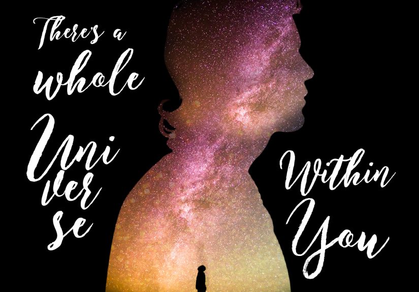
Silhouettes are visual shorthand with swagger. One shape can say “mystery,” “movement,” “romance,” “terror,” or “this person definitely owns a long coat.” And when you put that shape on a posterwhere attention is rented by the millisecondsilhouettes pull their weight fast.
This is the behind-the-scenes story of how I built a silhouette poster series: concept, craft, design decisions, typography, printing, and the tiny disasters that taught me the most. If you’re a designer, illustrator, printmaker, or a brave soul who once said, “I could totally screen print that,” welcome. You’re among friends.
Why Silhouettes Work So Well on Posters
Posters have one job: communicate. Not “politely suggest.” Not “whisper the message into the void.” Communicate like it means it. Silhouettes help because they’re built on three poster superpowers: contrast, clarity, and intrigue.
1) Contrast that reads from across the street
A silhouette is basically contrast doing squats. You get instant separation between figure and background, which makes the subject readable at a distanceexactly what a poster needs when it’s competing with traffic, sunlight, and that one guy loudly opening a bag of chips.
2) Negative space becomes part of the story
When you remove interior detail, the outline has to carry the meaning. That forces good decisions. It also invites the viewer’s brain to “complete” the image, which is a polite way of saying: people love solving puzzles as long as the puzzle doesn’t feel like homework.
3) A consistent “series look” is easier to maintain
If you’re building a setsay 6–12 postersconsistency matters. Silhouettes give you a stable visual language: shape + background + type system. You can vary color, texture, subject, and layout while keeping a recognizable identity across the whole set.
The Concept: Building a Series, Not Just a Pretty One-Off
A poster series is a small universe. Before I drew anything, I wrote three rules on a sticky note and stuck it to my monitor like a tiny art director who never sleeps:
- Rule 1: Every poster needs one clear idea (not six half-ideas in a trench coat).
- Rule 2: The silhouette must be readable in two seconds.
- Rule 3: The type must support the silhouette, not wrestle it in public.
Then I chose a theme that could survive repetition: “Everyday heroes after dark”. Think: a bike courier, a night-shift nurse, a street musician, a late-night cook, a security guardpeople whose stories already live in shadows and streetlight.
Pick a theme with built-in variety
If your theme only has one kind of shape, you’ll get a series that looks like clones. Look for variety in: posture, props, clothing, tools, hair, and silhouette “signature” (e.g., a trumpet reads instantly; a laptop bag reads instantly; a chef hat is basically a billboard).
Write micro-stories for each poster
I gave each subject a one-sentence story. Not to publishjust to design. For example: “The courier is outrunning tomorrow’s deadlines.” That sentence influenced angle, motion, type weight, and the direction of a background gradient. Words are a cheat code for visuals.
Making Silhouettes: From Shadow to Shape
There are a few reliable ways to create silhouettes, and each has a different “feel.” I tried three methods across the series (and yes, I absolutely picked the hardest one first because confidence is nature’s prank).
Method A: Cut-paper silhouettes (analog, crispy, a little chaotic)
Cut paper silhouettes have a warmth that software can imitate but never fully replicate. The edge isn’t perfect. It has tiny decisions baked into ithuman decisionslike “oops, my scissors drifted, now the elbow is heroic.”
If you go analog, here’s what helps:
- Start with a strong reference photo in side-profile or a clear 3/4 angle.
- Over-emphasize identifying features (hair, hat, instrument, coat collar).
- Cut bigger than you thinksmall cuts turn into fussy edges fast.
- Scan at high resolution so the texture stays tasty when enlarged.
Method B: Vector silhouettes (clean, scalable, dangerously satisfying)
For the posters that needed sharp edges and easy resizing, I went vector. The goal wasn’t “perfect realism,” it was recognition. I traced shapes with the Pen tool and treated it like sculpture: remove everything that doesn’t help the silhouette read.
My simple vector workflow:
- Convert the photo into a high-contrast reference (so forms are obvious).
- Trace the outer contour first (one clean path beats twelve messy ones).
- Carve out negative spaces that improve legibility (like the gap between arm and torso).
- Simplify curves until the figure feels iconic, not anatomical.
Method C: “Shadow capture” (a fun trick for dramatic poses)
For two posters, I literally used a real light source to cast a shadow on paper and traced the shadow outline. It’s fast, it’s theatrical, and it makes you feel like an old-timey inventor. Bonus: the pose naturally becomes “poster-ish,” because shadows love exaggeration.
Designing Each Poster: Composition That Doesn’t Panic
Once the silhouette exists, the poster becomes a composition problem: where does the subject sit, where does the type live, and how do you keep the whole thing from looking like a ransom note taped to a silhouette museum?
Use a grid (even if you’re “a free spirit”)
I used a consistent grid across the series: margins, a type column, and a flexible image zone. The grid kept the set cohesive even when individual posters got weird (in a good way).
Make one thing the hero
Every poster had one dominant element: either the silhouette (big and centered) or the typography (big and commanding). When both tried to be the hero, they fought, and I had to break it up like a design bouncer.
Let the background do quiet work
Instead of busy backgrounds, I used simple systems: gradients that suggest streetlight, subtle texture that implies grit, or repeating shapes that add rhythm. The background should support the silhouette, not steal its lunch money.
Typography: How to Keep Type from Ruining the Vibe
Typography on a silhouette poster is a balancing act. You need readability and hierarchy, but you also need restraint. Type can be loud. Silhouettes are already dramatic. Two divas on one stage? Risky.
Create a repeatable type system
I kept it consistent: one display type for titles, one workhorse sans for details, and predictable placement rules (title top-left or bottom-left; details in a tight block).
Design for distance
Posters are read from a few feet awayor a few car lengths awayso I treated type like signage: bigger than I wanted, cleaner than I thought was “cool,” and with enough contrast that the message doesn’t disappear when lighting changes.
Spacing is not decoration; it’s oxygen
Letter spacing and line spacing matter more than people admit. If the title felt “off,” it was often spacing, not the font choice. I printed test sheets constantly because type behaves differently on paper than on a glowing screen that lies to you for fun.
Color and Texture: Limited Palettes, Maximum Punch
A silhouette poster series is a perfect excuse to embrace limited palettes. A few reasons: fewer colors = stronger identity, easier production, and fewer opportunities to accidentally invent “sad beige maroon.”
My go-to palette strategy
- One dominant background color (or gradient family).
- One silhouette color (usually a deep near-black, not pure black).
- One accent color for a highlight, small shape, or a type emphasis.
Texture was the secret sauce. I added subtle grain, paper scans, or distressed masks so the large flat shapes didn’t feel sterile. The trick is to keep texture quiet enough that it doesn’t interfere with readability.
Printing and Paper: Where the Magic Gets Ink on It
This project got real the moment I had to print. Screens, inks, paper, finishingsuddenly my laptop confidence was worth exactly one (1) smudged test print.
Screen printing vs. digital printing
Screen printing delivers bold color and that gorgeous “made by hands” vibe, especially for silhouettes. It also introduces fun surprises like: registration issues, ink coverage drama, and the humbling discovery that drying racks do not appear out of thin air.
Digital printing is faster and easier for gradients and photo-like texture. If your series relies on subtle tone shifts, digital can be the practical choice. Either way, test prints are not optionalthey’re how you avoid ordering 50 posters that look like they were printed underwater.
Paper choices that affect the whole look
Paper is part of the design. Uncoated stocks feel tactile and artsy; coated stocks can make color look crisp and punchy. Thicker paper can feel premium, but it also changes how ink sits and how the poster handles.
My rule: match paper to the vibe. The night-shift series looked best on a slightly toothy, uncoated stock that made the blacks feel rich and the texture feel intentional.
Finishing: protect the poster without killing it
If the posters are going outdoors or getting handled a lot, lamination can help. But glossy finishes can create glare that fights the silhouette’s clean readability. Matte finishing usually plays nicer with high-contrast shapes.
Common Mistakes I Made So You Don’t Have To
1) Making the silhouette too detailed
If your silhouette has tiny interior bits, you’re basically re-inventing illustration… but with fewer colors and more frustration. Simplify. If it doesn’t help recognition, delete it.
2) Forgetting the “read it fast” test
I started taping test prints to a wall and walking away until the poster was a rectangle in my vision. If I couldn’t identify the subject and read the title quickly, the design wasn’t done.
3) Letting typography drift across the series
Series cohesion dies by a thousand tiny inconsistencies: different type sizes, different spacing, different alignment rules. Build a type system and treat it like a contract you signed with your future self.
4) Not planning for production limits
If you’re screen printing, every color is a commitment. I kept the number of inks low and used the paper color as a “free” color whenever possible. It saves time, money, and your sanity.
How I Packaged the Series for Sharing
A series needs a little presentation help. I posted the set as:
- A full grid view so the consistency reads immediately.
- Individual close-ups so details (texture, edges, type) get their moment.
- Process shots (sketch, silhouette creation, proof prints) to build credibility and interest.
If you’re aiming for SEO-friendly content and discoverability, describe the work using natural phrases people actually search: “silhouette poster series,” “silhouette art poster,” “cut-paper silhouette design,” “screen printed poster,” “negative space poster,” and “typography poster layout.” Sprinkle them where they fitdon’t force them. Nothing ruins good design like marketing that sounds like it’s trying to win an argument.
Conclusion: Why I’d Do It Again (Even With the Ink on My Hands)
Making a poster series with silhouettes taught me how powerful restraint can be. When you remove detail, you add intention. The silhouette becomes a design anchor: it forces clarity, rewards smart composition, and plays beautifully with bold typography and limited color palettes.
More importantly, the series format made me better. One poster is a moment; a series is a system. You learn what your rules are, which rules matter, and which ones you only invented because you were scared of the blank page. (The blank page is harmless. It’s the deadline that bites.)
If you’re on the fence, do it. Start with three posters. Pick a theme with variety. Make silhouettes that read fast. Keep type disciplined. Print tests. Laugh at your mistakes. Then make the next one better.
500-Word Addendum: Extra Lessons From the Silhouette Trenches
After the “official” series was done, I kept tinkeringbecause artists love closure almost as much as cats love closed doors. Here are the messier, more human lessons that didn’t fit neatly above, plus a few things I wish I could’ve whispered to myself before I started.
First: silhouettes are brutally honest about posture. The moment you reduce a person to an outline, awkward poses become louder. A slumped shoulder reads as tired. A bent elbow reads as tension. A weird hand position reads as “AI tried to draw fingers again.” I started doing quick pose studies (stick figures, basically) before committing to a final contour. It felt silly until it saved me from designing an entire poster around what looked like a dislocated wrist.
Second: props are your best friendbut only if they’re iconic. A trumpet, a mop, a bike frame, a chef hat, a stethoscope: these read instantly. A “generic object” does not. I tried giving one subject a “satchel.” It read like a blob. I tried again with a messenger bag silhouette and suddenly the story clicked. The rule became: if the prop isn’t recognizable in shadow form, it either needs simplification or it needs to leave.
Third: texture should be tested at final size, not zoomed-in fantasy size. On my screen, the grain looked delicious. Printed small, it looked like dirt. Printed large, it looked like a snowstorm. So I built a little “texture strip” test file with three levels of grain and printed it alongside proofs. That one tiny step saved the series from accidental grit overload.
Fourth: type gets weird when it’s too close to the silhouette. The outline creates tension with nearby letterforms, and suddenly your neat headline looks like it’s being eaten by a shadow. The fix was spacingmore padding than I thought I neededand occasionally letting type overlap the silhouette on purpose (but cleanly) so it felt intentional, not accidental.
Fifth: production is design. When I screen printed a couple of the posters, I learned that ink coverage changes the “weight” of the silhouette. A rich, solid print makes the figure feel heavier and more graphic; a slightly transparent black can feel smoky and atmospheric. I started choosing ink and paper with the same care as choosing fonts. That’s when the posters stopped feeling like files and started feeling like artifacts.
Finally, here’s the most useful mindset shift: a series is not about perfection; it’s about momentum. If poster #1 is a little rough, but it establishes the rules, it’s doing its job. Poster #2 will tighten the system. Poster #3 will have better spacing. Poster #4 will finally nail the balance between silhouette, type, and background. By poster #6, you’ll look back at poster #1 and feel fondlike you’re watching a baby giraffe learn to walk. Wobbly, determined, and somehow still impressive.