Table of Contents >> Show >> Hide
- What “Justify” Means (and Why It Sometimes Looks Awkward)
- Before You Start: Paragraph Text vs. Point Text
- How to Justify Text in Photoshop: 15 Steps
- Troubleshooting: When Justified Text Looks Bad (and What to Do)
- Practical Example: Making a Clean “About” Box for a Flyer
- Pro Tips for Better-Looking Justified Paragraphs
- of Real-World Experience with Justified Type in Photoshop
Justified text is one of those design choices that can look chef’s-kiss polished… or like your words got into a fistfight with the spacebar. If you’ve ever clicked a justify icon in Photoshop and watched weird gaps (“rivers”) appear between words, you’re not doing it wrongPhotoshop is simply doing exactly what you asked, sometimes a little too enthusiastically.
This guide walks you through how to justify text in Photoshop the right way, with the cleanest spacing you can reasonably expect from a paragraph engine that’s also busy helping people remove exes from vacation photos. You’ll learn the differences between point text vs. paragraph text, where the Paragraph panel hides, which justify option to pick, and how to fine-tune hyphenation and justification settings so your text block looks intentionalnot accidental.
What “Justify” Means (and Why It Sometimes Looks Awkward)
When text is justified, Photoshop tries to align the paragraph to both the left and right edges of a text box. To make every line reach the same width, it adjusts spacingmainly word spacing, and sometimes letter spacing and glyph scaling depending on your settings. That’s why you can end up with huge gaps in narrow columns or short lines: Photoshop has to “stretch” the line until it hits the right edge.
Justified text usually looks best when your line length is reasonable (not too narrow), your font is readable at the chosen size, and you allow the software some flexibility using hyphenation and better composition settings.
Before You Start: Paragraph Text vs. Point Text
Here’s the biggest “why is the button gray?” issue in Photoshop typography: justification only works on paragraph text. If you clicked once and typed a single line (point text), you won’t get full paragraph formatting like justification. You need a text box (paragraph text) so the lines can wrap and behave like a real paragraph.
Good news: you can convert between them without retyping your life story.
How to Justify Text in Photoshop: 15 Steps
- Open your document. Launch Photoshop and open the file where you want justified text (print layout, social graphic, flyer, whatever’s on today’s menu).
- Select the Type tool. Press T to activate the Horizontal Type Tool (or Vertical Type Tool if you’re doing vertical typography).
- Create paragraph text (a text box). Click-and-drag on the canvas to draw a text box. If you only click once, you’ll create point text (and justification options may be unavailable).
- Paste or type your paragraph. Add your text. Use normal paragraph breaks only where you truly want a new paragraphnot as a DIY line-wrapping strategy.
- Select the correct type layer. In the Layers panel, click the text layer you want to format so Photoshop applies changes to the right paragraph(s).
- If your text is point text, convert it. Go to Type > Convert to Paragraph Text. This turns your single-line text into a reflowable text box that can be justified.
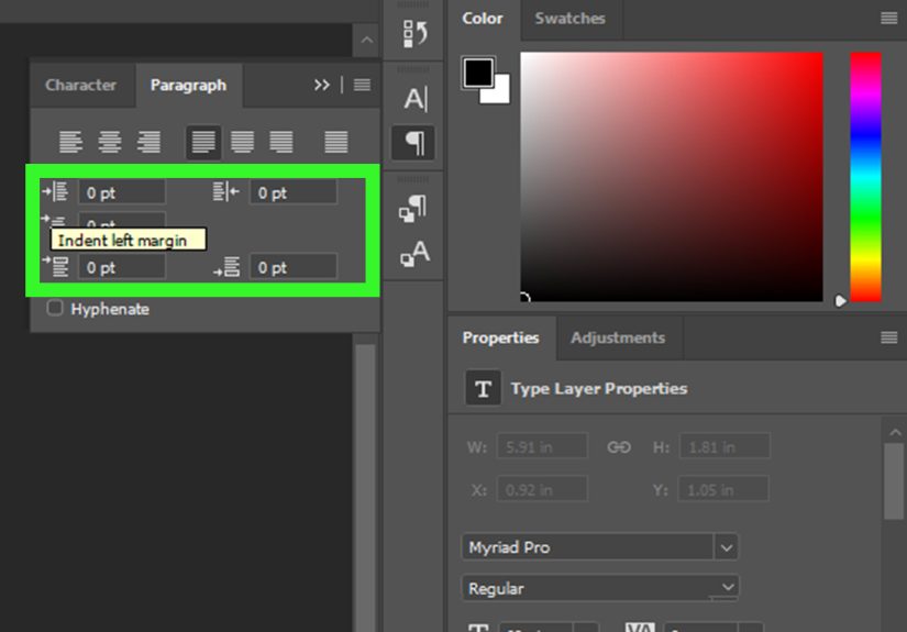
- Open the Paragraph panel. Choose Window > Paragraph. This is your typography control room for alignment, indents, spacing, and hyphenation.
- Highlight the paragraph(s) you want to affect. Click inside the text with the Type tool, then drag to select specific paragraphsor leave it unselected to affect all paragraphs in that layer.
- Choose a justification style. In the Paragraph panel, pick one of the justify icons:
- Justify Last Left (common for clean body text)
- Justify Last Centered (stylized layouts)
- Justify Last Right (special cases like captions or certain designs)
- Justify All (forces even the last line to stretchuse carefully)
- Decide how you want the last line to behave. If the last line is short, Justify All can create comically wide spacing. Most body text looks better with Justify Last Left so the last line stays natural.
- Turn on (or adjust) hyphenation. In the Paragraph panel, check Hyphenate if spacing looks uneven. Hyphenation gives Photoshop more options to break lines and reduce giant gaps.
- Fine-tune hyphenation settings (optional but powerful). Open the Paragraph panel menu (the little menu in the panel corner) and choose Hyphenation. Adjust rules like minimum word length, hyphen limits, and whether capitalized words can hyphenateespecially helpful for narrow columns.
- Adjust justification settings to reduce ugly spacing. From the Paragraph panel menu, choose Justification. Tweak Word Spacing (Desired/Min/Max), Letter Spacing, and (carefully) Glyph Scaling. The goal is to tighten “rivers” without making text look squished or distorted.
- Switch to a better composer for smoother paragraphs. In the Paragraph panel menu, choose Adobe Every-line Composer when available. It typically creates more consistent spacing than single-line composition, especially in justified paragraphs.
- Commit your changes and sanity-check at 100% zoom. Click the checkmark in the Options bar (or commit the type edit), then view at 100%. If the paragraph still has weird holes, slightly widen the text box, adjust font size, or revisit hyphenation/justification settings.
Troubleshooting: When Justified Text Looks Bad (and What to Do)
Problem: The justify icons are grayed out
Fix: You’re almost certainly using point text. Convert it via Type > Convert to Paragraph Text, or redraw the text as a box by dragging with the Type tool.
Problem: Huge gaps between words (“rivers”)
Fixes that actually work:
- Turn on hyphenation so Photoshop has more line-break options.
- Adjust Justification settings so Word Spacing has a tighter acceptable range.
- Widen the text box slightly (even small changes can dramatically improve spacing).
- Use Adobe Every-line Composer when available for better overall composition.
- Avoid super narrow columns unless you’re willing to babysit the typography.
Problem: The last line looks ridiculous
Fix: Don’t use Justify All for normal body text unless you specifically want that stretched last line. Switch to Justify Last Left (or centered/right if your design calls for it).
Problem: My paragraph has random spacing chaos
Fix: Look for manual line breaks you added out of desperation earlier. In paragraph text, let the box handle wrapping. Manual returns can force weird line lengths that amplify justification gaps.
Practical Example: Making a Clean “About” Box for a Flyer
Let’s say you’re designing a workshop flyer with a small bio block. You want a neat rectangle of text that aligns on both sides. Here’s what usually produces the cleanest result:
- Create a paragraph text box that’s wide enough for comfortable line length.
- Pick Justify Last Left (so the last line stays natural).
- Enable Hyphenate and tweak hyphenation rules if the column is tight.
- Open Justification settings and reduce extreme word spacing so Photoshop can’t create giant gaps.
- If spacing still looks uneven, widen the box slightly or adjust font size by 0.5–1 pt (yes, that tiny change can be magic).
Pro Tips for Better-Looking Justified Paragraphs
Pick the right justify option for the job
For most layouts, Justify Last Left is the “professional default.” Justify All is best reserved for special cases (like very controlled layouts where you’re okay editing line breaks).
Hyphenation is not the enemy
People often avoid hyphenation because they’ve seen it abused. But gentle, well-configured hyphenation reduces ugly spacing in justified textespecially in narrow columns.
Don’t let word spacing go wild
If your Justification settings allow a huge range for word spacing, Photoshop will absolutely use it. Tightening the Min/Max range often improves texture and readability.
Be cautious with glyph scaling
Glyph scaling can help spacing, but overuse can make type look subtly stretched or squeezed. If you use it, keep changes modest and review at 100% zoom.
Design your text box like a typographer, not a firefighter
Justification looks better when the layout supports it. If your column is extremely narrow, you’re asking Photoshop to perform typographic gymnastics in a phone booth.
of Real-World Experience with Justified Type in Photoshop
In real projects, the first time people try justified text in Photoshop usually goes like this: they build a clean layout, paste in copy, hit the justify button, and then stare at the screen like Photoshop just replaced their paragraph with a series of suspiciously spaced ransom-note words. That reaction is normal. Justification is one of the most “it depends” typography features because it’s not only about the settingit’s about the box width, the font, the size, the language rules, and how flexible you allow spacing to be.
One common experience is discovering that tiny layout changes beat giant formatting changes. If your text has rivers, it’s tempting to start adjusting tracking, kerning, and anything else that sounds typographic. But often, widening the text box by a few pixels (or increasing font size by 0.5–1 pt) smooths spacing instantly. That’s because justification needs room to distribute words more evenly. When the column is too tight, Photoshop has fewer line-break choices, so it compensates with big gaps. Designers who work on posters, flyers, and social graphics run into this constantlyespecially when they’re trying to cram a full paragraph into a stylish little rectangle.
Another real-world pattern: hyphenation becomes your unexpected best friend. People avoid it until they see how it reduces spacing problems. Once hyphenation is enabled (and tweaked a bit), lines can break more naturally, and you get fewer “two words stretched across a football field” moments. The trick is not to let hyphenation go wild. Good-looking justified type uses hyphens sparingly and intelligently. If you notice too many hyphens in a row, that’s usually a sign your column is too narrow or your hyphenation rules are too permissive for the font and size.
You’ll also notice that the last line is where justification gets dramatic. “Justify All” forces even the final line to stretch, which can look strange unless the last line is reasonably full. In practice, many designers default to “Justify Last Left” because it keeps the paragraph edges clean without turning the final line into a spacing experiment. If you’re making a brochure-style block in a graphic, that choice alone often makes the result look immediately more professional.
Finally, the most useful experience-based lesson is this: Photoshop can do solid paragraph typography, but it rewards patience. When you’re aiming for polished justified text, you’re not just clicking a buttonyou’re balancing a system. If the paragraph looks “off,” it’s rarely one setting’s fault. It’s usually the combination of box width, hyphenation rules, and spacing tolerances. Once you treat it like a mini layout problem instead of a single toggle, Photoshop starts behavingand your text blocks stop looking like they need a chaperone.