Table of Contents >> Show >> Hide
- What makes a pendant a “decorative bulb” pendant?
- Start with the bulb, not the fixture
- Light quality: the difference between “glowy” and “glary”
- Dimming: make it romantic, not chaotic
- Placement rules that keep pendants pretty and functional
- Glare control: the #1 complaint with clear glass pendants
- Safety and specs: the unsexy details that prevent regrets
- Energy efficiency: “vintage look” can still be modern
- Design recipes: specific examples that work
- Maintenance: keeping decorative bulbs looking intentional
- Real-world experiences: what people learn after living with decorative bulb pendants
- Experience 1: “They looked perfect online… and then they blinded me.”
- Experience 2: “Why does my bulb flicker like it’s nervous?”
- Experience 3: “I didn’t plan for layered lightingand I regretted it.”
- Experience 4: “The wrong scale makes the whole room feel off.”
- Experience 5: “Maintenance is real, but it’s manageable.”
- Conclusion
Decorative bulb pendants are the rare home accessory that’s allowed to be both practical and a little showy.
They’re lighting fixtures where the bulb isn’t something you hideit’s the main character. The result can feel like
jewelry for your ceiling: a warm filament glow over a kitchen island, a row of clear globes above a bar, or a cluster
of sculptural bulbs that turns a boring corner into “oh, this place has taste.”
But here’s the plot twist: when the bulb is the star, everything about the bulb mattersshape, brightness, color,
dimming behavior, even whether it makes your dinner guests feel like they’re being interrogated. This guide breaks down
how to choose decorative bulb pendants that look intentional, feel comfortable, and don’t cause the kind of glare that
makes people suddenly remember they left the stove on (even when they didn’t).
What makes a pendant a “decorative bulb” pendant?
In most pendant lights, the shade or diffuser does the heavy lifting. In decorative bulb pendants, the fixture is often
minimalan open cage, a simple socket, a clear glass globe, or a slim metal frameso the bulb is clearly visible.
That visibility is the whole point: the bulb’s silhouette and glow become part of the design.
Common decorative-bulb pendant styles
- Socket-only pendants: Just a cord, a canopy, and a socket. Minimalist and bold.
- Open-cage pendants: A frame around the bulbindustrial, modern farmhouse, and loft-friendly.
- Clear glass globes: “Floating bulb” vibes; clean and airy, but can be glare-prone.
- Cluster pendants: Multiple bulbs at staggered heights for drama in stairwells or high ceilings.
- Linear multi-light pendants: Several bulbs aligned over islands and dining tables for symmetry.
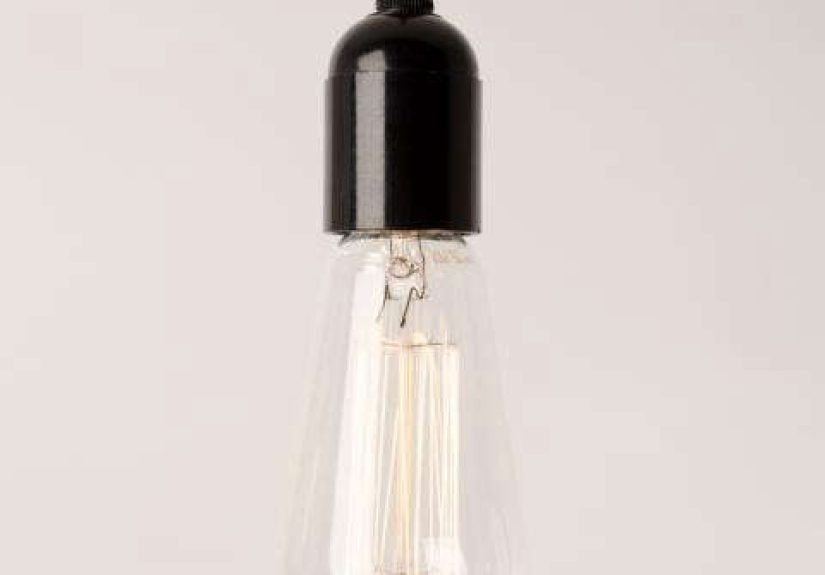
Start with the bulb, not the fixture
If you pick the pendant first and the bulb later, you risk buying a beautiful fixture and then lighting it with a bulb
that looks… like it came from a gas station display rack. With decorative bulb pendants, it’s smarter to decide what
kind of bulb you want to showcase, then choose a fixture that flatters it.
Bulb shapes that look great on display
- ST (Edison-style) bulbs: Tall teardrop silhouettes; classic “vintage filament” look.
- G bulbs (globe): Round, modern, and balancedespecially good in clear globe pendants.
- T bulbs (tubular): Sleek and architectural; great for modern, linear fixtures.
- Short, squat bulbs: Useful when you want the fixture to feel compact and not hang too low.
Base types you’ll see most
In the U.S., most decorative bulb pendants use a medium base (E26). Some smaller pendantsespecially
petite glass shadesuse candelabra bases (E12). Always confirm the base type before you fall in love,
because “I’ll just make it work” is how people end up owning five bulbs they can’t return.
Light quality: the difference between “glowy” and “glary”
Decorative bulb pendants are as much about mood as illumination. That means you need to think beyond “Does it turn on?”
and ask three better questions: How bright? How warm? How flattering?
Lumens: choose brightness like you choose hot sauce
Lumens measure brightness. For decorative bulb pendants, too many lumens can feel harsh (especially with clear glass),
and too few can feel like you’re cooking dinner in a romantic period drama. A practical approach:
- Ambient glow (hallway, bedroom corner, bar mood): roughly 200–450 lumens per bulb.
- General lighting (dining area, small kitchen nook): roughly 450–800 lumens per bulb, often on a dimmer.
- Task-forward (islandspaired with other task lighting): commonly 600–900 lumens per bulb, but control glare.
The cheat code is layered lighting: let pendants provide sparkle and style, while recessed lights or
under-cabinet lighting handle serious task work. Your eyesand your chopping handwill thank you.
Color temperature (Kelvin): the mood thermostat
Color temperature is measured in Kelvins (K). Lower numbers look warmer and cozier; higher numbers look cooler and
crisper. Decorative bulb pendants usually look best in the warm-to-neutral range:
- 2200K–2700K: Candle-to-warm incandescent feel. Cozy, flattering, very “evening-friendly.”
- 3000K: Still warm, but a bit cleanergreat for kitchens that want warmth without looking yellow.
- 3500K–4000K: Neutral to cool-whitebetter for workspaces, but can feel less “glowy.”
CRI: how “real” your colors look
CRI (Color Rendering Index) is about color accuracy. If your pendant lights are near food, art, or faces (hello, dinner
guests), a higher CRI helps colors look more natural. For kitchens and dining areas, many people prefer bulbs in the
90+ CRI neighborhood when availableespecially if the bulb is visible and part of the vibe.
Dimming: make it romantic, not chaotic
Decorative bulb pendants love dimmers because they let you shift from “prep mode” to “pasta-night ambiance” instantly.
But dimming LEDs can cause flicker, hum, or that awkward strobe effect that makes everyone look like they’re in a low-budget
music video. To avoid drama:
How to reduce flicker and compatibility issues
- Use dimmable bulbs (sounds obvious; still commonly missed).
- Use an LED-rated dimmer (older dimmers were designed for incandescent loads).
- Check bulb/dimmer compatibility guidance when available (especially for vintage-style filament LEDs).
- If your goal is “perfect mood control,” consider smart bulbsjust confirm the pendant allows them and the bulb isn’t enclosed in a way that traps heat.
Placement rules that keep pendants pretty and functional
A decorative bulb pendant can be gorgeous and still be hung at the wrong heightlike a great hat worn over someone’s eyes.
Here are the placement guidelines designers and installers lean on because they work in real homes with real humans.
Over a kitchen island: the famous 30–36 inch zone
For most kitchen islands, a standard starting point is to hang pendants so there’s about 30–36 inches
between the bottom of the fixture and the countertop. That usually provides task light without turning the island into
a forehead hazard.
- Spacing: If you’re using multiple pendants, many installers space them about 2–3 feet apart (measured from the center of each shade).
- Edge clearance: Keep the outer pendants comfortably in from the island ends so the arrangement feels centered and intentional.
- Odd numbers: One or three pendants often looks balanced over typical islands.
Over a dining table: similar height, different goal
Over a dining table, the typical hanging range is also around 30–36 inches above the tabletop. The goal
is comfortable sightlines while creating a warm pool of light that makes food look appealing and conversation feel cozy.
In open walkways and foyers: clearance matters
In spaces where people walk under the fixture, prioritize vertical clearance. A safe rule is to keep the bottom of the
fixture around 7 feet above the floor when it’s in a circulation path. If you’re working in any area
where accessibility guidelines apply, you also need to think about minimum headroom and protrusions.
Glare control: the #1 complaint with clear glass pendants
Clear glass pendants are popular because they feel light, airy, and timeless. But they also put a bright point source
right at eye levelespecially over islands where people sit or stand nearby. If you’ve ever looked up and thought,
“Wow, that’s pretty… and also my retinas are sizzling,” you’ve met the glare problem.
Fixes that keep the look but calm the light
- Choose a lower-lumen bulb and rely on layering for task lighting.
- Use frosted or lightly diffused bulbs if the filament look isn’t the only goal.
- Install a dimmer so you can reduce brightness when you’re not actively cooking.
- Pick a shape that reduces point glare (some globes and coated bulbs feel softer than clear ST bulbs).
- Consider tinted or seeded glass if you want a visible bulb but less punchy brightness.
Safety and specs: the unsexy details that prevent regrets
Decorative bulb pendants may be style-forward, but they’re still electrical products. The smartest “design move” is
choosing fixtures and bulbs that are tested, properly rated, and appropriate for where you’re installing them.
Look for proper safety certification
Many indoor decorative fixtures are evaluated to recognized safety standards for luminaires and LED equipment. In plain
English: buy fixtures that are appropriately certified/listed for your market and usage, not mystery metal from the
bargain internet basement.
Dry vs. damp vs. wet locations (especially for bathrooms)
If you’re putting a pendant in a bathroom or near moisture, check the fixture’s location rating. Damp-rated fixtures
are intended for humid areas; wet-rated fixtures are for direct water exposure. When in doubt, choose the safer rating
and confirm local requirementsbathrooms are not where you want to freestyle electrical decisions.
Energy efficiency: “vintage look” can still be modern
The good news: you can get that vintage filament style without burning through energy like it’s 1903. Many decorative
filament LED bulbs mimic the look of incandescent filaments while using a fraction of the wattage. That means you can
keep your cozy glow and still feel good about leaving the lights on during a long dinner.
What to check before you buy
- Wattage/fixture max: Even with LEDs, follow the fixture’s maximum rating.
- Enclosed vs. open fixture: Some bulbs aren’t designed for enclosed fixtures due to heat.
- Dimming compatibility: Confirm the bulb is dimmable and the dimmer is LED-rated.
- Color temperature consistency: Use the same Kelvin rating across a room for a cohesive feel.
Design recipes: specific examples that work
If you like the idea of decorative bulb pendants but want a “tell me what to buy” starting point, here are a few
combinations that consistently look good in American homes.
Example 1: Modern kitchen island (warm, not yellow)
- Three small clear-glass globes with medium-base sockets
- G25 globe LED bulbs, 3000K, dimmable, moderate lumens
- Undercabinet lighting for true task work
Example 2: Industrial loft vibe (the classic Edison look)
- Open-cage pendants in matte black or aged brass
- ST-style filament LED bulbs, 2200K–2700K, dimmable
- Keep lumens restrained to avoid “spotlight in your face” syndrome
Example 3: Dining table glow-up (cozy, flattering)
- One statement pendant or a linear multi-light fixture
- Warm bulbs (2700K) with a dimmer
- Hang about 30–36 inches above the tabletop
Maintenance: keeping decorative bulbs looking intentional
Decorative bulb pendants are honest: they show everything. Dust, fingerprints, and that one bug who apparently thought
your kitchen was a resort. A few habits help:
- Use a microfiber cloth on bulbs and glass (power off first, please).
- Handle clear bulbs with gloves to avoid smudges that show when lit.
- Replace bulbs in sets when possible so color and brightness match.
Real-world experiences: what people learn after living with decorative bulb pendants
After the install is done and the compliments roll in, real life begins. And real life is where decorative bulb pendants
reveal their quirkssome charming, some mildly annoying, and some that can be solved in five minutes if you know the trick.
Experience 1: “They looked perfect online… and then they blinded me.”
The most common post-install surprise happens with clear glass pendants and clear filament bulbs. In photos, they read as
warm and luminous. In person, depending on height and sightlines, they can feel like three tiny suns aimed directly at the
seated person on the far side of the island. People often describe it as “beautiful but intense.” The easy fixes are also
the most boring-sounding: drop the lumen level, add a dimmer, or swap to a lightly frosted bulb. Many homeowners keep the
decorative silhouette while softening the light, which preserves the look without turning casual conversation into squinting practice.
Experience 2: “Why does my bulb flicker like it’s nervous?”
Flicker usually isn’t the pendant’s faultit’s a compatibility tango between the bulb, the dimmer, and sometimes the wiring.
A lot of people discover this only after they’ve installed the prettiest filament LEDs they could find, dimmed them low for
ambiance, and watched the light wobble like it’s trying to send Morse code. The practical lesson: choose dimmable bulbs,
use LED-rated dimmers, and don’t be afraid to try a different bulb brand if the first one misbehaves. Once dialed in, the
payoff is huge: pendants that can go from “bright enough to chop onions” to “soft enough to pretend you didn’t burn the garlic.”
Experience 3: “I didn’t plan for layered lightingand I regretted it.”
Decorative bulb pendants are often chosen for style, not raw output. That’s fineuntil someone realizes the pendants alone
don’t fully light the countertop corners or the sink. The homeowners who feel happiest long-term tend to treat pendants as
part of a lighting system: recessed cans for ambient fill, under-cabinet strips for task lighting, and pendants for sparkle.
That layered approach also lets you use lower-lumen decorative bulbs (less glare!) while still having enough light to function
like an actual kitchen where people cook, not just pose with cutting boards.
Experience 4: “The wrong scale makes the whole room feel off.”
Another common lesson is scale. Bulbs that are too small can look accidentallike you forgot to finish the fixture. Bulbs
that are too large can dominate a small room and hang too close to your face. People often end up happiest when the bulb size
intentionally matches the fixture: bigger globes inside bigger glass, slimmer bulbs in tighter shades, and consistent bulb shapes
across multiple pendants for a clean rhythm. If you’re doing three pendants, using three identical bulbs is usually the calmest
visual choice (unless your house is intentionally eclectic and can pull off “whimsical museum lighting”).
Experience 5: “Maintenance is real, but it’s manageable.”
Clear glass pendants collect dust and show fingerprints faster than you’d expect. The good news is that most owners settle into
a simple routine: wipe the glass occasionally, keep a microfiber cloth handy, and accept that the fixture may need more attention
than a shaded pendant. The upside is worth itwhen clean, decorative bulb pendants add depth and warmth that makes a room feel
finished. And if you’re the kind of person who finds cleaning oddly satisfying, congratulations: your ceiling jewelry has become
your newest hobby.
Conclusion
Decorative bulb pendants are one of the easiest ways to add personality to a space because they combine structure (the fixture)
and sparkle (the bulb) in one visible, design-forward element. The best results come from a simple formula: pick a bulb with the
right brightness and warmth, plan placement for comfort and clearance, control glare with smart choices, and use dimming and
layered lighting to make the space feel good at all hours. Do that, and your pendants won’t just “light the room”they’ll set
the tone for it.