Table of Contents >> Show >> Hide
- Start Here: The 3 Things That Decide Whether a Color Feels “Right”
- The Core Bedroom Color Schemes That Rarely Fail
- Scheme 1: Warm White + Soft Greige + Natural Wood
- Scheme 2: Blue + White + Sand (Coastal Calm Without the Seashell Collection)
- Scheme 3: Sage Green + Cream + Brass (The “I Sleep Like a Houseplant” Look)
- Scheme 4: Blush + Taupe + Charcoal (Soft, Not Sugary)
- Scheme 5: Charcoal + Cream + Deep Wood (Moody Hotel Energy)
- Color Families: How to Pick the Right Shade Without Overthinking It
- 8 Ready-to-Use Bedroom Color Schemes (With Specific Pairings)
- How to Make Your Scheme Look “Designed,” Not Accidental
- Small Bedroom Tricks: Color Choices That Make a Room Feel Bigger
- Testing Paint Like a Normal Person (Not a Mythical Designer Unicorn)
- of Real-World “Bedroom Color Scheme” Experiences (What People Actually Run Into)
- Conclusion: Your Best Bedroom Color Scheme Is the One That Supports Rest
- SEO Tags
Choosing a bedroom color scheme sounds simple until you’re standing in a paint aisle holding fourteen “soft whites” that all look identical… until you get home and one suddenly turns into “buttered popcorn” under your lamp. The good news: you don’t need a design degree (or a spiritual journey) to pick a palette that feels calm, stylish, and actually you.
This guide breaks down bedroom color schemes that work in real American homessmall rooms, big rooms, weird lighting, rental-friendly changes, and all. You’ll get clear ideas, practical rules, and specific palette examples you can copy without turning your bedroom into a mood swing. [1][2]
Start Here: The 3 Things That Decide Whether a Color Feels “Right”
1) Your room’s light direction (a.k.a. why the same paint looks different everywhere)
Natural light changes color. North-facing rooms often read cooler and can make crisp whites look a little gloomy, while warmer neutrals can help balance that out. East-facing rooms are bright in the morning and softer later; west-facing rooms glow warm in late afternoon. Translation: the best “bedroom color scheme” is the one that behaves nicely in your light. [6]
2) Undertones (the secret sauce you can’t unsee once you notice it)
Two colors can share the same “name” (beige, gray, white) but have different undertonespink, yellow, green, blue, or violet. Undertones are why a “neutral” can suddenly clash with your flooring or make your bedding look dingy. Warm shades generally include oranges, browns, yellows, reds, pinks, and whites with warm undertones; cool shades lean blue/green/gray. [5]
3) Contrast level (calm doesn’t always mean “all beige”)
A soothing bedroom can be high-contrast (inky walls + crisp bedding) or low-contrast (soft walls + gentle textiles). The trick is controlling the amount of contrast so the room feels intentionalnot like you ran out of paint halfway through.
The Core Bedroom Color Schemes That Rarely Fail
These are the “workhorse” schemes designers and home editors come back to because they’re flexible, restful, and easy to decorate around. [1][7]
Scheme 1: Warm White + Soft Greige + Natural Wood
If you want your bedroom to feel clean but not sterile, warm whites and greige are your best friends. Pair them with oak, walnut, cane, linen, or boucle for instant coziness. This scheme is also forgiving if you change rugs or bedding seasonally.
- Walls: warm white or light greige
- Trim: same color (slightly brighter) for a modern look, or a creamier white for classic contrast
- Accents: black hardware, brass, warm woods, woven textures
Example palette: Warm white walls + putty linen bedding + walnut nightstands + a sandy rug.
Scheme 2: Blue + White + Sand (Coastal Calm Without the Seashell Collection)
Blue bedrooms are popular for a reason: they read serene, timeless, and “exhale-worthy,” especially when balanced with white and sandy neutrals. You can go airy (pale sky blue) or dramatic (navy), then soften with beige, cream, or light oak. [4][10]
- Walls: pale blue, blue-gray, or navy accent
- Bedding: crisp white + textured throws
- Warmth: jute, linen, and sandy neutrals to keep blue from feeling chilly
Example palette: Blue-gray walls + white duvet + sand linen pillows + light wood bed frame.
Scheme 3: Sage Green + Cream + Brass (The “I Sleep Like a Houseplant” Look)
Greenespecially muted sagehits a sweet spot: calming, fresh, and easy to pair with warm neutrals. It’s also fantastic if your bedroom has lots of natural materials (wood floors, rattan, linen) or if you want a soft color that still feels grown-up. [3][7]
- Walls: sage, mineral green, or green-gray
- Trim/bedding: creamy whites and ivories
- Metals: brass, aged gold, or black for contrast
Example palette: Muted sage walls + ivory bedding + brass reading sconces + warm wood tones.
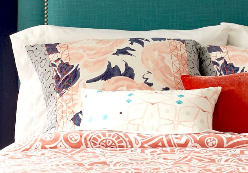
Scheme 4: Blush + Taupe + Charcoal (Soft, Not Sugary)
Blush can be sophisticated when it’s dusty or earthy, especially with taupe, mocha, or charcoal to ground it. If you’re nervous, start with blush textiles and keep walls neutralor go all-in with a muted pink paint and moody accents. [1][7]
Example palette: Dusty blush walls + taupe upholstered headboard + charcoal throw + warm brass details.
Scheme 5: Charcoal + Cream + Deep Wood (Moody Hotel Energy)
Dark bedrooms can feel cozy and cocooning, not claustrophobicespecially when you layer creamy textiles and warm lighting. A deep charcoal or near-black backdrop makes bedding and artwork pop, and it’s shockingly forgiving for everyday life. (Yes, even if you drink coffee in bed. No judgment.) [8]
- Walls: charcoal, ink, deep blue-gray
- Bedding: cream/ivory + plush textures
- Lighting: warm bulbs, layered lamps, dimmers if possible
Color Families: How to Pick the Right Shade Without Overthinking It
Whites & Off-Whites: The most “simple” choice that causes the most drama
White bedrooms are timeless, but the wrong white can read icy or dingy depending on your light and finishes. If your room runs cool, look for whites with warm undertones. If your room runs warm, you can handle a cleaner whiteor keep things balanced with creamy textiles. [6]
Pro move: Use the same white on walls and trim for a modern, seamless look. Use a slightly brighter trim if you want crisp definition.
Blues: Best for classic calm (from airy to dramatic)
Pale blues and blue-grays feel light and relaxing; mid-tone blues feel traditional and grounded; navy and ink feel dramatic and luxe. To keep blues from feeling cold, add warm neutrals (cream, tan, caramel leather), warm woods, and soft textures. [4][2]
Greens: Restful, nature-inspired, and surprisingly versatile
Sage and green-grays are “new neutrals,” which means they play nicely with lots of styles: modern organic, farmhouse, traditional, even minimal. Keep your other finishes warm (ivory, wood, brass) for a welcoming feel. [3][7]
Purples: Trending againuse them like a chef uses salt
Deep plums and dusty lilacs can be cozy and elegant, but they work best when they’re complex (think gray or brown undertones) and paired with grounding neutrals. If you’re cautious, bring purple in through a headboard, art, or lampshades before committing to walls. [9]
Warm Earth Tones: Terracotta, clay, caramel, and peach
Warm tones can feel incredibly invitingespecially in bedrooms that get cooler light. The key is choosing a softened, earthy version (clay/peach instead of neon coral) and grounding it with stone, taupe, or warm gray. [1][2]
8 Ready-to-Use Bedroom Color Schemes (With Specific Pairings)
1) Soft Blue-Gray + Crisp White + Light Oak
A clean, calming scheme that feels “fresh hotel” without being sterile. Add black accents for a modern edge.
2) Muted Sage + Cream + Brass
Cozy, organic, and flattering in most light. Works beautifully with linen bedding and woven textures. [3]
3) Warm Greige + Ivory + Walnut
If you like neutrals but don’t want them to feel flat, add contrast through wood tones and layered textiles.
4) Navy + White + Camel
Classic and bold. Navy on walls (or just the headboard wall) looks sharp with bright bedding and a camel throw.
5) Dusty Blush + Taupe + Matte Black
Soft but not “baby.” Matte black keeps it grounded; natural wood keeps it warm.
6) Charcoal + Cream + Aged Brass
Moody and elegant. Use warm lighting and plush textiles so it feels cozy, not cave-like. [8]
7) Seafoam/Blue-Green + White + Warm Wood
Blue-green blends the calm of blue with the freshness of greengreat for a relaxed, airy vibe. [4]
8) Lavender-Gray + Warm White + Natural Linen
Subtle color with a sophisticated twist. Keep patterns simple and texture-rich (linen, cotton, wool).
How to Make Your Scheme Look “Designed,” Not Accidental
Use the 60–30–10 rule (but don’t treat it like a law of physics)
- 60% main color (walls + big furniture)
- 30% secondary color (bedding, rug, curtains)
- 10% accent color (pillows, art, a vase that doesn’t look lonely)
This keeps the room cohesive while still interesting. You can swap the 10% accent seasonally without repainting anything.
Repeat your accent color at least three times
If your accent color shows up once, it looks random. If it shows up three times (say: pillow + artwork + small decor), it looks intentional.
Pick a metal and commit (mostly)
Mixed metals can look great, but bedrooms feel calmer when there’s a “lead” metallike brasssupported by one secondary metallike black. Try not to invite chrome, gold, and oil-rubbed bronze to the same party unless you really know what you’re doing.
Small Bedroom Tricks: Color Choices That Make a Room Feel Bigger
Go low-contrast for an airy feel
When walls, trim, and large furniture live in a similar tonal family, your eye reads the room as more expansive. Soft whites, pale greige, and gentle blue-grays are great here. [6]
Try “color drenching” for cozy (yes, even in small rooms)
Painting walls, trim, and sometimes even the ceiling in the same color can make a small bedroom feel intentional and envelopinglike a boutique hotel. Deep colors can work beautifully when lighting and textiles are layered thoughtfully. [8]
Testing Paint Like a Normal Person (Not a Mythical Designer Unicorn)
- Sample first. Paint a large swatch or use a sample board you can move around.
- Check it morning, afternoon, and night. Bedrooms change mood dramatically once lamps are on.
- Match to fixed finishes. Flooring, big furniture, and countertops don’t changestart there.
- Choose a finish that fits the vibe. Matte/eggshell is popular for walls because it feels soft and forgiving; trim often looks best in satin or semi-gloss.
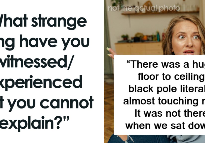
of Real-World “Bedroom Color Scheme” Experiences (What People Actually Run Into)
In real homes, the “best” bedroom color scheme is rarely the one that looks most dramatic on a phone screenit’s the one that behaves well on a Tuesday night when you’re tired, the laundry is judging you from the chair, and the only lighting you’ve turned on is the bedside lamp with the warm bulb you swear you’ll replace “soon.” That’s why so many homeowners start with calming classicssoft blue-grays, warm whites, muted greensand then personalize with bedding, art, and texture. They want a room that feels restful even when life isn’t.
One of the most common experiences people share is the “white paint surprise.” They pick a bright white because it looks crisp online, then their bedroom turns icyespecially if the room faces north or doesn’t get much direct sun. Suddenly the bedding looks dull, the walls feel stark, and the space reads more like a waiting room than a retreat. The fix is usually simple: shift to a warmer white or creamy off-white, then add natural textures (linen curtains, a woven rug, a wood headboard) so the room feels inviting instead of clinical. [6]
Another frequent moment: discovering undertones the hard way. Someone chooses a “neutral gray,” paints the walls, and then notices a green cast next to their beige carpetor a purple cast next to warm wood floors. It’s not that the paint is “bad”; it’s that undertones are doing what undertones do: reacting to surrounding colors and light. Many people solve this by pulling a color from something they already love in the room (a rug, a piece of art, even a throw pillow), then choosing a wall color that harmonizes with it rather than trying to force a trendy shade to cooperate.
Then there’s the bold-color success story, which usually starts with fear and ends with, “Why didn’t I do this sooner?” A deep navy, charcoal, or inky blue-gray can make a bedroom feel quiet and luxuriousespecially with crisp, light bedding. People often report sleeping better simply because the room feels more cocooned and less visually busy. The key “aha” is lighting: moody walls demand warm, layered light (bedside lamps, maybe a soft overhead fixture on a dimmer) and plush textures that catch the glow. When those pieces come together, dark colors stop feeling heavy and start feeling like a deliberate, cozy envelope. [8]
Finally, a very practical experience: color schemes live and die by repetition. Homeowners might pick a lovely wall color, then buy random decor that doesn’t echo it anywhere else, and the room feels unsettled. Once they repeat the same tone three timessay, in a pillow, an artwork detail, and a throwthe room suddenly looks “finished.” That’s the quiet magic of a good bedroom color scheme: it’s not only the paint color. It’s the relationship between walls, textiles, lighting, and the little details you see right before you fall asleep (or right before you scroll “just one more minute” for 45 minutes).
Conclusion: Your Best Bedroom Color Scheme Is the One That Supports Rest
The right bedroom palette doesn’t have to be complicated. Start with your light, choose undertones that flatter your fixed finishes, decide how much contrast you want, then build a simple 2–3 color foundation. After that, texture does the heavy lifting: linen, cotton, wool, wood, and warm lighting will make almost any scheme feel more inviting. And if you’re stuck, remember this timeless design truth: you can always change pillows faster than you can repaint a room.
SEO Tags
Footnotes: [1] Better Homes & Gardens. [2] HGTV. [3] Sherwin-Williams. [4] Benjamin Moore. [5] Real Simple. [6] Apartment Therapy. [7] House Beautiful. [8] Martha Stewart. [9] Good Housekeeping. [10] Architectural Digest.