Table of Contents >> Show >> Hide
- 1. Too Much Clutter in All the Wrong Places
- 2. A Bad Lighting Plan
- 3. Furniture That Is the Wrong Scale
- 4. Window Treatments That Look Like an Afterthought
- 5. Trend-Chasing Instead of Building a Cohesive Home
- 6. Visible Everyday Messes: Cords, Countertop Chaos, and Entryway Pileups
- 7. Cheap-Looking or Dated Finishes
- Why These Mistakes Matter More Than You Think
- Real-World Experiences: What Homeowners Usually Notice First
- Conclusion
Some homes walk into a room before you do. They feel polished, thoughtful, and quietly confident. Others announce themselves with the decorating equivalent of spinach in the teeth. The good news is that a house rarely looks bad because it is too small, too old, or not expensive enough. More often, it looks bad because a few common design mistakes are stealing the spotlight.
Designers tend to agree on the usual suspects. It is not about having a museum-perfect home or buying furniture with names that sound like European aristocrats. It is about editing what you have, making smarter visual choices, and giving each room a little breathing room. If your place feels off but you cannot quite put your finger on why, one of these seven issues is probably the culprit.
Here are the biggest things that instantly make your house look worse than it needs toand how to fix them without staging your home like a luxury hotel lobby.
1. Too Much Clutter in All the Wrong Places
Clutter is the fastest way to make a house look tired, chaotic, and smaller than it really is. Designers are not anti-stuff. They are anti-stuff everywhere. When every tabletop is crowded, every open shelf is packed, and every entryway looks like a drop zone for backpacks, mail, shoes, and mystery cords, the entire home starts to feel visually noisy.
The problem is not just the quantity of items. It is the lack of hierarchy. A room looks polished when your eye knows where to land. A room looks bad when it is forced to ricochet between framed quotes, half-burned candles, five tiny vases, yesterday’s receipts, and a decorative object that appears to have been purchased during a moment of weakness in a discount aisle.
How to fix it
Edit first, organize second. Keep surfaces at about two-thirds full, not one hundred percent packed. Group smaller objects into trays so they read as one intentional moment instead of a yard sale. In entryways, give everyday items a real home: a basket for shoes, hooks for bags, and a tray for keys and mail. Clutter does not need to disappear completely. It just needs to stop freelancing.
2. A Bad Lighting Plan
If a home has only one ceiling light per room and a prayer, designers notice immediately. Poor lighting makes even a well-furnished room look flat, harsh, and oddly joyless. It can also make paint colors look wrong, artwork look dull, and people look like they are being interrogated.
The biggest mistake is relying only on overhead lighting. One lonely flush-mount fixture cannot do all the emotional labor in a room. Another common issue is using bulbs that feel too cool or too bright, which can make a house look sterile instead of welcoming. Even beautiful furniture looks less expensive under unforgiving light.
How to fix it
Layer your lighting. Every room should ideally have a mix of ambient, task, and accent light. That means an overhead fixture plus lamps, sconces, or both. In living rooms, add a floor lamp near seating and a table lamp on a side table. In bedrooms, use bedside lamps instead of depending entirely on the ceiling fixture. Lighting should make a room feel softer, warmer, and more dimensionalnot like a convenience store at 2 a.m.
3. Furniture That Is the Wrong Scale
This is one of the most common interior design mistakes, and once you see it, you cannot unsee it. A tiny rug floating under a coffee table. Artwork the size of a postage stamp on a giant wall. A bulky sectional swallowing a modest room whole. Furniture that is too small makes a space feel unfinished. Furniture that is too big makes it feel cramped. Either way, the room looks awkward instead of intentional.
Designers talk about scale and proportion for a reason. Rooms feel good when the pieces relate well to each other and to the architecture. When they do not, the whole space feels off, even if every item is technically nice on its own.
How to fix it
Measure before buying anything larger than a throw pillow. Choose rugs large enough for at least the front legs of major furniture to sit on them. Hang art with enough visual weight for the wall. In a large room, do not fill the space with lots of small pieces just because they fit your budget; that often makes the room look more cluttered. Save up for fewer, better-scaled items. Your house will look calmer immediately.
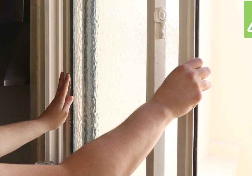
4. Window Treatments That Look Like an Afterthought
Few things make a house look more unfinished than sad curtains. You know the type: panels that are too short, too skimpy, badly wrinkled, or hanging as if they lost a fight with gravity. Window treatments do a lot of visual heavy lifting. When they are wrong, the entire room feels cheaper.
Short curtains can make ceilings feel lower. Narrow panels can make windows look stingy. Outdated fabrics and dusty blinds can date a room faster than an old trend report. Designers often point out that even beautiful spaces lose points when the windows are not dressed properly.
How to fix it
Hang curtain rods higher and wider than the window frame to create the impression of height and fullness. Choose panels that skim the floor rather than awkwardly hovering above it. If your style is minimal, that is finejust make sure minimal does not accidentally become “temporary apartment energy.” Crisp Roman shades, tailored drapes, and clean woven blinds all work when they look intentional.
5. Trend-Chasing Instead of Building a Cohesive Home
A house starts to look bad when every room seems to be dating a different internet trend. One room is all beige boucle. Another is farmhouse. The bathroom is trying to relive a terrazzo moment. The kitchen has hardware chosen by committee and open shelving packed with things that nobody actually uses. The result is not eclectic. It is confused.
Designers are not saying you must ignore trends forever. They are saying your home needs a point of view. When you buy pieces only because they are popular, especially low-quality versions of trendy items, the space can feel generic and temporary. It also dates faster, which means your home starts looking stale almost as soon as the algorithm moves on.
How to fix it
Start with a consistent color palette and a general style direction. That does not mean every room must match perfectly, but they should feel related. Use trends in smaller, easier-to-swap layers like pillows, art, or accessories. Put your bigger investment into timeless anchors: a solid rug, good lighting, classic upholstery, and materials that age well. Personality lasts longer than trend panic.
6. Visible Everyday Messes: Cords, Countertop Chaos, and Entryway Pileups
Some things are not technically decor, but they still control the room. Tangled cords under a TV, overloaded kitchen counters, piles of unopened mail, shoes breeding by the front door, random chargers on every surfacethese details send a strong message. And that message is: “No one is in charge here.”
Designers often focus on first impressions, and the entryway is a major one. If the first thing guests see is disorder, your whole house feels less polished, even if the living room beyond it is lovely. Kitchens suffer the same problem. Beautiful cabinets and finishes do not stand a chance when the counters are crowded with small appliances, paper clutter, and three bottles of vitamins standing guard like tiny bouncers.
How to fix it
Hide cords whenever possible with cord covers, furniture placement, or simple cable management boxes. Limit what lives on the kitchen counter to the things you use daily. Create a proper landing zone near the door with closed storage, hooks, and one surface for essentials. The goal is not perfection. It is reducing the number of little visual interruptions that make a home feel messy.
7. Cheap-Looking or Dated Finishes
You do not need a luxury renovation to make a house look good. But certain finishes can drag down the entire impression of a space. Think builder-grade hardware that looks flimsy, cabinetry that has seen better centuries, dated wall texture, dingy paint, worn-out fixtures, or decorative choices that scream “this was on clearance in 2013 and yes, I bought two.”
Designers often say that low-quality finishes stand out more than people expect. A home can have great bones, but if the hardware feels light, the paint is scuffed, or the walls look neglected, the place starts to read as cheap instead of cared for. This is especially true in kitchens, bathrooms, and heavily used areas where small details get noticed quickly.
How to fix it
Focus on upgrades with outsized impact. Swap dated cabinet hardware. Refresh paint where walls are marked or tired. Replace worn switch plates, tired faucets, or old light fixtures. Repair what is broken instead of decorating around it. A house does not need to be brand-new to look beautiful, but it does need to look maintained. There is a big difference between lived-in and let-go.
Why These Mistakes Matter More Than You Think
Here is the funny part: most of these problems are not about money. They are about attention. A home looks good when it feels edited, balanced, and functional. It looks bad when too many little issues pile up and compete for attention. You can have a modest home with thoughtful lighting, scaled furniture, clean surfaces, and a cohesive look, and it will feel far more expensive than a larger home stuffed with clutter and trend leftovers.
That is why designers tend to notice the same things right away. They are looking for flow, proportion, warmth, and restraint. In other words, they are looking for evidence that someone made decisions on purpose.
Real-World Experiences: What Homeowners Usually Notice First
In real homes, these seven problems rarely show up one at a time. They travel in packs. A homeowner might start by feeling frustrated that the living room looks “cheap” in photos, but the real issue is a combination of cluttered shelves, a rug that is too small, and lighting that is doing absolutely nothing heroic. Once those three things are corrected, the same room often feels dramatically more expensive without a full redesign.
One common experience happens in entryways. People get used to seeing shoes by the door, bags slung over chairs, a stack of unopened mail on the console, and a lonely overhead light that makes everything look slightly guilty. Because it becomes normal, they stop noticing it. Then guests arrive, and suddenly the home feels less pulled together than it did five minutes earlier. The fix is usually simple: fewer things in view, better storage, and one lamp or attractive fixture that softens the entire moment.
Kitchens tell a similar story. Many homeowners assume their cabinets or countertops are the main problem, when the bigger issue is visual overload. A blender, air fryer, coffee pods, cutting boards, paper towels, mail, fruit bowl, and decorative sign can all be individually harmless. Together, they create a countertop traffic jam. Once the extras are removed and only the daily essentials remain, the room often looks newer, cleaner, and easier to use. That is a powerful shift, especially in a space people see every day.
Another frequent experience is buying furniture in stages without a real plan. Someone starts with a sofa they like, adds a chair from another store months later, grabs a side table because it is on sale, then ends up with a room that feels disconnected. Nothing is exactly wrong, but nothing clicks either. Designers often explain that this is why scale and cohesion matter so much. When pieces are chosen without considering the whole room, the result can feel accidental instead of curated.
Lighting is the sleeper issue homeowners mention after the fact. They do not always realize how bad their lighting is until they add a pair of lamps, swap bulbs, or install a dimmer. Then suddenly the room becomes flattering, cozy, and finished. It is one of those changes that makes people wonder why they tolerated the old setup for so long. The same goes for curtains. Once properly sized window treatments are installed, many people say the room finally looks “done.”
Perhaps the most interesting experience is realizing that expensive purchases do not solve visual confusion. A costly sofa will not rescue a cluttered room. Trendy decor will not fix bad lighting. Fancy art cannot compensate for poor scale. The homeowners who get the best results usually do the least glamorous work first: editing, measuring, repairing, and simplifying. That is not as exciting as buying a dramatic new chandelier at midnight, but it works. And in design, working beats dramatic every time.
Conclusion
If your house feels like it is one bad accessory away from giving up entirely, do not panic. Most homes do not need a full makeover. They need better editing, smarter lighting, more appropriate scale, and a little honesty about what is actually making the space feel off. Start with the most obvious visual distractions, fix what looks accidental, and let each room breathe. A beautiful home is not about perfection. It is about intention.