Table of Contents >> Show >> Hide
- Why AutoShapes in Word Are Worth Using
- 1. Turn Steps Into Easy-to-Follow Process Graphics
- 2. Build Simple Flowcharts Without Leaving Word
- 3. Add Callouts and Annotations to Screenshots or Images
- 4. Create Better Headers, Dividers, Labels, and Badges
- 5. Design Custom Forms, Checklists, and Printable Layouts
- 6. Layer Shapes to Make Mini Infographics and Visual Summaries
- Best Practices for Using AutoShapes in Word
- My Experience Using AutoShapes in Word
- Conclusion
Microsoft Word has a funny reputation. Most people think of it as the place where essays are born, résumés get over-edited, and tables go rogue at the worst possible moment. But Word has another side: it can also be a surprisingly handy design tool. If you have ever clicked Insert > Shapes and thought, “Neat, a rectangle,” then immediately moved on with your life, you have been ignoring one of Word’s most useful features.
AutoShapes in Word, now commonly labeled simply as Shapes, can do much more than decorate a page. They can organize ideas, explain steps, add emphasis, guide the reader’s eye, and make plain text look less like a tax form and more like something a human being might willingly read. That matters whether you are building a training guide, a classroom handout, a business proposal, a flyer, or a document that needs to look polished without requiring a full-blown design program.
In this guide, we will walk through six smart ways to use AutoShapes in Word, plus practical tips for making them behave. Because yes, shapes can absolutely improve your document. They can also wander across the page like confused toddlers if you do not format them properly. Let’s prevent that.
Why AutoShapes in Word Are Worth Using
Before diving into the six ideas, it helps to know why shapes matter in the first place. Good documents are not just readable. They are scannable. Most readers do not sit down and lovingly study every paragraph. They skim, hop, and search for the parts that answer their question. AutoShapes help you create visual structure so your content is easier to understand at a glance.
Shapes can hold text, connect ideas, highlight important notes, create dividers, and build simple visual systems inside a Word document. They also work well with common formatting tools like fill color, outline, shadow, wrap text, alignment, rotation, and grouping. In other words, they are not random decorations. They are little building blocks for cleaner communication.
The trick is using them with purpose. A single arrow can clarify a process. A callout can save a reader from missing a crucial detail. A row of matching boxes can turn a clunky paragraph into a tidy workflow. Used well, AutoShapes make your document feel intentional. Used badly, they make it look like a birthday card designed by a caffeinated raccoon.
1. Turn Steps Into Easy-to-Follow Process Graphics
One of the best ways to use AutoShapes in Word is to break a process into clear visual steps. Instead of dumping instructions into one dense block of text, use rounded rectangles, arrows, and numbered circles to guide the reader from start to finish.
When this works best
This approach is ideal for tutorials, employee training materials, classroom worksheets, onboarding documents, and how-to guides. If your reader needs to follow actions in order, shapes can reduce confusion fast.
Example
Let’s say you are creating a guide called “How to Submit an Expense Report.” Instead of writing six long paragraphs, you could create six boxes labeled:
1. Collect receipts → 2. Open form → 3. Add totals → 4. Attach files → 5. Review → 6. Submit
Suddenly the process feels manageable. The reader sees the road map before reading the details. That alone improves usability.
Why it helps
Visual steps reduce cognitive overload. Readers can track progress, understand sequence, and locate the step they need without rereading the whole page. It is the difference between a helpful GPS and someone yelling street names at you from a moving car.
2. Build Simple Flowcharts Without Leaving Word
If you need to explain decisions, branches, or paths, AutoShapes are perfect for basic flowcharts in Word. You do not always need fancy diagram software. For many everyday documents, Word handles the job just fine.
Useful shapes for flowcharts
- Rectangles for tasks or actions
- Diamonds for decisions
- Arrows or connectors for direction
- Ovals for start and end points
A simple example might look like this:
Start → Complete application → Approved? → Yes: Send confirmation / No: Request more information
This is especially helpful in HR documents, internal policies, troubleshooting guides, school projects, and customer service instructions. Anytime the answer depends on “if this, then that,” a flowchart can beat a wall of text.
How to keep it readable
Use consistent sizing, align shapes neatly, and keep the wording inside each shape short. Flowcharts should show logic, not become part of the puzzle. If the reader has to squint at six different font sizes and a crooked arrow pointing into the void, the chart has betrayed you.
Word’s alignment and grouping tools are especially useful here. Once everything is lined up, group related shapes so they move together instead of drifting apart every time you nudge one box by half a pixel and ruin your afternoon.
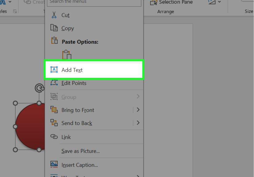
3. Add Callouts and Annotations to Screenshots or Images
AutoShapes are fantastic for explaining screenshots, diagrams, or photos in Word. If your document includes an image and you want to point out something important, shapes can do the job quickly and clearly.
Good options for annotation
- Arrows to point at buttons or icons
- Callout shapes for short notes
- Outlined rectangles to highlight an area
- Circles or ovals to emphasize one part of an image
This is a great technique for software guides, training documents, product instructions, classroom materials, and support manuals. For example, if you are explaining a dashboard screenshot, you might place a callout next to the search bar saying, “Use this field to find older records,” and another arrow pointing to the export button.
The result is much easier to follow than forcing the reader to guess which tiny corner of the image you mean. It also makes your content look more polished and intentional.
A small but important tip
Do not over-annotate. If you add twelve arrows, eight stars, and three clouds, your screenshot starts looking like a conspiracy board. Highlight only the details that matter most. Clarity wins.
4. Create Better Headers, Dividers, Labels, and Badges
Sometimes AutoShapes are not about explaining information. They are about making the page look cleaner and more appealing. Word documents can feel visually flat, especially when everything is just heading, paragraph, heading, paragraph, repeat until morale improves. Shapes can add structure and personality without going overboard.
Practical design uses
- Use a banner shape for a title block
- Add a horizontal line shape as a section divider
- Create small colored labels for categories like “Important,” “Tip,” or “Example”
- Use circles or badges to feature “Top 5,” “New,” or “Checklist” markers
This works beautifully in newsletters, lesson plans, reports, templates, event handouts, and branded documents. A simple colored rectangle behind a heading can make a section stand out. A slim line with a bit of spacing can help separate major topics. A bright callout badge can draw attention to a key takeaway.
The secret is restraint. You want your document to look polished, not like it lost a fight with a sticker machine. Pick a small color palette, repeat the same shape style across the document, and let consistency do the heavy lifting.
Why this matters for SEO-style readability
Even if your document is not a web page, people still scan it like one. Strong visual breaks improve user experience, keep readers oriented, and make long content feel less intimidating. In other words, shapes can help your layout breathe.
5. Design Custom Forms, Checklists, and Printable Layouts
AutoShapes in Word can also help you build forms and printable resources that look more custom than the default options. No, they are not a full replacement for advanced form tools, but for many simple layouts they work wonderfully.
Ways to use shapes here
- Use rectangles as fill-in boxes
- Use lines for signature areas or handwritten responses
- Use small squares as printable checkboxes
- Use rounded boxes for sections in planners or worksheets
Imagine you are making a weekly planner. You can create a neat layout with labeled boxes for Monday through Sunday, a sidebar for priorities, and a small circle badge for “Goal of the Week.” It feels much more designed than a plain table, and you have more flexibility over placement and styling.
This approach is especially useful for teachers, coaches, administrators, and small business owners who need quick custom documents without learning graphic design software. You can build attendance sheets, brainstorming pages, feedback forms, packing lists, menu planners, or event worksheets with a little shape magic.
One caution
If you want a truly interactive digital form, Word’s form controls are often a better choice. But if the goal is a printable or visually polished static layout, AutoShapes are absolutely worth using.
6. Layer Shapes to Make Mini Infographics and Visual Summaries
Here is where AutoShapes in Word stop being merely practical and start getting fun. By combining shapes, text boxes, icons, and smart formatting, you can create simple infographics directly inside a Word document.
What this can look like
- A timeline with circles and connecting lines
- A comparison graphic with two columns of matching boxes
- A statistics panel with colored shapes behind numbers
- A “dos and don’ts” section using icons and labeled boxes
For example, if you are writing a document about team goals, you could build a short visual summary with three bold boxes labeled Quarter 1, Quarter 2, and Quarter 3, each with one key objective inside. Add a line, matching colors, and some spacing, and suddenly your summary looks deliberate instead of accidental.
This is useful when you want readers to pause and absorb the main points quickly. A mini infographic can break up a long report and give the eye a place to rest. It is also helpful for presentations, proposals, class handouts, and internal one-pagers.
How to avoid a mess
Use alignment tools. Use consistent font sizes. Keep spacing even. Group related objects. And please, for the love of readable documents, do not use eight different shape effects just because Word technically allows it.
Best Practices for Using AutoShapes in Word
Now that you have the six main uses, here are a few habits that make shapes easier to manage:
- Keep styles consistent: repeat the same colors, outlines, and font treatments.
- Use alignment tools: neat spacing instantly makes your document look more professional.
- Group related objects: this prevents accidental chaos when moving items around.
- Watch text wrapping: if shapes jump around, check their wrap settings and position options.
- Use white space: shapes need breathing room to work well.
- Prioritize readability: every shape should serve a purpose, not just fill space.
The biggest mistake people make with AutoShapes in Word is treating them like decorations first and communication tools second. A good shape improves understanding. A bad shape just sits there looking expensive.
My Experience Using AutoShapes in Word
When I first started using AutoShapes in Word, I treated them like a novelty. I would drop in a few arrows, maybe a rectangle, and feel wildly accomplished for about thirty seconds. Then I would try to move one item, and the rest of the page would react like I had kicked an anthill. A label would slide into the footer. An arrow would twist itself diagonally across the document like it had strong opinions. A callout would decide it no longer believed in alignment. It was chaos with a ribbon menu.
Over time, though, I realized the problem was not Word. The problem was that I was using shapes without a system. The moment I started paying attention to alignment, grouping, and text wrapping, everything changed. Instead of fighting the document, I could actually shape it. That was the turning point.
One of my favorite uses was creating training handouts. I had a document full of procedural steps that looked technically correct but painfully boring. So I rebuilt part of it using rounded rectangles, arrows, and a few callouts. Suddenly the instructions felt easier to follow. People stopped asking, “Wait, what comes next?” Quite frankly, that alone felt like a small office miracle.
I also learned that shapes are excellent for making plain documents feel more intentional. A simple banner behind a heading can make a guide look cleaner. A narrow divider line can separate ideas without adding clutter. A set of matching boxes can make a summary section feel organized instead of improvised. None of these changes are dramatic on their own, but together they make a document easier to trust. Readers notice when something feels visually coherent, even if they cannot explain why.
Of course, there were mistakes. I definitely went through a phase where every shape had a shadow, every box had a gradient, and every page looked like it had been designed by someone who had just discovered “effects” and refused to calm down. The lesson there was simple: just because Word lets you do something does not mean the document needs it. Clean shapes beat flashy shapes almost every time.
The most useful habit I picked up was reusing successful layouts. Once I built one good process graphic or one tidy sidebar style, I copied it into future documents and adapted it. That saved time and kept things consistent. It also meant I was no longer reinventing the wheel every time I needed a checklist, flowchart, or visual callout.
So if AutoShapes in Word have ever felt clunky, my honest experience is this: they get much better once you stop treating them like random art supplies and start treating them like layout tools. With a little patience, they can make your documents clearer, smarter, and a lot less dull. And in Word, that is basically a superpower.
Conclusion
AutoShapes in Word are far more useful than many people realize. They can help you explain steps, build flowcharts, annotate images, create better section breaks, design custom forms, and produce mini infographics without leaving the document. That makes them valuable for teachers, students, office teams, freelancers, and anyone who wants their Word files to look more polished and communicate more clearly.
The real win is not that shapes make documents prettier, although they often do. It is that they make documents easier to understand. And when your reader spends less time decoding the layout and more time absorbing the message, your content has done its job.