Table of Contents >> Show >> Hide
- 1) Machine-Made “Fake Handmade” Finishes
- 2) Matte Black… When It’s Used Everywhere
- 3) Overly Distressed Oil-Rubbed Bronze (a.k.a. “Faux Farmhouse Bronze”)
- 4) Builder-Grade Brushed Satin Nickel Everywhere
- 5) Warm Yellow Brushed Brass (and the “Gold Everything” Phase)
- How Designers Keep Hardware From Looking Dated
- Fast, High-Impact Updates (Without a Full Remodel)
- Real-World Experiences: What People Notice When They Ditch Outdated Hardware Finishes (About )
- Conclusion
Hardware is the jewelry of your home. And just like jewelry, it can either make an outfit look intentional… or make it look like you got dressed in the dark during a fire drill. The good news: swapping cabinet pulls, door levers, faucet finishes, and even switch plates is one of the fastest, most budget-friendly ways to “update the whole vibe” without remodeling your whole life.
One caveat before we lovingly roast these finishes: if you love what you have and it’s in great condition, keep it. Design “rules” are more like guidelineskind of like “do not eat an entire bag of tortilla chips over the sink.” People do it. Sometimes it’s even the right choice.
1) Machine-Made “Fake Handmade” Finishes
You’ve seen them: hardware that’s pretending to be artisanal. Faux hammered bronze. “Antique pewter” that looks suspiciously like it was printed by a printer. Distressing that’s so uniform it’s basically a stencil. Designers are increasingly over the “imitation craft” era because it can read as mass-produced, even when the price tag tries to convince you otherwise.
Why it feels dated
- Too perfect to be authentic: Real hand-hammering and aging has variation. The fake stuff often repeats the same pattern piece after piece.
- It locks you into a theme: Faux “old world” finishes can force a space into costume mode (and nobody wants their kitchen dressed for a Renaissance fair).
- It competes with natural materials: When you’ve got real stone, wood grain, or handmade tile, imitation finishes feel like the “knockoff handbag” of the room.
What to choose instead
Go for finishes that either (a) are honestly modern and clean, or (b) are genuinely crafted. Think knurled details, subtly hammered textures, solid metals that develop patina, and higher-quality coatings that hold up to daily use. If you love the idea of durability, look for reputable “lifetime” or advanced coatings (often described as PVD) that resist wear.
2) Matte Black… When It’s Used Everywhere
Matte black hardware had a very long moment. It looked sharp. It photographed like a dream. It made every white kitchen instantly feel “designer.” And then… everyone did it. On every cabinet. With every faucet. With every light fixture. In every flipped house on the internet.
Why it feels dated
- Trend fatigue: Matte black became the default “quick upgrade,” which can make a home feel time-stamped to a particular design era.
- High contrast can feel harsh: In softer, warmer interiors (hello, wood tones and earthy paint colors), black can look heavy if it’s not balanced.
- One-note styling: When everything matches, the room can feel flatlike a whole outfit in one color with no texture.
What to choose instead
Matte black isn’t “banned.” Designers are just using it more strategicallyoften mixed with warmer metals or used as an accent rather than the entire personality of the space. Try pairing black cabinet pulls with a warm-toned faucet finish, or keep black on lighting while your hardware goes softer (nickel, bronze, or a living brass).
3) Overly Distressed Oil-Rubbed Bronze (a.k.a. “Faux Farmhouse Bronze”)
Oil-rubbed bronze used to be the cozy, candlelit answer to shiny chrome. Then distressing went into overdrive. Suddenly everything looked like it had been “aged” in a factory for exactly 17 minutes and 32 seconds.
Why it feels dated
- It can look dirty, not lived-in: Heavy distressing can read as grime instead of characterespecially on faucets and frequently touched hardware.
- It screams a specific era: The distressed, rustic bronze wave is strongly tied to peak farmhouse trends.
- It’s often visually busy: If your counters, backsplash, or cabinets already have movement, distressed bronze adds more “noise.”
What to choose instead
If you still want warmth and depth, designers are leaning toward bronze finishes that feel richer and more refinedless “painted-on aging,” more subtle patina. The key difference: distressed vs. dimensional. Dimensional finishes have depth; distressed finishes often look artificially scratched.
Also consider polished nickel or softer silvery metals if you want something bright without the “mirror” vibe of chrome.
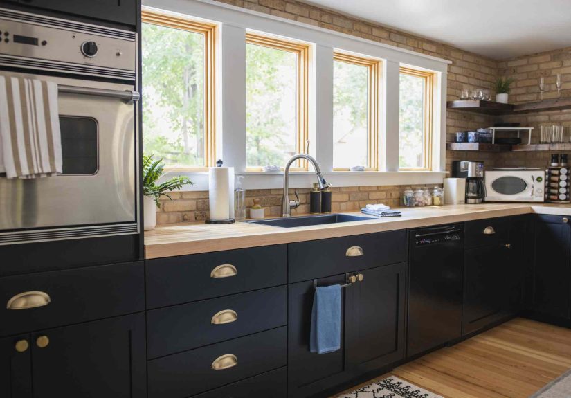
4) Builder-Grade Brushed Satin Nickel Everywhere
Let’s be clear: nickel itself isn’t the villain. Nickel can be timeless, flexible, and gorgeous. The problem is the ultra-generic, “installed in every rental since 2009” version of brushed satin nickelespecially when it’s used on everything, in every room, and always paired with the same standard arched cabinet pull.
Why it feels dated
- It reads as default: The finish can feel like a “builder package” rather than a design decision.
- It can skew plasticky: Lower-quality plated hardware in brushed nickel sometimes looks dull or chalky under warm lighting.
- Matchy-matchy makes it worse: When faucets, knobs, pulls, and lighting are all the same brushed nickel, the room can feel predictable.
What to choose instead
If you like a silver family finish, try upgrading within that lane:
- Polished nickel: warmer and softer than chrome, with a more elevated shine.
- High-quality satin nickel: still low-maintenance, but with better depth and less “flat gray.”
- Chrome (used intentionally): especially good for modern or retro spaces, and it can feel crisp with cooler palettes.
And if your heart wants something more current? Use nickel as the “supporting actor” and layer in a second finishlike brass, bronze, or matte blackso the room feels collected rather than copied-and-pasted.
5) Warm Yellow Brushed Brass (and the “Gold Everything” Phase)
Brass has history. Brass has charm. Brass can be timeless. But the very specific, warm-yellow brushed brass that flooded the marketpaired with white shaker cabinets and a subway tile backsplashhas started to feel like a design timestamp.
Why it feels dated
- Overexposure: When a finish becomes the go-to manufacturer default, it can lose its “special” factor.
- Undertone problems: Some brassy finishes lean very yellow, which can clash with cooler whites or look brassy in an unflattering way under certain bulbs.
- It can read as trend-first: When every detail screams “I saw this on social media,” the room may not feel personal.
What to choose instead
If you love warmth, choose brass with more nuance:
- Unlacquered brass: a “living finish” that develops patina and character over time.
- Antique or aged brass: softer, less bright, and often more forgiving with paint and stone.
- Champagne bronze / soft gold tones: less yellow, more muted.
Or go in a totally different direction: bronze and copper are getting attention for their depth and “collected” feelespecially in warmer, layered interiors.
How Designers Keep Hardware From Looking Dated
If you want your hardware finishes to age well (in a charming way, not in a “why did we do this?” way), use this simple framework.
Start with what you can’t (or won’t) change
Countertops, flooring, and appliances are the “big rocks.” Hardware should make those look better, not fight them. Stainless appliances often play nicely with nickel, polished chrome, and certain brass tones.
Pick an anchor finish
Choose one finish that leadsoften the faucet or main light fixture. Then build around it.
Mix metals, but keep it intentional
- Limit it to two finishes (three at most) so it looks curated, not chaotic.
- Match undertones: warm metals (brass/bronze/copper) like each other; cool metals (chrome/nickel) like each other. Matte black can act as a neutral bridge.
- Use zones: one finish on perimeter cabinets and another on an island, or one on plumbing and one on cabinet hardware.
Test in your lighting (seriously)
Finishes change dramatically from daylight to warm bulbs to evening shadows. If you can, order a sample or one extra pull and look at it in the actual room before committing.
Don’t forget performance
Kitchens and bathrooms are “high-touch” zones. Fingerprints, water spots, and cleaning products matter. If maintenance will drive you bananas, pick a finish that hides wear and is known for durability.
Fast, High-Impact Updates (Without a Full Remodel)
- Cabinet hardware: swap pulls and knobs first; it’s the biggest visual payoff per dollar.
- Faucets: a new faucet can modernize a sink area instantlyespecially if the old finish screams “builder basic.”
- Switch plates: underrated. New plates can make the whole wall feel sharper (and you don’t have to live with the yellowed plastic of doom).
- Door levers/knobs: matching interior door hardware helps your home feel consistent and considered.
Real-World Experiences: What People Notice When They Ditch Outdated Hardware Finishes (About )
The funny thing about hardware is that you don’t notice it… until you do. Most homeowners start a refresh for a practical reason (“this handle is loose” or “this faucet is leaking”), and end up realizing the finish was quietly dating the entire space. Here are a few real-world patterns designers hear all the timeplus what tends to work better.
Experience #1: The “Matte Black Everything” Hangover. Someone swaps in matte black pulls because it’s an easy upgrade, and for a while, it looks crisp and modern. Then they add a black faucet. Then black pendants. Then black door levers. A year later, the room feels a little severeespecially if the homeowner has warmed up their style with natural wood, creamy paint, or softer textiles. The fix is usually simple: keep black as an accent (lighting or select hardware), and bring in a warmer counterbalance like antique brass, polished nickel, or a soft bronze. Suddenly the kitchen looks layered instead of locked into one “trend uniform.”
Experience #2: Distressed Oil-Rubbed Bronze That Never Looks Clean. In kitchens and baths, heavily distressed bronze can make people feel like they’re losing a cleaning battlebecause the finish already looks “pre-scratched.” Homeowners often describe it as looking dusty or smudgy even right after wiping it down. The common upgrade is moving to a bronze finish with more depth and less fake distressing, or shifting to a brighter finish like polished nickel that reads intentional and fresh. Many people say the space feels “lighter” immediately, even if nothing else changes.
Experience #3: Builder-Grade Brushed Nickel That Feels Like a Rental. This is the classic: the home is lovely, but the hardware is the same brushed nickel you’ve seen in a thousand builder-grade installs. It’s not ugly; it’s just… anonymous. When homeowners replace it with higher-quality nickel (or even polished chrome in a modern space), they’re shocked by the difference. The cabinets suddenly look more custom. The room feels newer. And guests start saying things like, “Did you remodel?” even when you didn’t.
Experience #4: Brass That Was Trendy, Then Too Much. Some homeowners adored the warm brass waveuntil every store, every influencer, and every “before-and-after” showed the exact same look. If the brass is very yellow or very ubiquitous, it can start to feel less special. The people who stay happy long-term usually do one of two things: they switch to a more nuanced brass (unlacquered, aged, or champagne tones), or they mix metals so brass becomes a highlight instead of the entire chorus line.
Experience #5: The “Small Swap, Big Confidence” Effect. The best part? Hardware upgrades give homeowners confidence to make bolder choices later. After a simple switch from dated finishes to a more intentional mixsay, polished nickel with antique brass accentspeople often feel freer to repaint cabinets, add art, or introduce color. It’s like updating the accessories first: the whole outfit starts making sense.
Conclusion
Outdated hardware finishes aren’t “bad”they’re just clues about when a space was last updated. If your home feels a little stuck, start small: ditch imitation finishes, avoid overdoing matte black, skip overly distressed bronze, upgrade builder-grade nickel, and choose brass tones with depth. The most timeless move designers keep coming back to is intentionality: pick an anchor finish, mix metals thoughtfully, and choose quality finishes that look good in your real-life lighting (not just in a showroom spotlight).